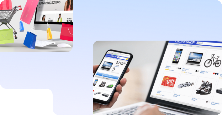
SEO Services
No magic - just our painstaking joint work on the site


No magic - just our painstaking joint work on the site
No magic - just our painstaking joint work on the site
Sharing the most useful advices about marketing!
No magic - just our painstaking joint work on the site

Over 20 years of work, our team has helped dozens of medical centers to move into the TOP-5 of Google, make their websites convenient and useful for patients, and most importantly, maintain and improve the health of many people who look for medical service providers every day via the Internet. High-quality medicine is the main trend of our time, and it begins with the site.
A really effective website of a medical institution helps not only to sell services, but is also able to relieve the medical staff by answering the main patients’ questions.
But creating a high-quality site that would immediately cover all the necessary aspects of user interaction is quite difficult. Especially if you do not have a clear algorithm of actions. In this article we will try to offer you such an algorithm.
Content:
We would like to draw your attention to the fact that… 
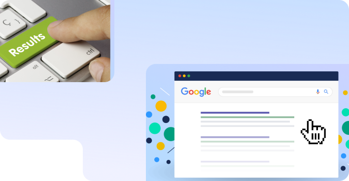
Even small, but systematic improvements to your site give tangible results and increase the hits number.
Let's take an example so that we don't look like we’re only theorists 
On the medical center website of one of our customers, we made only ONE improvement - we removed the “Call me back” button from the site footer (this is the lowest part of the site, because few people scrolled to it) and made it “floating”, so now it moves when scrolling the page and always remains in front of the user's eyes.
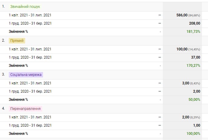
Here's how the number of patients with this form increased in a short period.
Another example: on the site of another customer we completely finalized the structure of the start page in an adaptive version (the one that is displayed on mobile devices and tablets) at the end of last year.
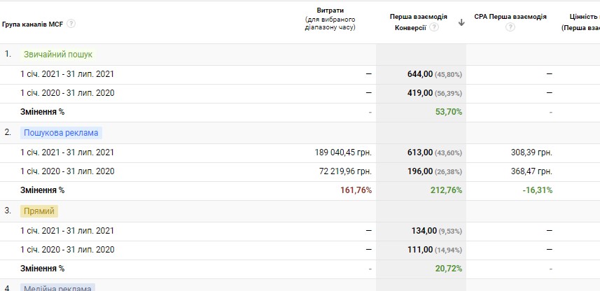
Here are the results in terms of the appointments number from the site the medical center received in the last 7 months of 2021 (compared to the same period last year).
And now let’s speak directly about the improvements that will definitely make your site a more effective channel for receiving applications.
The ideal medical center website is a resource with a pleasant design, without technical errors, with competent and detailed content, as clear as possible and easy to use. But how can this be achieved? Here, as in any other business, we start right out the gate - that is, from the Home (Main) page.
With the help of the Home page any visitor to your site should be able to obtain the following data:
Now let's take a closer look at what blocks should be on the Homepage so that it meets all the requirements and gives each patient a comprehensive idea of why and how he can apply to this clinic.
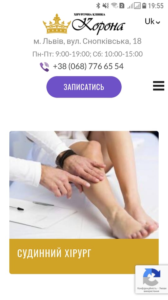
This is the top of the site. What's important? First, the header is common to most of the site's pages. And this means that, having finalized it on the Home page, the header will also change on other pages. Secondly, the header is the first thing visitors to your site see. These are two weighty arguments to start with the header. So...
The key elements of a header are:
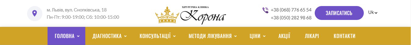
Particular attention should be paid to the visual design of the header. Despite the fact that it should contain all the specified blocks, the header should also be as compact as possible in appearance and low height.
This is especially true for mobile devices where the header can sometimes take up half the screen in horizontal view, which is neither correct nor convenient.
Most start pages on modern sites have this block without fail, although there are exceptions. The slider is designed to use visual information (banner) to draw more attention to key services or special offers already on the first screen:
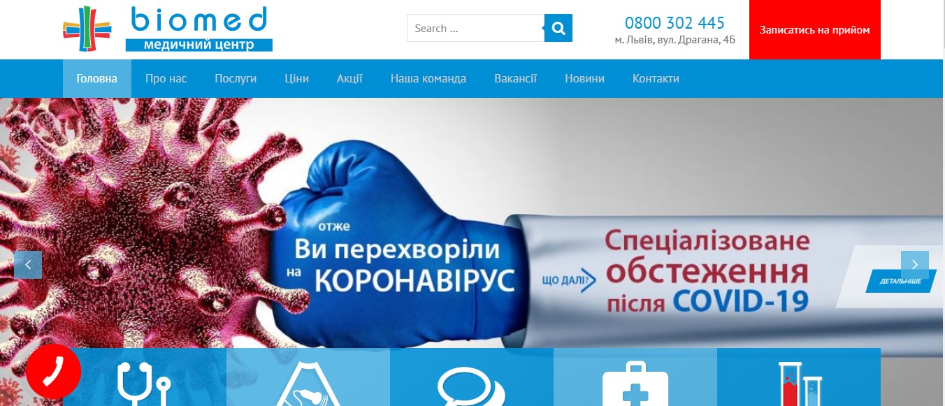
Of course, the creativity of the designer and the design of the proposal in accordance with the requests of potential customers will play an important role here. Equally important is the presence of short texts on the slides that reveal the essence of the proposal. Because just photos of offices or doctors which can often be found on the medical institutions websites will not tell the user anything about what additional value he can get here.
 By the way, the "Details" button on the slide with a link to the service page or promotion page creates the opportunity to speed up the patient's request for the service in which he is interested.
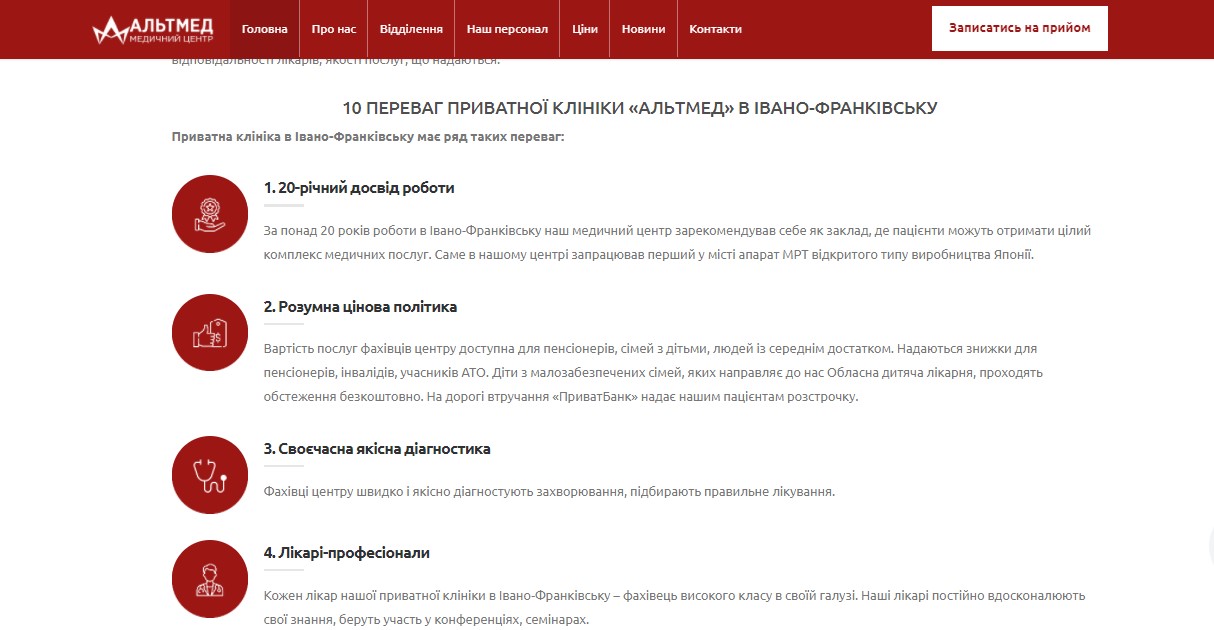
Such an emphasis on the main advantages of visiting your clinic is a convincing argument for users. It acts subconsciously, increasing your credibility.
Also, the presence of benefits helps people feel safe and understand that the medical center is worried about its own credibility in the eyes of patients.
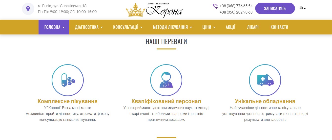
The list of benefits can be styled with icons that visualize the text and make it more interesting and attractive.
Also, the list of benefits can be both short and contain only key advantages, or detailed, which covers all the important arguments in favor of the medical center.
Depending on how broadly or highly specialized your medical institution is, a list of medical directions and services is drawn up on the home page.
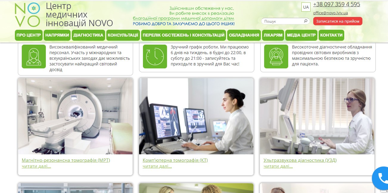
Most often, such lists are found in the form of rectangular clickable previews, with one click on which the user easily gets to the page of the desired services category or to the final page of the service.
This visual design has also become common because it is most convenient to adapt it to vertical viewing on modern smartphones.
The “who needs these texts, no one reads them” idea is probably the leader among harmful stereotypes. Harmful, first of all, for the positions of your site in search engines (Google, Yandex), and at the same time for appointments from the site. Why?
Let's be honest: today, before going to the doctor, we first turn to the Internet And the texts of medical blogs are that special type of content that people read, albeit out of necessity, but very carefully and purposefully. And this is very important! Here is how to use it.
In addition, it has long been discovered that reading from monitors occurs in a slightly different way than reading from paper: the brain will keep the most valuable and necessary information for a person in sight, quickly filtering out all secondary data. Therefore, high-quality text on the Home page is a guarantee not only of high positions in search results, but also of loyalty and trust of patients who always have the opportunity to read more useful information.
It is also necessary to pay special attention to a high-quality video that would briefly and interestingly tell about your institution, contain an overview of the interior and equipment, as well as an invitation to seek services from leading clinic specialists.
The presence of this block on the home page is very important in terms of increasing the confidence of potential patients and, in general, increasing the loyalty of the target audience. Because most people are already accustomed to chatting and making new acquaintances online, focusing on a large number of photos on social networks. In fact, the same thing happens with the help of the site: the user gets the opportunity to visually get to know the doctor and get basic data about him and his qualifications.
Thus, psychologically, it is much easier for a person to turn to a specific specialist with his problem than to an abstract institution, which is what a medical center is for him at the acquaintance stage:
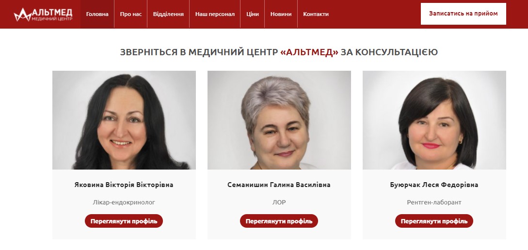
Clickable preview tiles with photos of doctors should lead to full-fledged pages. This increases the time spent by the user on the site, forms his confidence in the clinic, and increases conversions.
A very important point, which, unfortunately, is often underestimated. And although there is a lot of discussion today about people's real trust in online reviews, yet most of us continue to purposefully look for them on the Internet. Fact: if a patient does not find reviews directly on your clinic website, he may be distracted by searching for them in other sources, and never contact you for services.
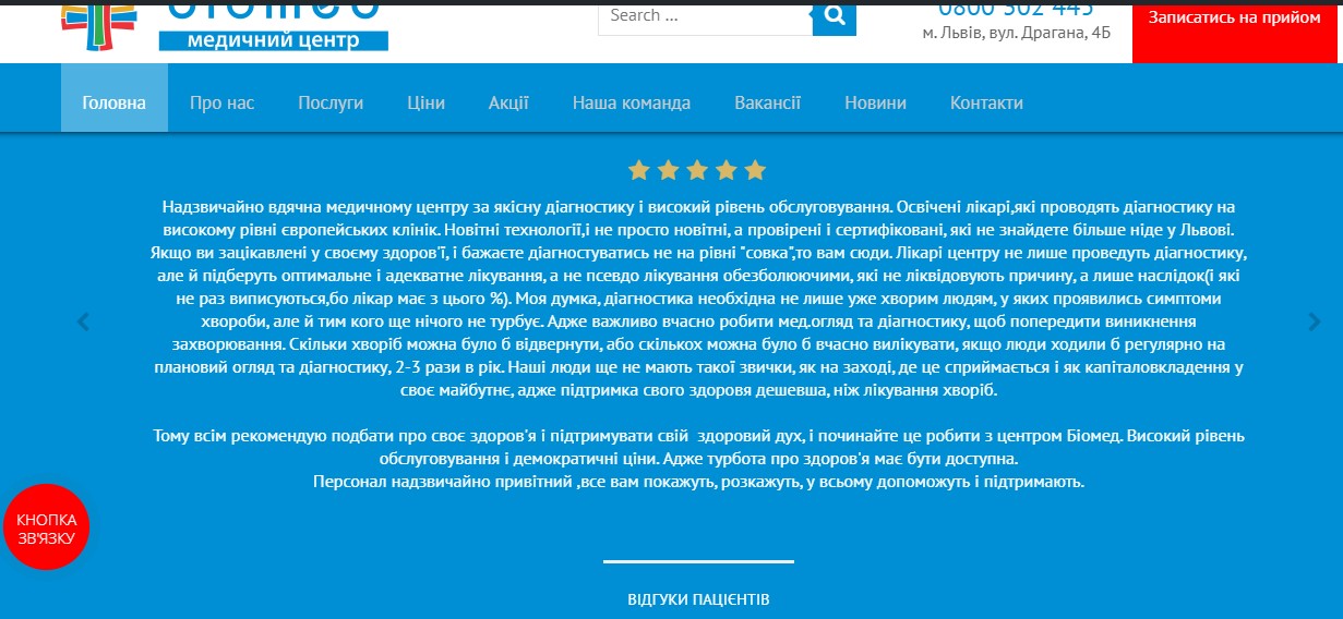
Therefore, you should make sure that your patients have the opportunity to share their impressions about the level of service and the results of treatment directly in the clinic or on the website.
Such a block should be added not only to the Home page, but also at the bottom of each page of the site. This will help the patient to get to the clinic faster and will improve the behavioral factors of the site.
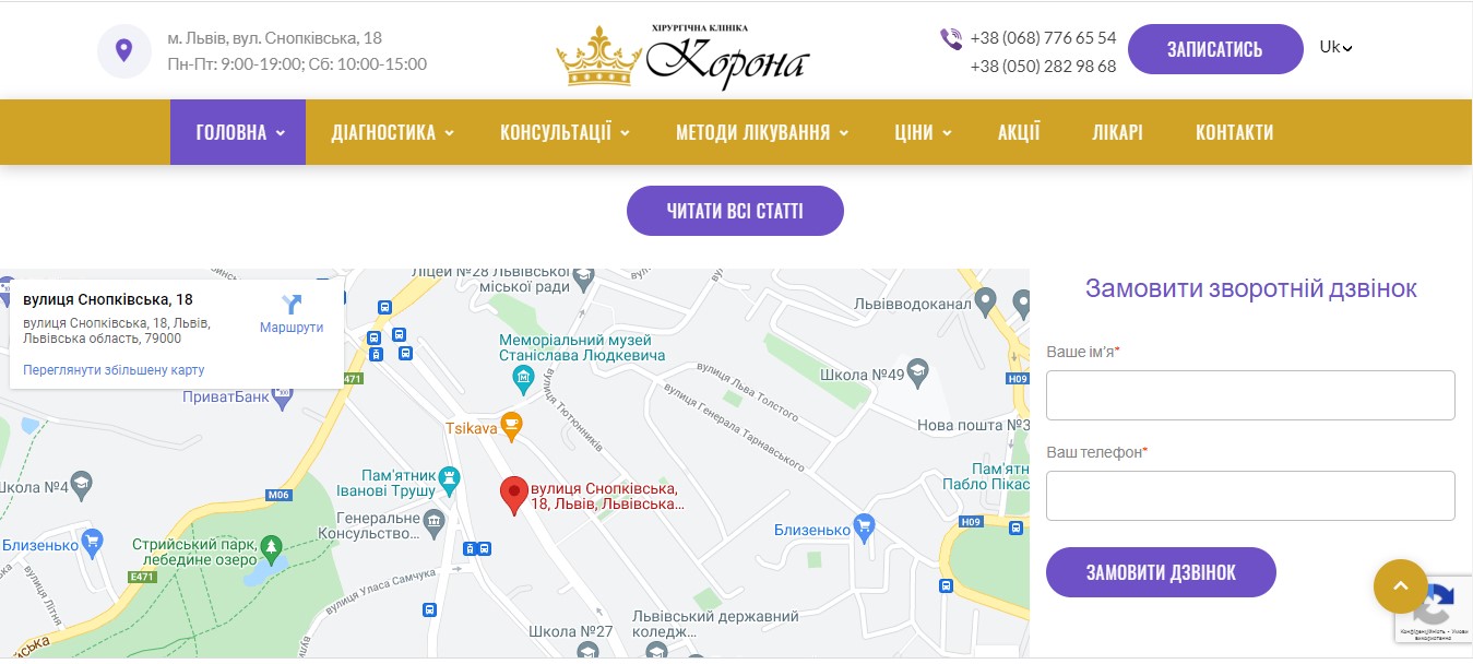
In addition, an additional schematic explanation of the location features or a recording form can be placed on the map.
To add such a card, you must first register your institution with Google My Business. We wrote here what it is and how to do it correctly.
Immediately, we note that the footer on the home page may differ from the footer on the other pages of the site both externally and in content. But it would be more correct to make it the same for the entire site.
The best option for the footer would be to fill it with the following elements:
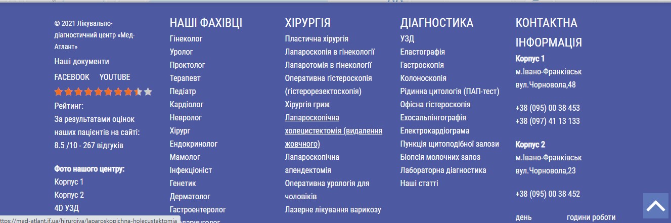
In any case, the footer should not be made too large, and its content should be placed compactly from left to right.
Also, the important elements of the Start Page, which qualitatively complement and expand its marketing characteristics, include the following:
Of course, in addition to the presence of all the listed blocks, their design is an important issue. But that's a completely different article...
So why did we speak so much? The home page of the medical institution website is a showcase which gives you a chance to show all your advantages and strengths. Now that you know exactly how to increase the efficiency of your site, do not neglect this opportunity! And if you need help, the specialists of our healthcare SEO agency are at your service!
We care about improving your sales :)