No magic - just our painstaking joint work on the site
Fill up and send! The best pop-ups to increase website conversion
What is a popup? This is a lead form that pops up on your computer screen when you are on a website page. This tool is named pop-up. It is good for collecting email addresses of site visitors ( potential customers).
The usual practice is to offer some usefulness and ask the visitor for an email instead. You can offer to take part in the action, free content (a large longread or a book laid out in pdf). Many people say that in 2019 pop-ups are annoying and do not work. But it's not. The whole secret is in the presentation:
- how exactly you ask to leave a contact;
- how useful material you offer;
- how easy it will be to fill in the fields;
- whether you guarantee data security or not;
- and whether you use the secret weapon of all times and peoples - a sense of humor.
We will show examples of tricks that work for pop-up.
People are willing to tolerate pop-ups if they are useful or make you smile.
Explicit savings for the site visitor
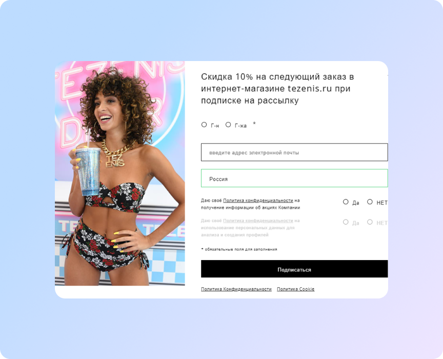
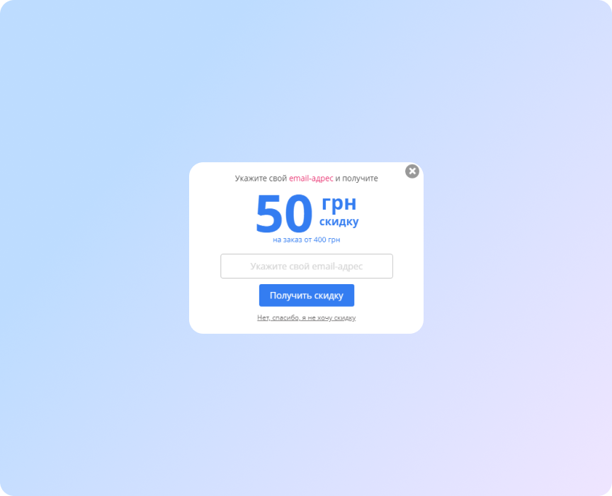
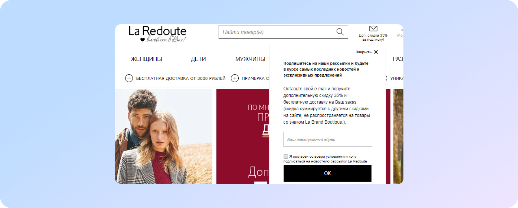
If you sell goods or offer services, these forms work just fine. Offer a discount:
- for subscribing to the store's newsletter;
- for the first purchase;
- for the delivery of goods;
- for the friend you bring;
- when buying more than XXX;
- for ordering additional items.
And also:
- notify that the promotion is ending;
- offer a promotional code for the next purchase;
- or go to the page with promotional offers or sales;
- donate something;
- offer to follow your social media account.
This is need to add some text. For example, "For subscribers - special offers"
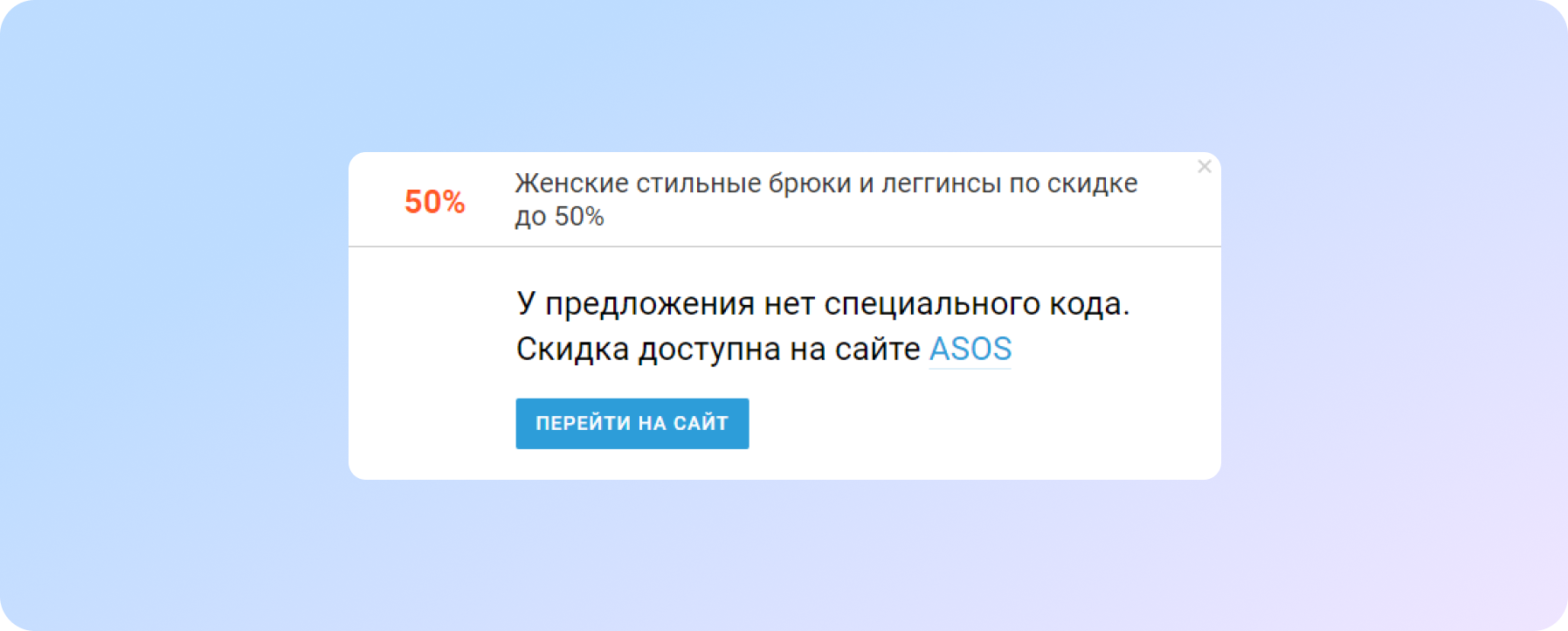
Aggregator sites do the same
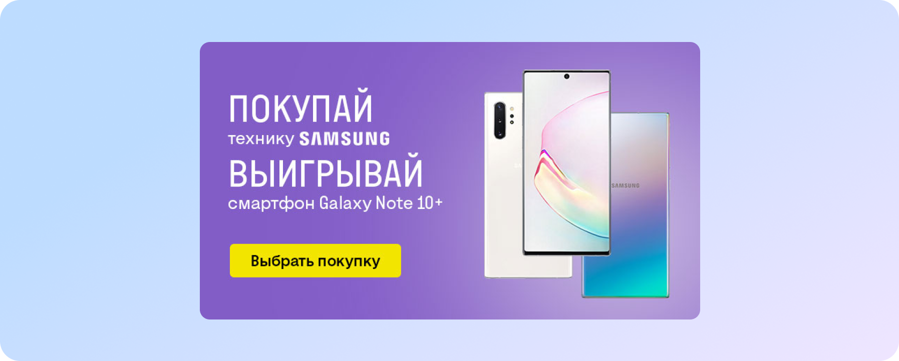
Fresh offer from Rozetka
In addition to the discount, there is also free shipping
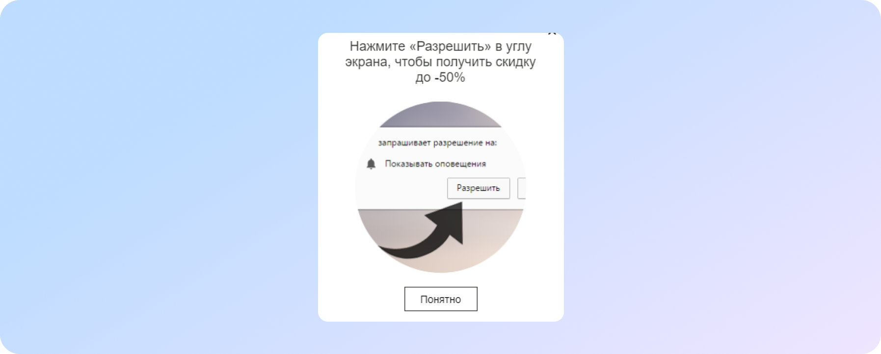
And here they give a discount in exchange for the fact that you allow me to notify you
Pop-up that offers content
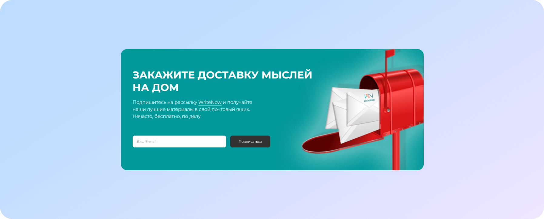
If you have an information product or service, the best way to take a potential client's contact is to invite him to subscribe to the newsletter, blog article announcements, download valuable content.
Here is a prime example:
See another good example:
And here's another one:
What is a good example: there is a USP and social proof
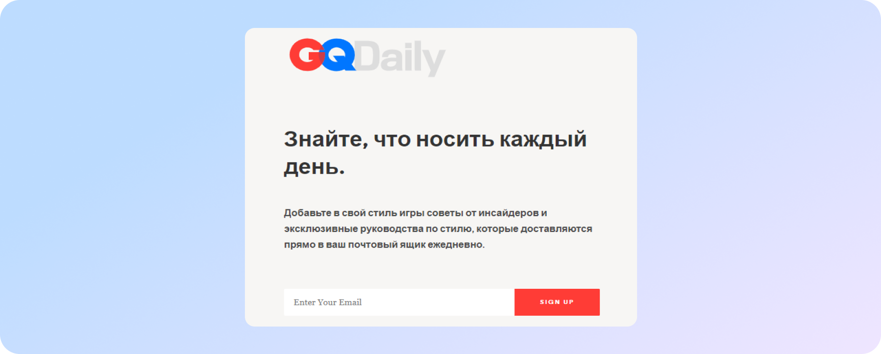
Pop-up window for those who love hot celebrity news
The biggest motivation for a subscriber is the item about “secret offers and gifts”
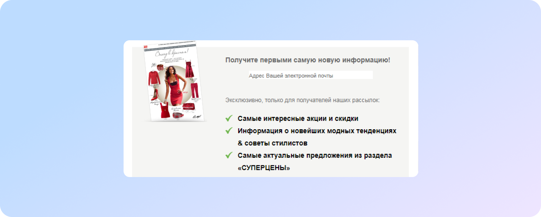
The Bonprix store tried and listed all the important reasons to subscribe to the newsletter
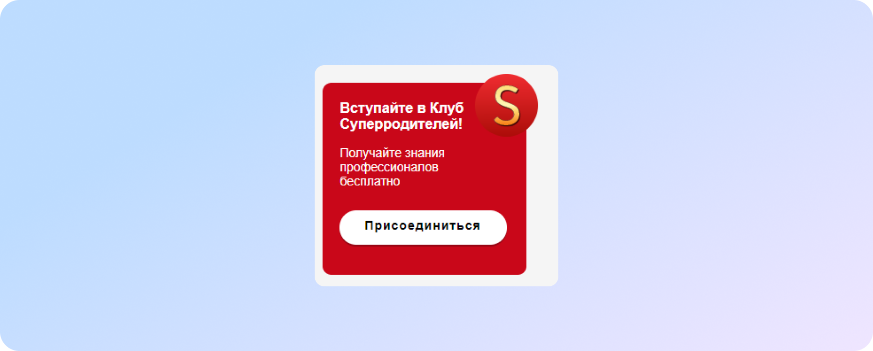
But what is offered to parents on the site with toys
If the site visitor is on a thematic section of the site (for example, phones of a certain brand, travel to Europe), then offer him to subscribe to content related to this topic. Often they offer to subscribe to news about a certain gadget model, which has yet to go on sale.
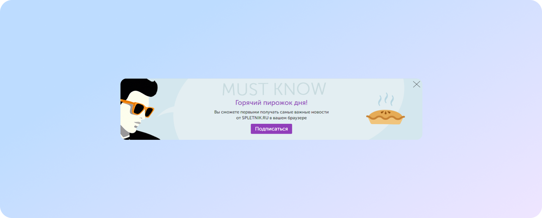
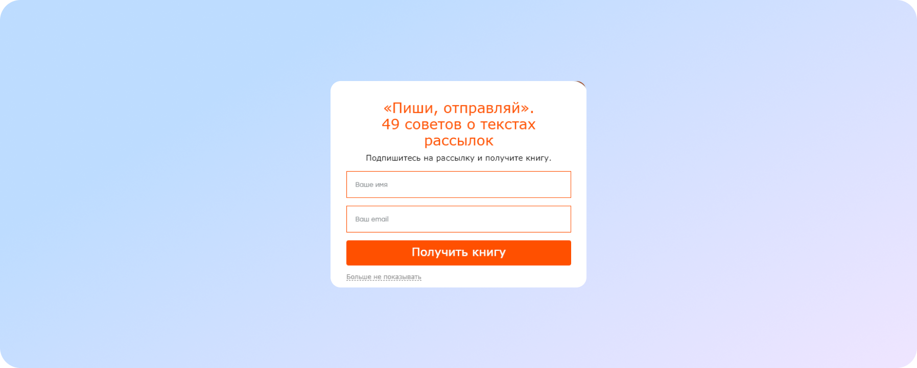
On the page of his blog, LeadMachine offers a subscription to fresh articles, adding a little humor
Great offer from the mailing service
Pop-up to save visitor time
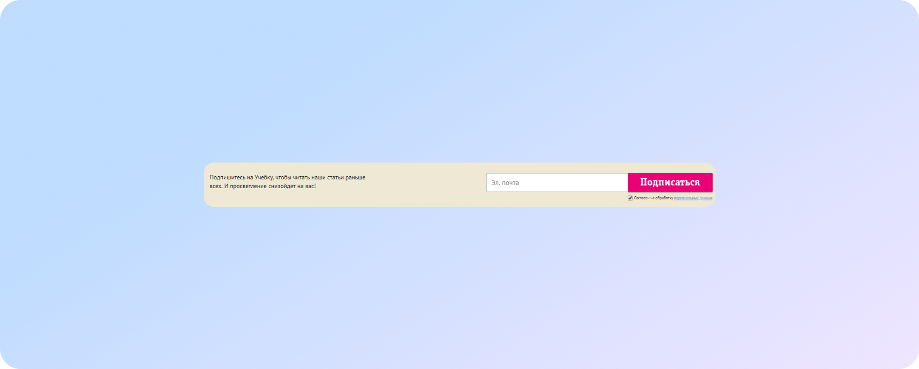
Laconic, simple... perfect!
When thanked, the popup is not annoying. If you have a lot of products or new categories, then this is a great way to get interested
And this window appears at the very bottom of the site after the visitor has spent more than three minutes on the site:
And the visitor is like: “Why not!”
Pop-up offering services
The secret of a good offer is the unity of the offer, design and the correct time of submission. Almost like a delicious dish in a restaurant.
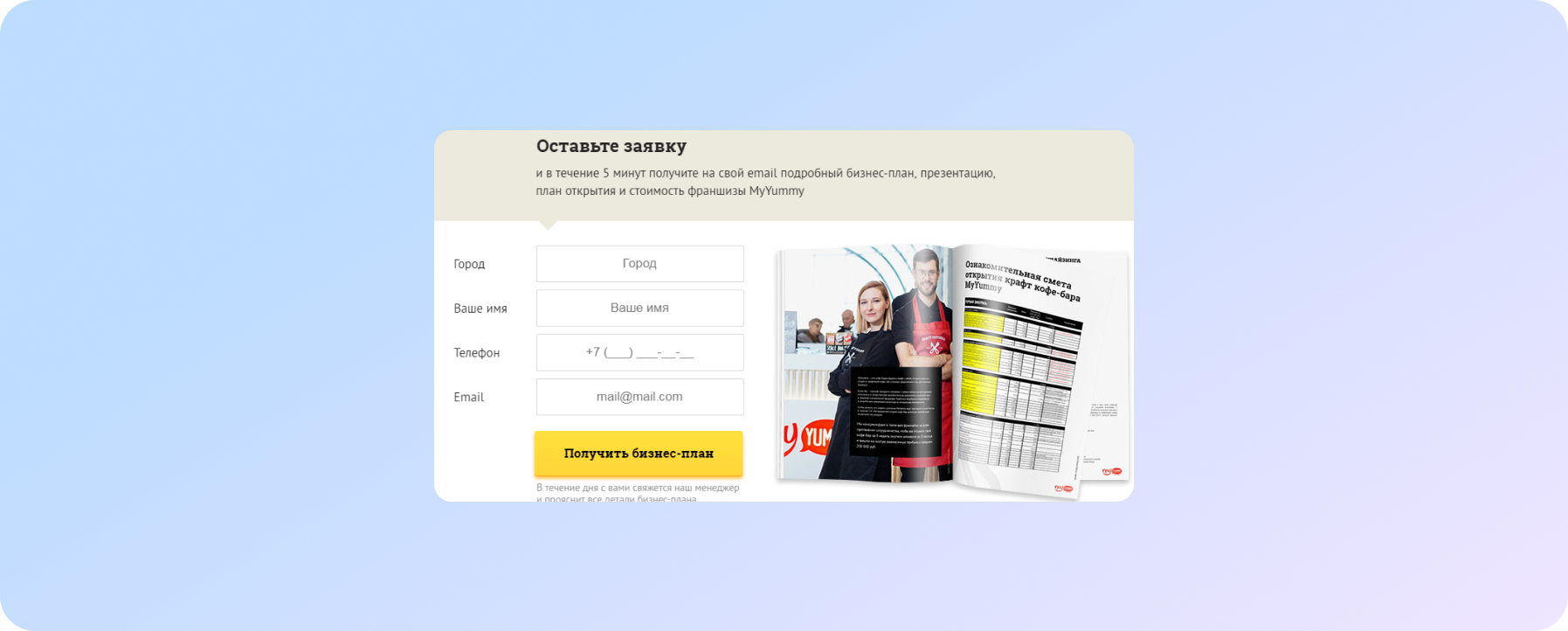
There is a very specific offer, the deadline is working!
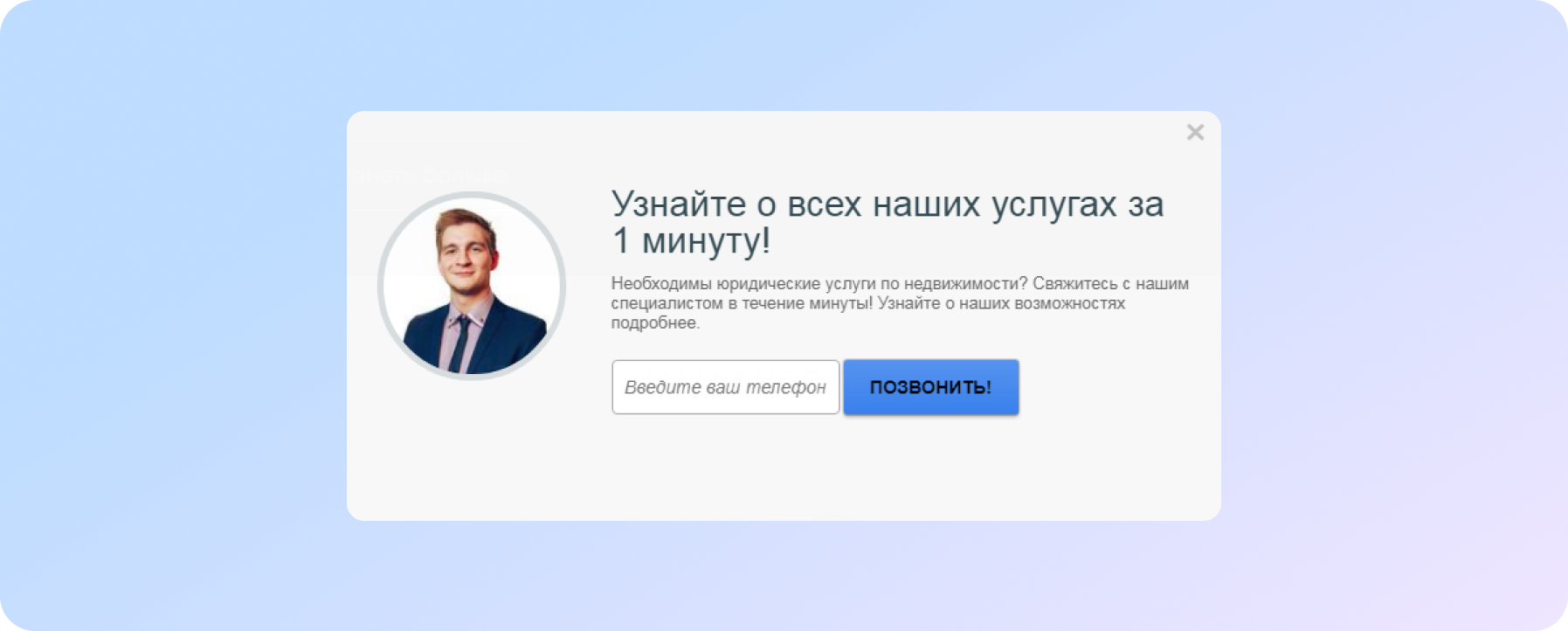
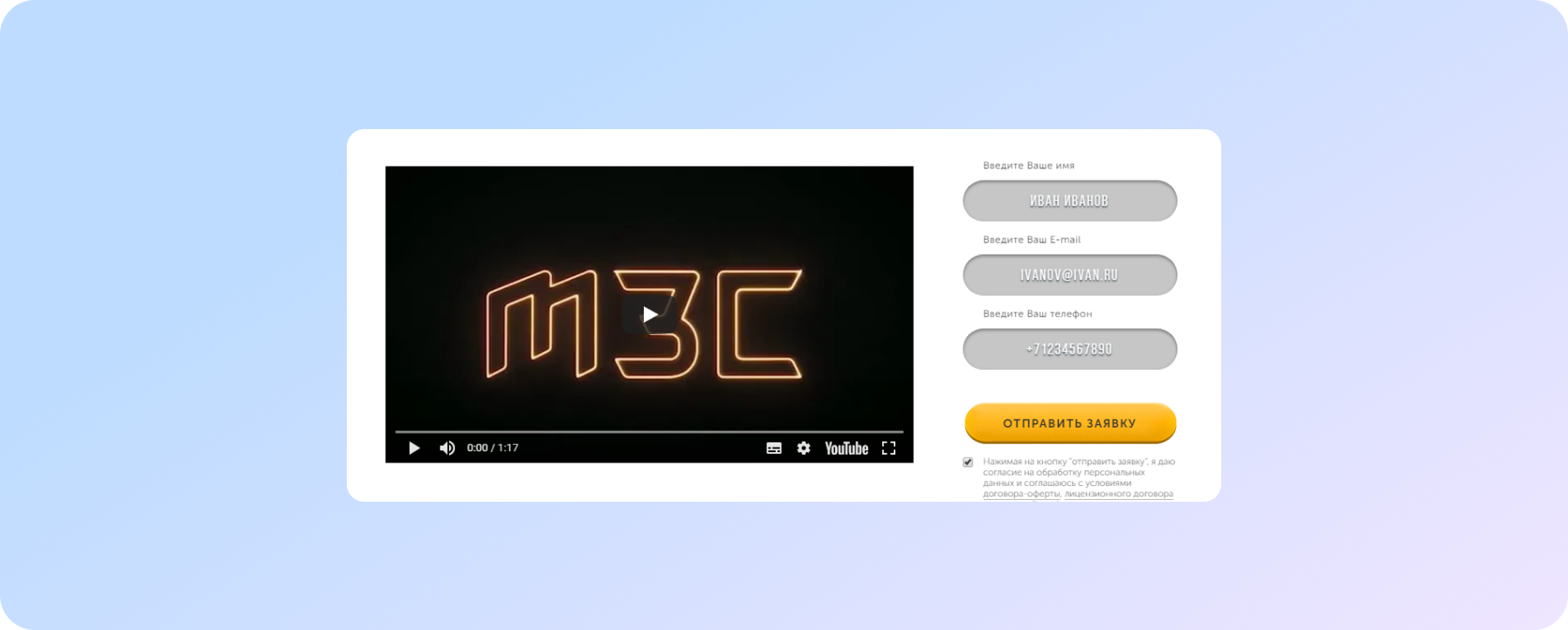
Here, take a picture of your employee. No - stock photos!
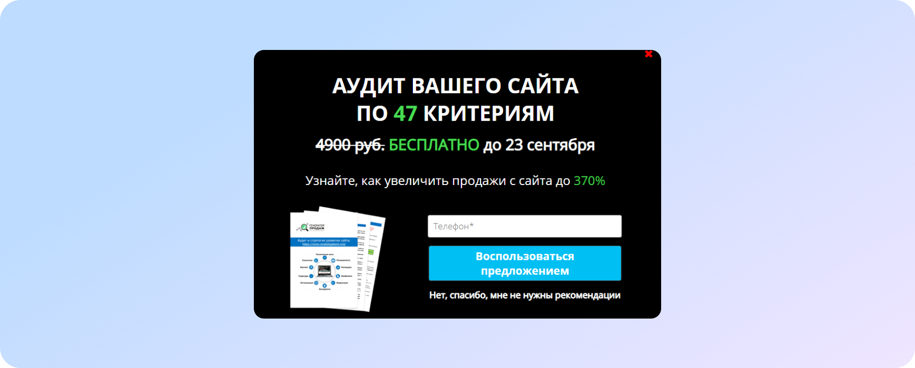
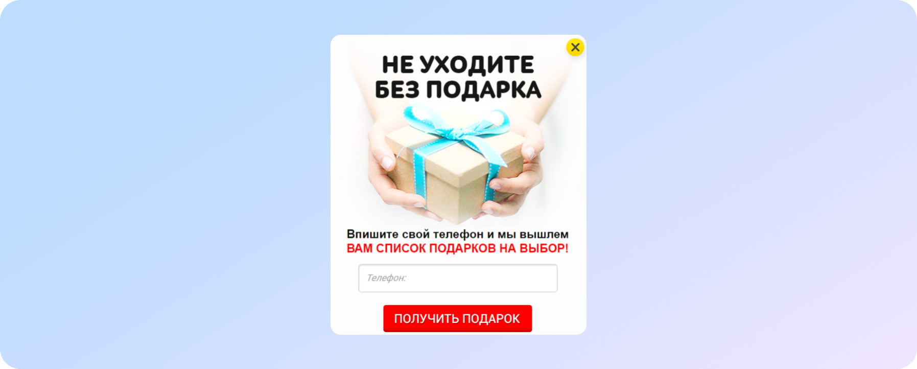
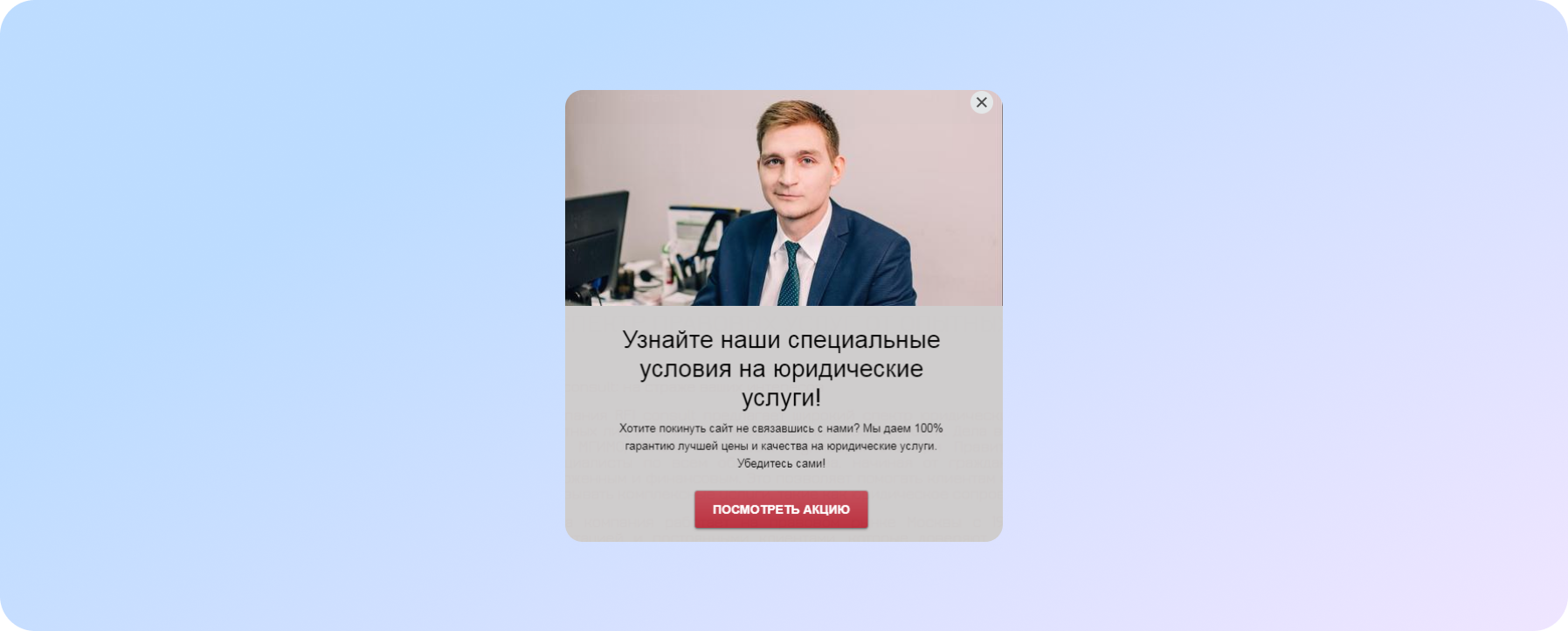
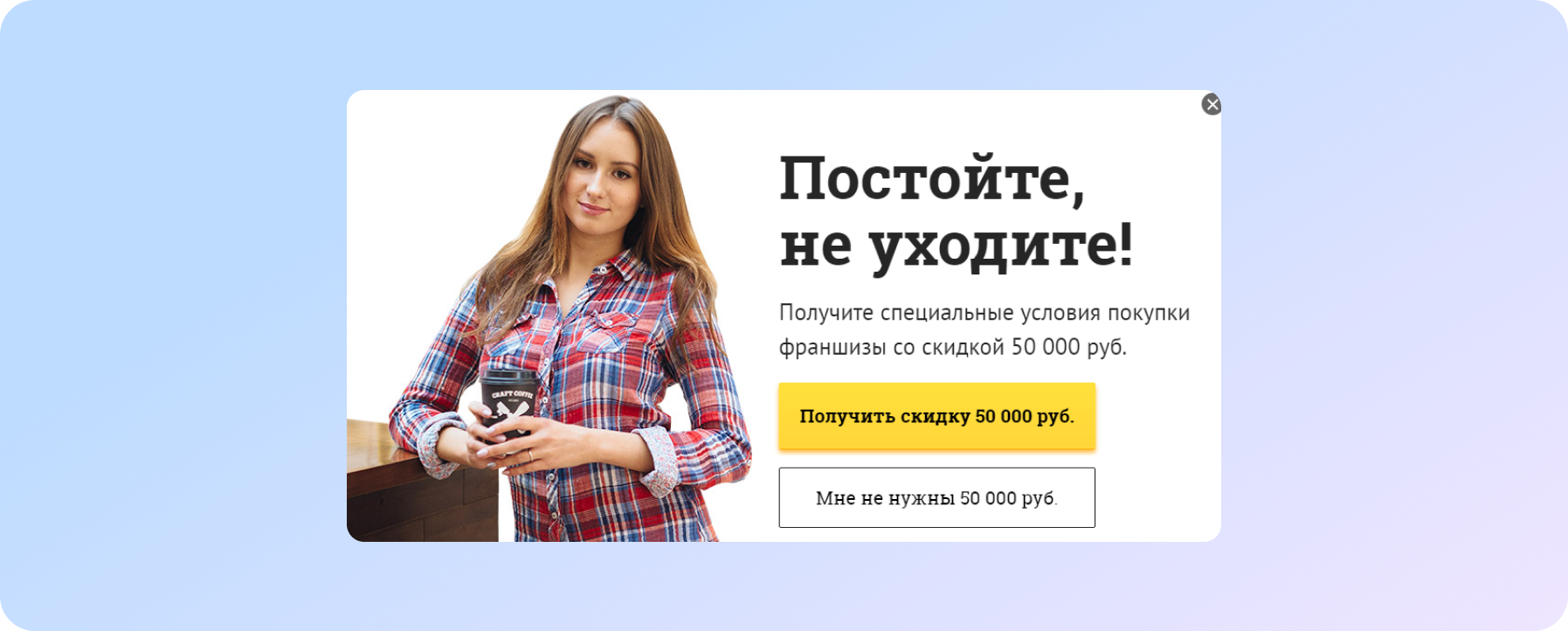
Hop-up exit-intent - a pop-up window when trying to leave the site
And here there should be no limit to creativity - the visitor was going to leave the site anyway. Therefore, you must surprise him, attract his attention and keep him.
Gift is good
Special conditions for services are also good
A big discount is a deafening argument. At least in order to once again study all the information
Bad pop-up examples
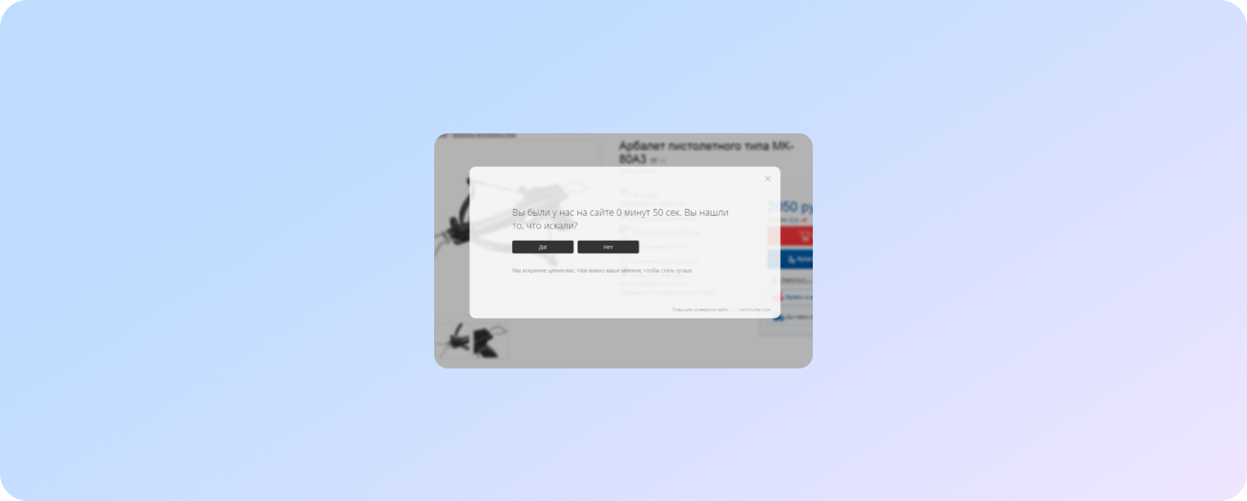
Tell me honestly, does this pop-up annoy you?
Uninformative and rude
If you forgot to tell about what you offer useful for contacts. If you forgot to tell us what you offer for contacts, then do it right now. Fix your pop-up!
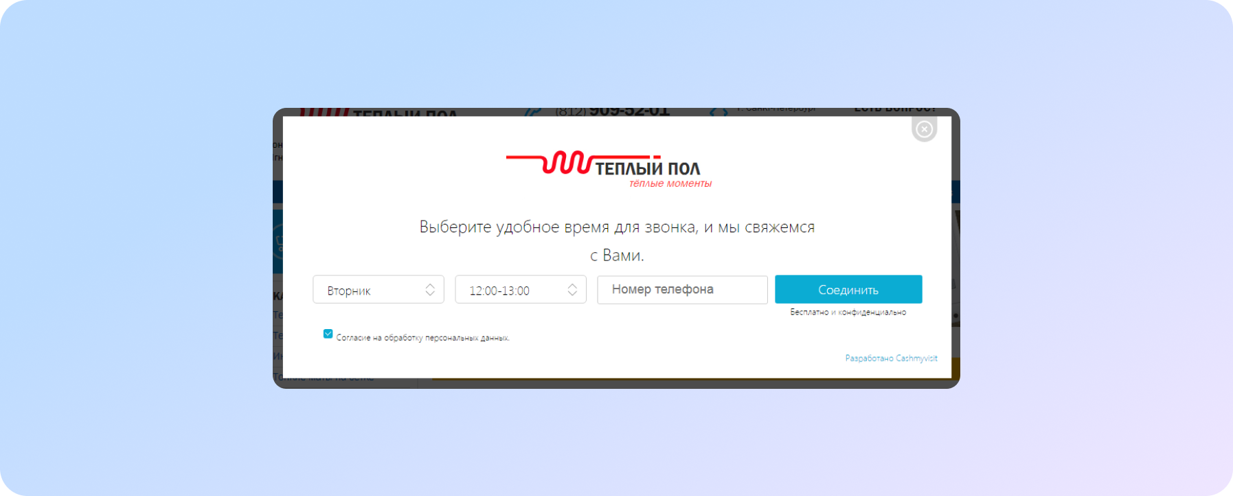
Let's think about this: wouldn't this pop-up offer for a free consultation strengthen it?
You also do not understand WHY they are calling to leave an application?
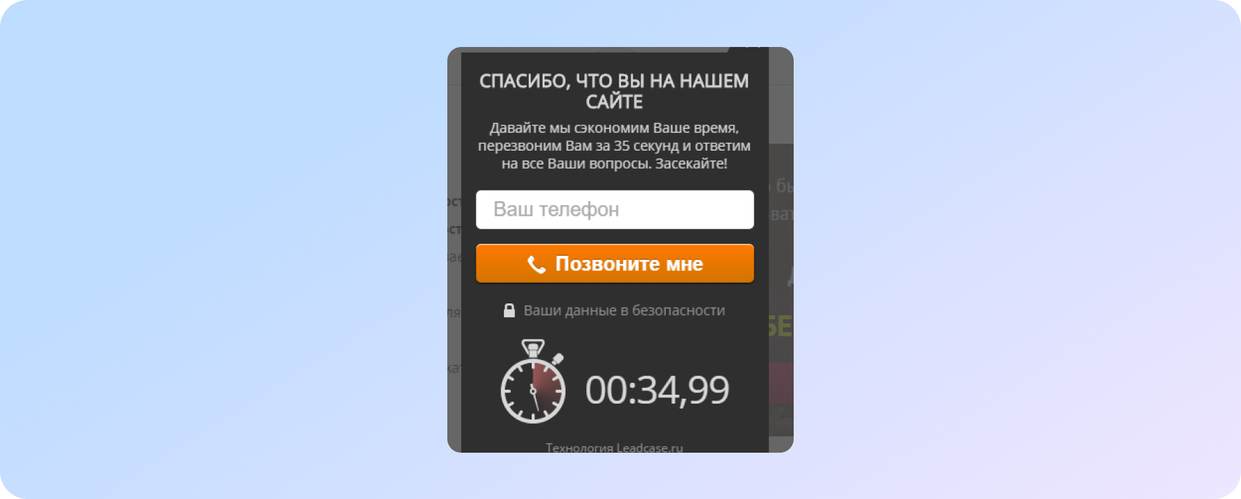
The pop-up pops up 5 seconds after you land on a legal services site. And it scares.
Sounds like "We're hopelessly bad, so just take our money"
Good, thoughtful pop-ups always contain an offer that might be of interest to potential customers. Contact is usually left only when they see something really useful.
Test texts, forms, the time the window appears on the site. Experiment with design. But never impose or force you to take a targeted action.
This is a great pop-up
For more pop-up ideas that will increase your site's conversions, check out our closed mailing list "Developing a Successful Website". Subscribe right now!
We care about improving your sales :)


