No magic - just our painstaking joint work on the site
Commercial website: how to create a successful e-commerce website for business in 2020
There is a beautiful and modern site, but there are no sales. Why? The question is sick, especially for company owners. Because, having spent money on an exclusive website design, they are waiting to get success right now - just to have time to sort out orders. Unfortunately, everything is arranged differently in the modern world, and it is unlikely that it will be possible to get away from the need to follow the latest IT field news (and even more so to “close” the issue with the site for a year or two).
There are at least several reasons: the Internet industry is developing so fast that by the time you finish reading this sentence, some bearded Google programmer will already be writing down a new tool that opens up new opportunities for network users. And if your competitors are more knowledgeable and faster, then potential customers will pass you by without you even knowing about it.
So, for example, in April of this year, Yandex launched the Yandex.Dialogues chat platform, which allowed users to ask a site manager a question directly from the search results without going to the site itself:
This makes the competition in SERPs more obvious: the user is already relying not only on “credible” first positions in SERPs and enticing snippets.
|
SEO Dictionary |
|
Snippet - a small text under the site title in the search results 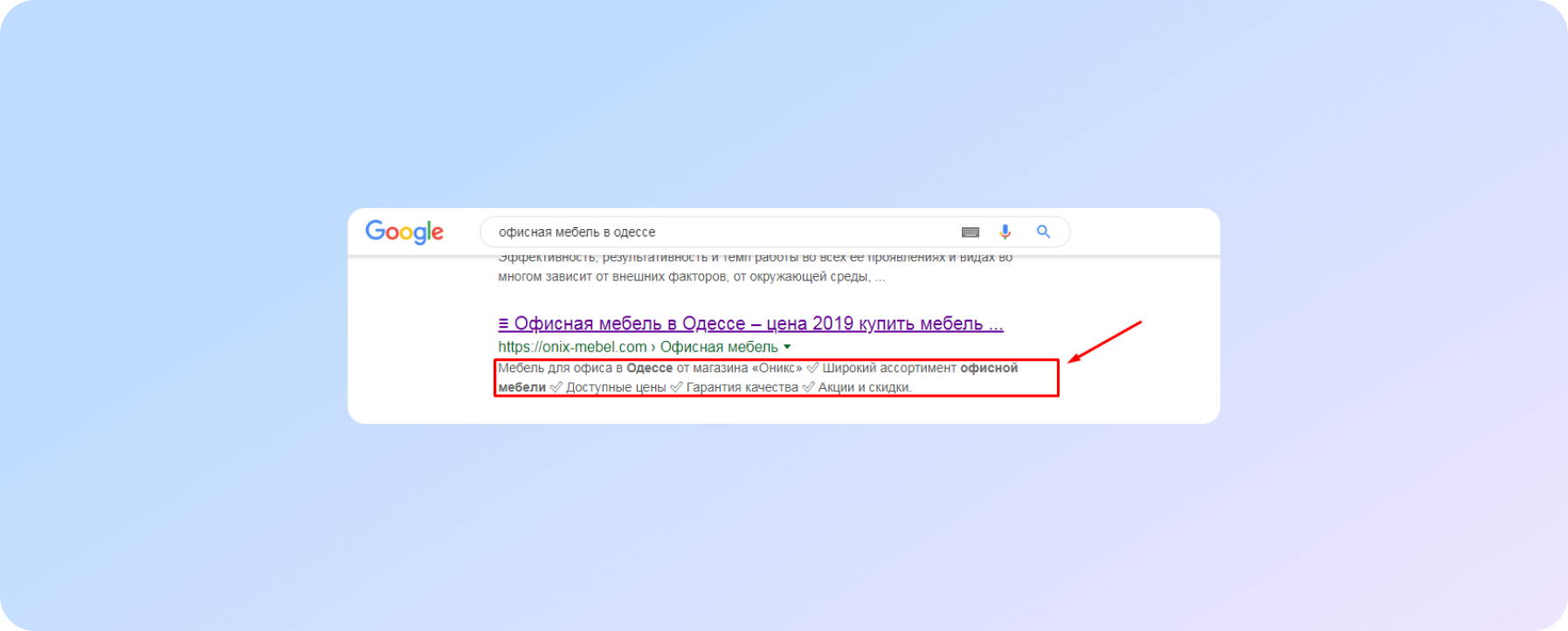 |
With the help of a chat, a company representative can influence the decision of a potential buyer and bring him to his site, even if this site is not included in the coveted top three.
Below - more about both new and familiar, but still relevant functions and elements of the site, which really increase the number of hits and sales.
What functionality is needed for a commercial site that receives applications via the Internet?
Target action buttons
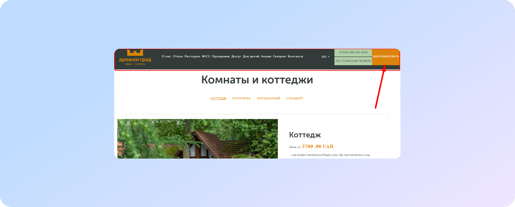
“Buy”, “Order”, “Book” should not only BE on the site, but also look highly visible, no matter where the user is on the page.
Placing options
- in the main menu of the site, the panel of which remains pinned when the page is scrolled:
- in additional blocks placed between page elements;
- in the side menu on the internal pages of the site.
Possibility to buy or order a service ONLINE
This is important, because if the buyer has the opportunity to purchase a product “in two clicks” directly on the site, then he will choose this option. Because it's faster, more convenient, and you can do it at any time of the day:
Therefore, this item can be ignored if you are absolutely sure that your product is exclusive, and you basically cannot have competitors!
If there is no 100% guarantee of this, then it is better that the site still has:
- shopping cart (if it is an online store);
- online booking form (if it is a hotel);
- an appointment form (if it is the site of a company providing services).
Full information about the product/service and PRICES
The irresistible urge of business owners to limit themselves to the unsubscribe “check the cost” or “the price is calculated individually” on the site is disastrous for sales. As well as the absolutely non-informative “all products are in the catalog”, but you can get this catalog by sending your email address ... Well, almost “a needle in an egg, an egg in a duck, a duck ...”. Yes, and it still exists. So these directories lie alone, they take up space on the hosting to be downloaded once a year.
Internet opportunities that have spoiled the modern user have long demanded from sites a new format for presenting material on the page - on the principle of a landing page. This is when the site provides complete information about the product: description, price, photo, video ... Up to the terms of packaging and delivery of this particular product.
If you don't do it, your competitors will.
UX design
The trouble of creative leaders is the desire to make the site "not like everyone else." The desire is understandable and natural, but often harmful when it comes to a selling site, and not a presenting one.
SEO Dictionary
UX (User Experience) - in the context of IT and talking about sites, this is all the experience that the user gets when interacting with the site.
Creating a site, it is important to remember that user experience must be POSITIVE if the site has to be selling. Therefore, it is worth considering the following.
Block Predictability
The site should be convenient and understandable, and the location of the main buttons and blocks should be logical and predictable.
Yes, this is an advanced director's nightmare. But! By following the terms of this paragraph, you will increase hits number from the site without fear that the user will break his head in search of the necessary information or button. And behavioral factors (the duration of the user's stay on the site) will improve. This means that your position in the search will be strengthened.
Easy to read fonts
Font type matters: in pursuit of originality, the user often suffers later. And so does the site owner when traffic drops and the bounce rate rises.
SEO Dictionary
Bounces - the number of users who left the site within the first 15-30 seconds without viewing a single page.
And this is serious, because the number of bounces is a serious reason for search engines to classify your site as uninteresting and of little use. And that means you can't bring it to the top. All for the benefit of the user, of course!
Therefore, it is better to choose from proven and less pretentious:
- Proxima Nova,
- Helvetica, Museo,
- Futura,
- Brandon Grotesque,
- Arial,
- Times New Roman,
- Courier New,
- Helvetica,
- Times,
- Courier,
- Verdana,
- Georgia,
- Gibson,
- Gotham,
- Classic Grotesque,
- Montserrat
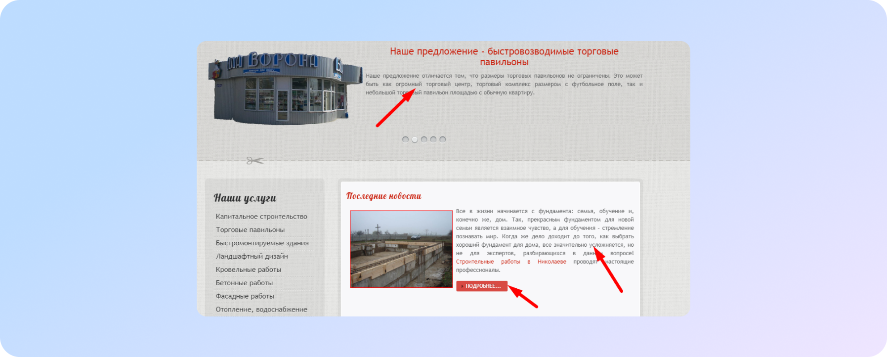
Font size is also important. It should be at least size 14 for comfortable reading. Better than size 16. In the example below - size 13, and this is very small, as you can see. If you see :)
If you are not sorry to give a potential client to competitors, show humanity and pity the eyes of those of your regular customers who, of necessity, will look for something on your site ...
| USEFUL |
|
Site with a large catalog of free fonts, including Cyrillic P.S. Here is a handy program (also free) that allows you to determine the font on the site or photo with one click (including indicating the font size, color, writing style, thickness). |
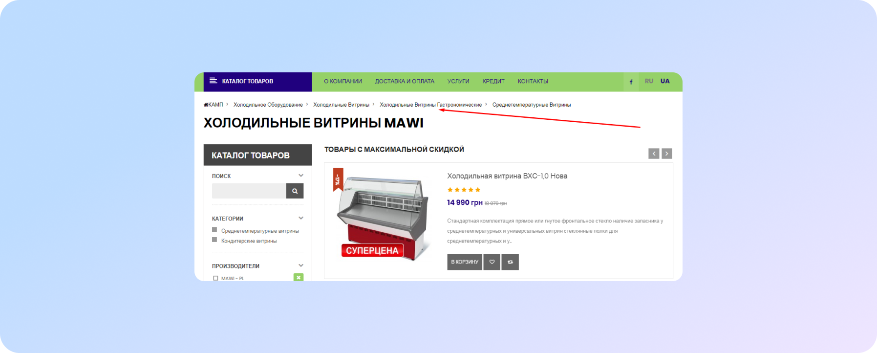
"Breadcrumbs"
The presence of this element on the site will be a plus both for users (it allows you to quickly return from the internal pages of the site to previous subsections and sections), and for SEO promotion.
Block "Similar products" / "Other rooms"
The presence of this element on the site will be a plus both for users (it allows you to quickly return from the internal pages of the site to previous subsections and sections), and for SEO promotion.
Block "Similar products" / "Other rooms"
The presence of blocks with additional information increases the chances that the user, if he does not buy something in excess of what was planned, will at least stay on the site, which means he will add points to the site when the robots crawl the next search engines.
Section "Blog / Articles"
- This block has the goal, much like the previous one, to keep the user on the site longer. But there are additional "bonuses":
- the regular appearance of new pages on the site is positively perceived by search engines;
- due to these pages, the “weight” of the site grows (this is especially important if your competitors have more pages on their sites);
- if the articles are really useful, they can bring additional guests to the site (the question is whether this audience will become at least potential customers, but this is a separate topic for discussion);
- again, if the texts are worthwhile, readers will share links to them with other users, as well as publish on their pages in social networks, and this is another advantage over competitors in search engine results.
Safety Certificate
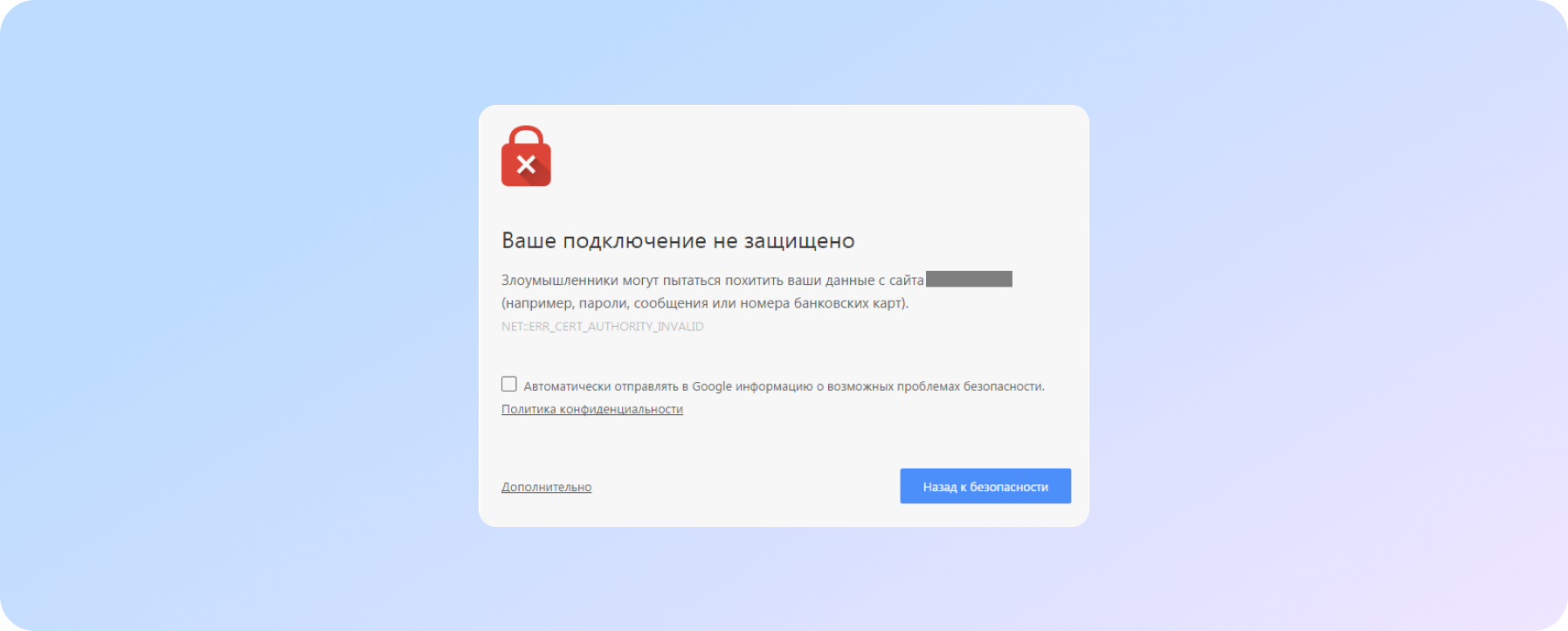
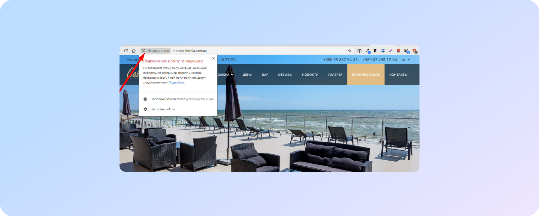
Few ordinary users and site owners understand why it is needed at all ... Until one day, when they go to their Internet resource, they find this picture:
Believe me, the number of real users (who could become customers) who did not get to your site because of this "evil beast" will sadden you. But that is not all. The absolutely real risk of hacking the site or leaking user information (contact information from feedback forms or logins / passwords when entering your personal account) is added to the troubles.
Online stores that accept card payments should install certificates by default, and customers should pay attention to whether the site uses a secure connection protocol. If not, then leaving your data on such a site (and even more so bank card data!) Is definitely not worth it.
In addition, the presence of a certificate on the site is one of the ranking factors in search engines, which was openly stated by Google back in 2014.
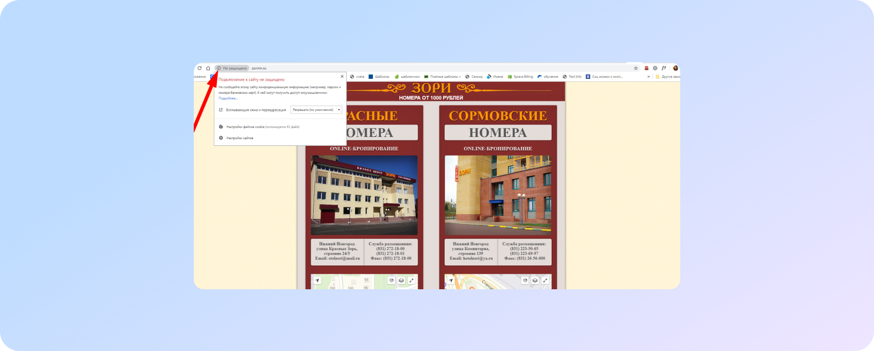
Finding out if a security certificate is installed on a site is easy - this information is located in the upper left corner of the browser, in the line with the site name:
Online chat
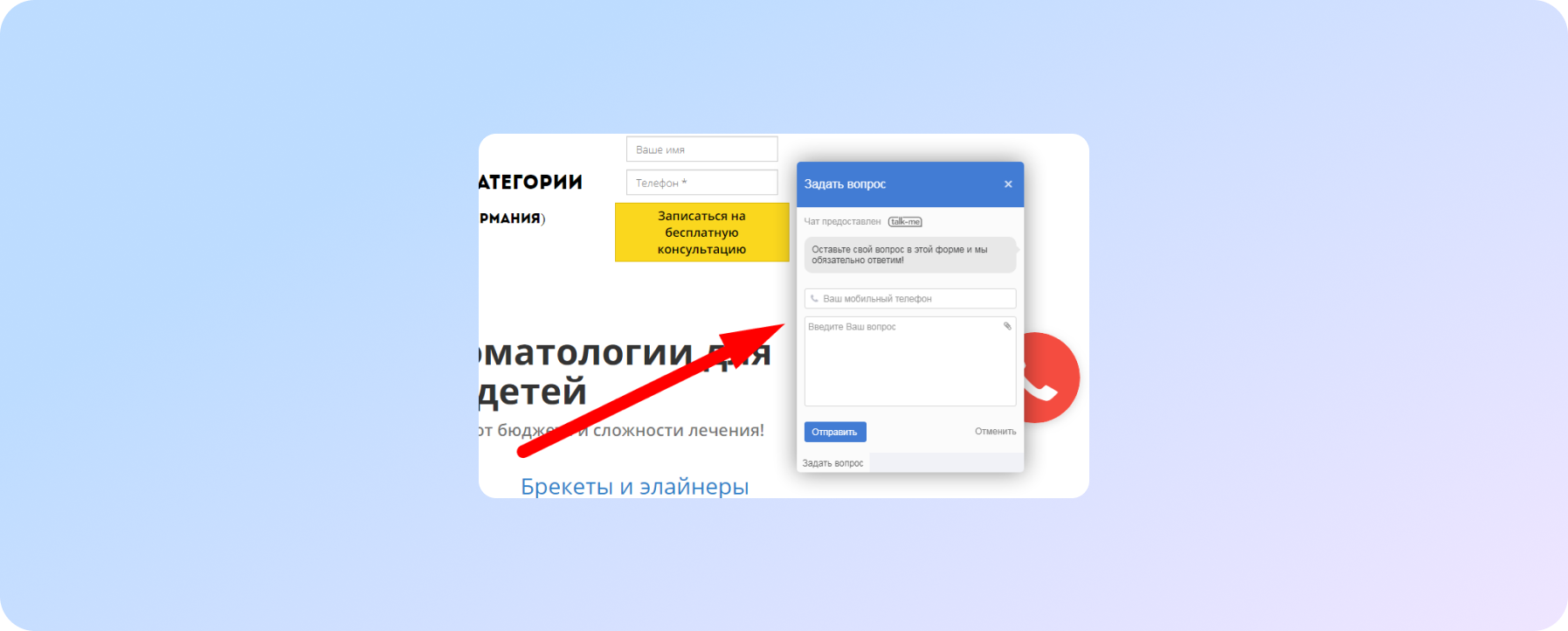
The ability to get an instant answer to a question about a product or service directly on the site is quite an ordinary function, which is not used by all companies. And if they are used, it is often not as it should be.
The main mistake is to connect ONLINE chat so that it works ... offline! This is from the “buy an annual gym membership and go there twice” series. A rhetorical question arises: “Who did get worse from this, except for your wallet and your health?”
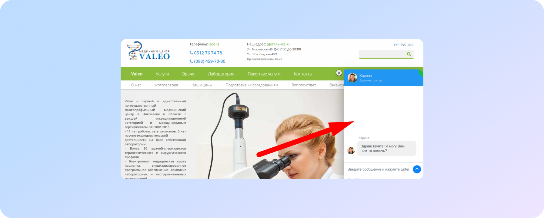
And it’s a completely different matter when the user is literally “greeted” on the site:
The last trend in this direction, which is mentioned at the beginning of the article, is chats in Yandex search results. Moreover, the new service allows you to display a chat (not any, however, but a chat from jivosite.ru) not only in organic search results, but also in a Yandex.Direct advertisement. This allows you to intercept customers even BEFORE they visit your site:
Call-tracking
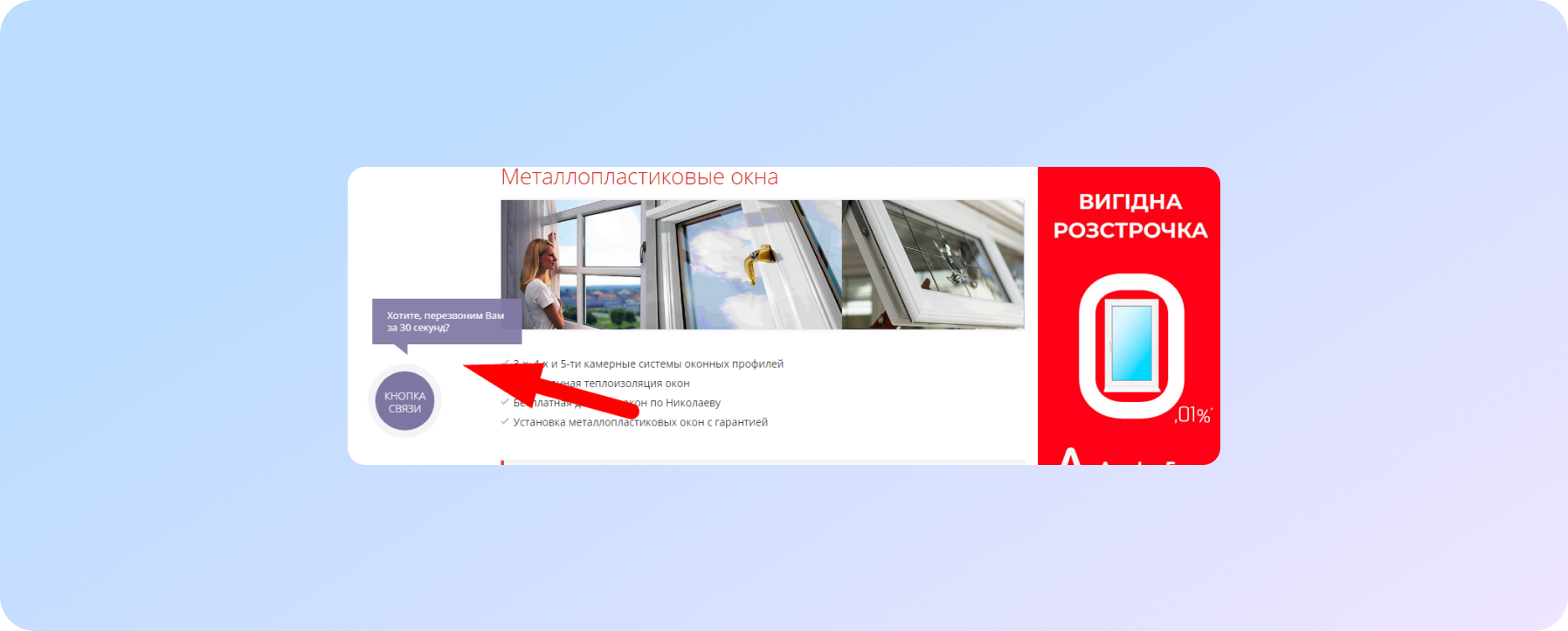
"Once upon a time, in a galaxy far, far away" sites used a feedback form for users to leave requests for a call. Today, this is archaic for obvious reasons: if earlier the user was called back within 1-3 minutes (this is at best: if the site owner updates the mail literally every minute), now with the capabilities of the “call back” function, the figure cannot even withstand 60 seconds no competition:
Therefore, if your site still has a “Request a call” button with a form for sending the buyer’s number to your mail, most likely it has long been covered with centuries-old Internet dust, and you have not received requests from it since the reign of pagers.
Adaptive version of the site
Back in 2015-2016. Google, followed by Yandex, openly stated that another factor by which sites will be evaluated will be their "mobile suitability." Fair enough, given that the number of mobile users is growing every year and averages about half of all site visits (in some cases, mobile visits reach two-thirds of all traffic).;
Here is a screenshot of the analytics of one of the sites promoted by our company (tourism - hotel):
As you can see, in January-August last year, 39.6% of the total number of all visitors came to the site from mobile devices. This year, over the same period, their number increased by 10% and amounted to 50.8%.
And in 2018, Google completely turned the SEO world upside down. More precisely - from desktop to mobile. It is the adaptive version of the site that is now the main one for Google.
This means that if you have made a cool site that you proudly show to partners on your monitor, this does not guarantee that if you open the same site from your phone, everything will work: the text will be readable, the layout will remain in place, there is no horizontal scrolling, photos are not stretched, and from the menu you can easily get to the desired page. And if so, then it is likely that your site has already been ousted from the issuance for “mobile unsuitability”.
Yandex.Map with a card from Yandex.Directory
Having this block provides several benefits:
- buyers/guests just need to click on the map to find out about the location of your company and build a route;
- this is the easiest access to the company card, including reviews. The more reviews your business has, the more likely it is that a search engine will recommend you to other users.
P.S. If your company does not have such a card, we recommend that you create it in Yandex and Google.
Website loading speed
This is an important factor for both search engines and users in general. As in the case of the callback function, modern users spoiled by attention are no longer ready to wait. Simply because they almost always have a choice that search engines take care of.
Therefore, if you go to the site and after a few seconds nothing appears on the screen, then the first reaction will be to press the "Back" button. The consequences are not just “minus one sale”, but also a decrease in positions in the issue.
Social network
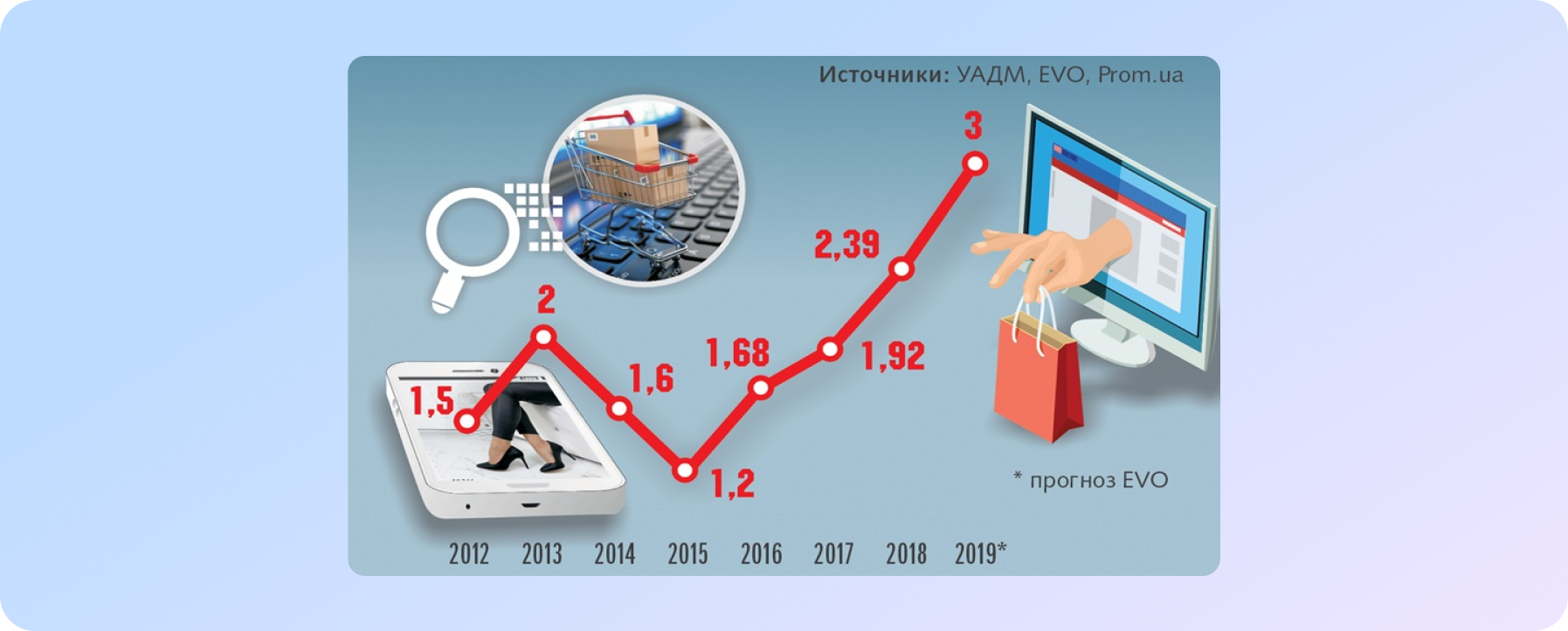
Social networks' role is growing inexorably in Internet marketing, and today they are the main source of sales for many companies. Therefore, to exclude this channel means to deprive yourself of a significant proportion of potential buyers. And in combination with SEO, it can become a powerful argument even in the most competitive niche.
As a rule, the audience from social networks is more loyal: these are people who are either familiar with your product or have clearly learned more about it than the same users in search engines, and at the same time become interested.
In addition, having a live company account inspires user confidence and promotes brand recognition.
The experience of our company daily shows that all of the above works. The introduction of even a part of these items increases conversions or, at least, indicators of behavioral factors. Selling all sites and high-quality traffic! :)
We have prepared a checklist for you! Check if everything is fine with your site.
We care about improving your sales :)


