SEO Services
No magic - just our painstaking joint work on the site


No magic - just our painstaking joint work on the site
No magic - just our painstaking joint work on the site
Sharing the most useful advices about marketing!
No magic - just our painstaking joint work on the site

Many business owners have faced a situation where advertising is on, funds are debited from the account, and there are still as many calls as there were before the launch...
Contractors will claim that this is an “unsuccessful site”, developers, in turn, that “site is okay, go look at the advertising settings”... and today we will tell you what you, as a customer, can check yourself before looking for someone to blame.
When a new project comes to our PPC agency for sales from the site, we first of all look at the site through the eyes of the user. And it is desirable that these were the “eyes” not of an advanced user, but, conditionally, of your neighbour grandma. If your neighbour grandma finds the site convenient and easy to understand, then the project has passed the test.
Let's go through our list together and hopefully this will help you get an outside perspective on your site:
How do these channels work, which you have and which you don’t not, but perhaps would like to add.
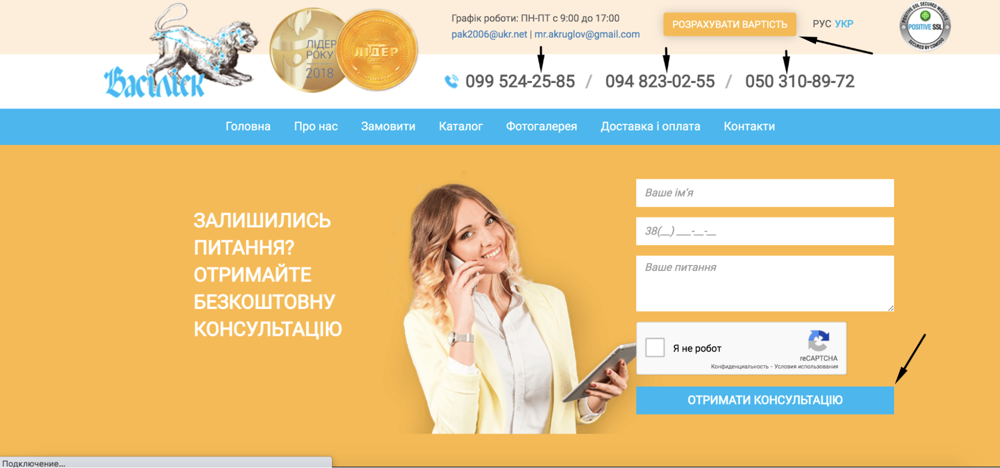
For example, if your site has four phone numbers in the header (top) of the site and six on the Contact Us page, be sure to call all of them to check:
We don’t know where exactly it will be convenient for the user to click on the phone number - in the header or footer (the lowest part of the site), or on which page he will be at the moment when he wants to dial you - on the final product page or on the “Contacts” page... because 
ALL numbers must be working! Non-working phone numbers must be hidden/removed/replaced with working ones BEFORE advertising campaigns begin!
The same applies to feedback forms. Below is a quick checklist of things to look out for when testing order forms before launching ads:
Depending on the type of activity and the purpose of the page (for example, whether it is a page with a description of the service or the final page of the product, or the main page of the site), the requirements for its operation, interface, and content will differ. But there are things that are always relevant:
We wrote more here about how the convenience of your site for the user can affect sales.
Let's imagine that you prepared the site and landing pages according to this list, correctly built the structure, checked the display of content and the correctness of the feedback forms, but nothing changed and you still don’t see the requests from advertising campaigns...
1. Inconsistency of the selected search phrases with our topic
Make sure that all the queries in your campaign are relevant to your activity and clean up the negative keywords as much as possible. This way you can exclude non-targeted users before they even see the ad, i.e. simply put, don't show it to them. Negative keywords include a term or phrase that describes a service you don't provide or a feature that doesn't match your product.
Let's look at an example of a popular tourist topic. You have a hotel in the suburbs of Odessa. But it’s by the sea. You take the group of queries “rest in Odessa”, because your hotel provides recreation services in Odessa. And you rightly think that this is exactly your target request.
Problem: someone is looking for a hotel in the historical center of the city and type "rest in Odessa", while someone else is looking for a sanatorium with treatment and also uses the query "rest in Odessa". Accordingly, for all these groups of requests, our advertising campaign will have refusals and the budget will be spent nowhere.
Solution. Take the maximum number of low- and medium-frequency queries that will EXACTLY reflect the theme and characteristics of your hotel.
Advice. Every few days after the ad launch, return to your personal account and review the search phrases that users come for. You will see that some of the queries are clearly not yours, and thus you will add to the list of negative keywords with each such check. By regularly cleaning out key phrases for ad impressions, you will not only save your advertising budget, but also bring only an interested audience to the site. And this, in turn, will reduce bounces and increase visits from the site.
2. Search query mismatch with the landing page
It is very important that the user gets exactly to the page that displays the answer to his question. For example, dentistry shows ads for the query "wisdom tooth extraction", but leads the ad to the main page. Question: How long does it take for a user to find information on tooth extraction on your website? An even more important question: will he search at all?.. Not a given.
Therefore, make sure that advertising for a service leads to a page with a description of this service; advertising of a certain category of goods leads to a page with a list of the assortment of this particular product, and not to the main page or any other page.
3. Inconsistency between the geography of ad impressions and the geography of service provided by the company
Also one of the common, albeit obvious mistakes 
For example, a window production and installation company operates only in the city of Kharkiv. And advertising is set up so that ads are shown throughout the Kharkiv region. As a result, we will either simply get a bounce, or the user will write, but will receive in response a very high cost of delivering goods to his city, thus another bounce.
If your company provides services throughout Ukraine, look things up: perhaps for some regions it is worth increasing the rates for display (in such cases, you need to create a separate advertising campaign). For example, a company producing and selling agricultural machinery is ready to ship its products throughout the country. But the agricultural regions in Ukraine are Kherson, Khmelnytsky and Kyiv regions. It is logical that these regions need more ad impressions, since both demand and competition will be higher here.
4. Discrepancy between the time of ad impressions and the time at which managers can process requests
For example, let's say your ads are set to run from 7 am to 11 pm, seven days a week. But the working hours of your employees, when they can answer calls, are from 10 am to 7 pm. On Saturdays and Sundays, the company has a day off, so calls are also not accepted.
What will happen in the end? Calls from users who call in the morning before 10 am or after 7 pm on weekdays, or at any time on weekends, will remain unanswered. Applications received late in the evening might be processed on the next day, in the best case, or after the weekend... This way you can lose a huge number of orders.5. Low attractiveness of ads and their low information content
It's like in the proverb where they judge by cover... Consider that your ad is the very “cover” that determines whether the user will pass by, or be interested in your advertisement and go to the site.
The most common mistake when compiling an ad is the lack of specifics. Empty phrases like “write, call” do not attract attention and do not increase the likelihood that a person will consider your advantages over competitors in them 
Before you start writing an advertisement, write down all the strengths of your company, the services you provide, or the products you sell. Divide them into more and less important. List the first, most important, in the announcement, the second - in the clarifications.
To draw even more attention to your ad, include sitelinks. This is also convenient for the user, especially if you display the address and phone number there.
After you run impressions, see how the ad looks against the other ad units. If you've read three ads and yours doesn't catch your eye, then you need to take a step back and redo it.
And instead of conclusions - a few valuable recommendations:
Another great article to deepen your knowledge is How to Increase Google Ads Conversions
What type of advertising suits your needs?
And here is the most detailed information about what contextual advertising is and answers to the most common questions of our customers.
We care about improving your sales :)