Contact us:

Let’s discuss how to promote your website.

Send

How to increase website conversion: 15 effective tricks

31.10.2019
2026
  1. Website loading speed
  2. Clear and user-friendly site structure
  3. Adaptive design
  4. Commercial pages
  5. Reviews
  6. Prices
  7. Product preview
  8. Online chat
  9. Search
  10. Sorting
  11. Filters
  12. Blocks "And also ..."
  13. Order form
  14. Map
  15. Content

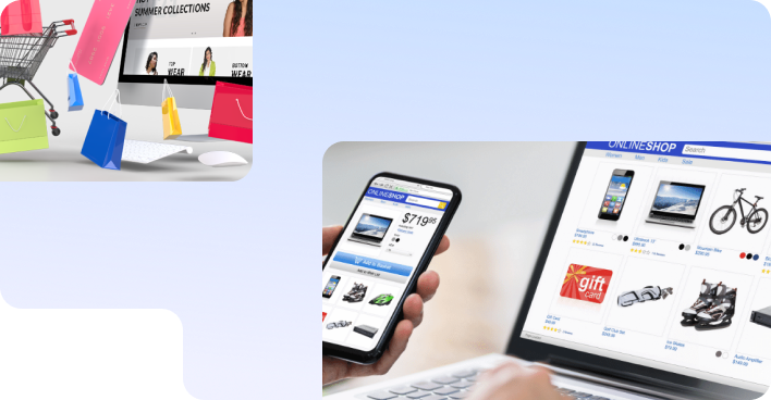
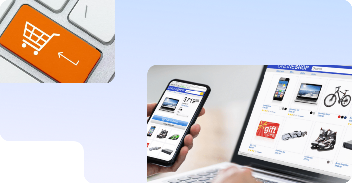
Nowadays we have a wonderful era of consumption. We shop every day and increasingly shop online. From water to household appliances, from food to real estate, from kitchen utensils to cars, everything is available online. The number of proposals that haunt us everywhere, every minute of life, rolls over. But the more offers, the more we are demanding for the service. Remember, when you are entering a cafe or restaurant, you evaluate everything: whether the waiter is friendly enough, what menu, whether the interior is beautiful. And if something is wrong, then you leave. Or, even if you tasted the local cuisine once, you will not recommend this place to anyone.

With websites everything is exactly the same as in life. Therefore, the most common question from customers of Sprava: “How to increase website conversion and sales?”

When you think about creating a site for business, you should switch on the most severe critic, constantly putting yourself in the place of the user. Only in this case will it be possible to create such an atmosphere on the site when it is unrealistic to leave without a purchase. The period when it was enough to place a product photo, a minimal description and a phone number is in the past.

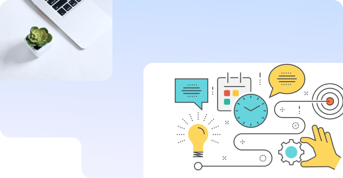
In our work, we strive to ensure that each page of the site that the user visits looks like a separate landing page. What does it mean:

  • high-quality content that 100% meets the user's request;
  • convenient navigation;
  • an unobtrusive push to make a conversion.

Below we will consider a list of blocks that must unconditionally be on the pages of your site. These are not recommendations, not innovations. This is what has already become the basis of the selling platform. Do you want to turn your site into a conversion site? Read the article to the end.

What is conversion and why is its growth a joy for business?

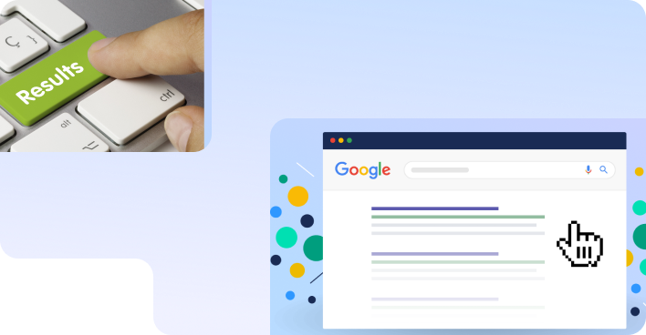
First, let's understand what a conversion is. Every businessman who is interested in the success of his project must understand how many users visit his site every day.

If 100 people visited the web resource. 10 of them completed an action (they called, sent a form, wrote to the chat, subscribed to the newsletter), which means the conversion of your site is 10%.

Is it easy? Yes, and even very!

BUT it is important to remember that calls, appeals and subscriptions are not always converted into real orders. This is already a question for the work of the sales department. So how can you increase website conversions? To answer this question, I have prepared a whole checklist.

Website checklist to increase its conversion

So how do you increase website conversions? To answer this question, we have prepared a checklist.

 
  1. Website loading speed

    “Really we should start from such basics?” - you ask. Exactly! In order to evaluate your site, you first need to get to it. Values to watch out for:

    • First byte - a value indicating the delay time in data transfer between the browser and the server. It is this value that is an indicator of the speed of content generation. The recommended value is no more than 1 second.
    • Start render - the start time of rendering the page, during which the user begins to see the first elements on the site. The recommended value is no more than 2 seconds.
     
  2. Clear and user-friendly site structureу

    So, we got to the site, and it loaded quickly. For the user to stay on it, the website must be comfortable. Perhaps you are actually a rare user who likes to go through entire quests on sites to find and open the menu. But in fact, it’s a bad idea to do that. All the main elements of the site should be located in places familiar to the user:
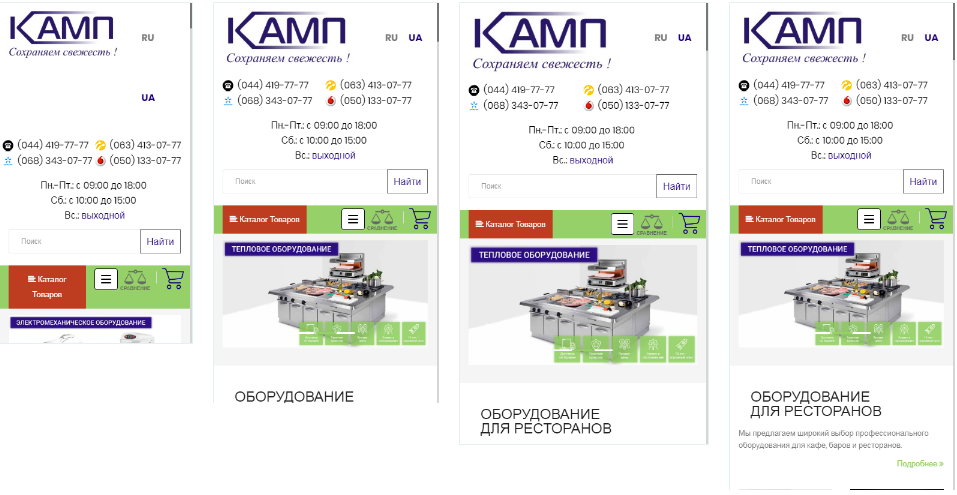
    • The company logo is on the left, at the top on all pages except the main one, it is active and leads to the main one.
    • Contacts are at the top right.
    • Phone numbers are active, especially for the mobile version.
    • Header, footer and main menu are the same for all pages of the site.
    an example of a good presentation of information in the header
     
  3. Adaptive design

    The share of traffic from mobile devices is currently 50% of the total traffic, if not all 70%. If you still do not have an adaptive website, then we strongly recommend changing the situation.

    • It is necessary to keep all html tags H1-H6.
    • The adaptive version should present all the content that is on the PC version, without cutting off the functionality, texts, and other elements of the site.
    • You should not use methods to hide text like "Read More" buttons, etc., if there is no the same in the PC version.
    • Do not change the order of SEO content output on the adaptive version, that is, H1 should be above the products, texts should be after them in the categories.
    • Mobile adaptive version is a version of the site on the same domain, no mobile subdomains or subfolders.
    • Do not duplicate the same content in the code for PC and mobile versions. Simply put, the code should not contain two menus, two text blocks, two product blocks, etc.
    adaptive display of the site on different screens
     
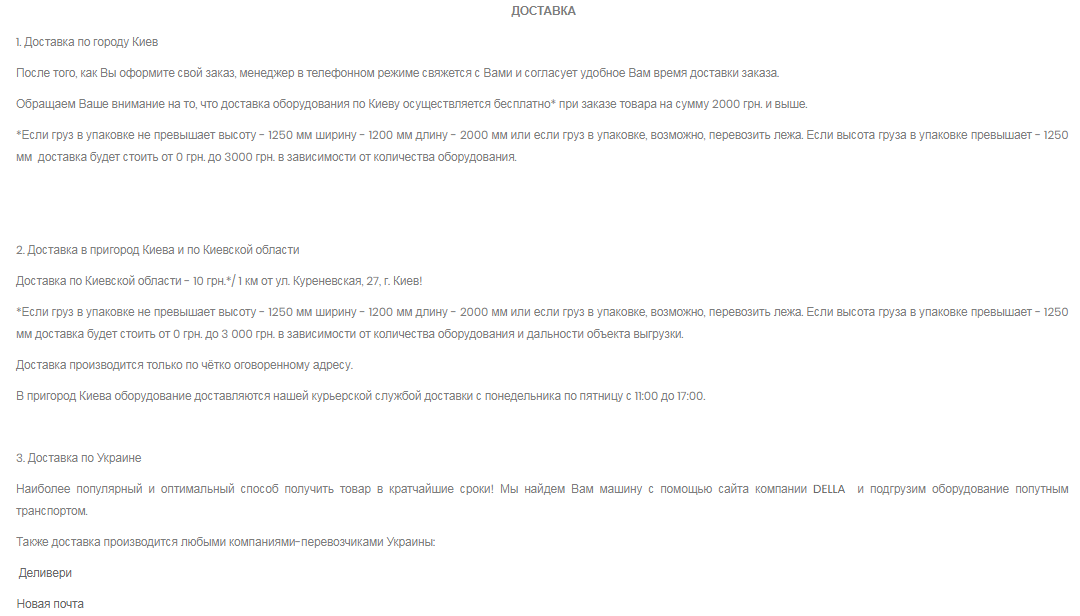
  4. Page of payment and delivery, as well as service, warranty and return conditions

    There is the point which many site owners stubbornly ignore. When buying on the Internet, the user does not see the face of the seller and his trustworthy eyes, so he will trust you for other reasons. And these pages are just such a reason. Try to give all the information, state it strict and clearly:

    • On the payment page all possible methods of payment should be listed: cash, bank transfer, payment to the courier upon delivery.
    • On the delivery page all possible points of issue should be indicated. The delivery service by courier (if any), detailed information about the delivery time and cost should be specified. And a feedback form should be put there - let the user ask his question, if he has one, and not leave to look for an answer on another site.
    • Describe your service - is it paid or free, under what conditions can you use it, and in what time frame.
    • Warranty - whether it is provided, how much is valid, in what cases.
    • Return conditions - tell in detail on what grounds the user can return the goods, add excerpts from generally accepted documents.
    example of providing information on the page Payment and delivery
     
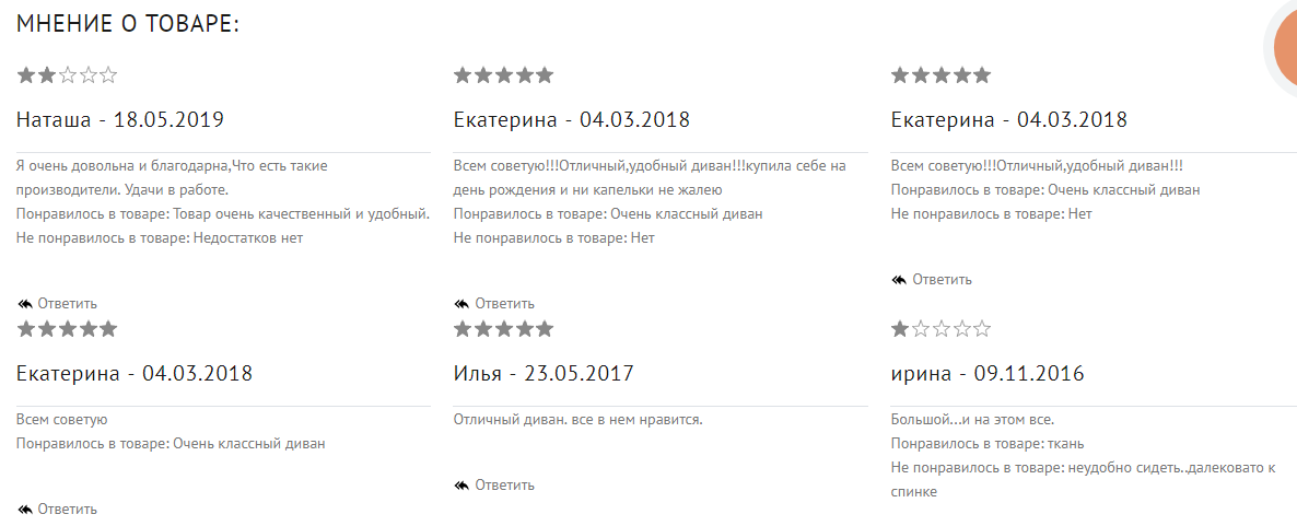
  5. Reviews. Reviews. Once again reviews

    “Oh, competitors will start writing there,” we often hear. This problem is easily solved by moderating reviews before they are published on the site, but reviews should be:

    • not only about the company, but also about a specific product/service;
    • with the possibility of rating stars;
    • the site should have a separate page with reviews, a block with reviews should be displayed on all pages, as well as on the final page of the product.
    site reviews
     
  6. Prices

    Yes, and in the 21st century, we are still talking about the importance of adding prices to a site because we are still facing the fact that it is not being done. Do you have the cost tied to the dollar / euro? Then provide a module that will convert the price into the required currency based on the exchange rate. Do you often change prices and each time correction takes a long time? Think about importing via file.

    It should be convenient not for you, but for your client, because it is he who increases your profit:

    • The price should be noticeable on the site (larger than the main text, highlighted in color).
    • Promotional items must show both the old and the new price, both on the product preview and on the final page.
    • If you still do not indicate the price, then tell the user why. For example: “the product is out of production”, “the product is out of stock” and a recommendation to check the price with the manager.
    example of pricing on the website of an online store
     
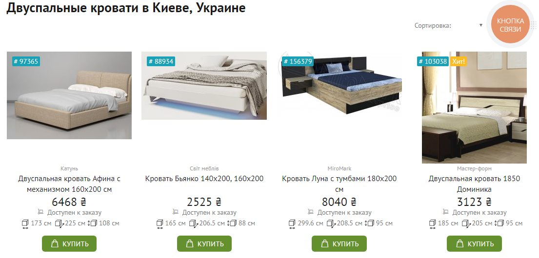
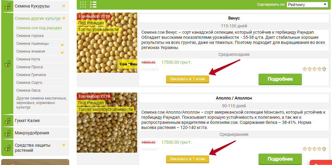
  7. Possibility to buy or order from product preview

    The product preview should include the following: photo, name, price (promotional and actual), action button. It’s often In online stores that in order to add a product to the basket, you must either register on the site or fill out some forms. But very often the user comes to the site with the desire to buy one product. It would be nice to provide for this the “Buy in 1 click” button, where all the user needs is to leave a phone number. Conversion will grow, we guarantee.

    button to order in one click on the site
     
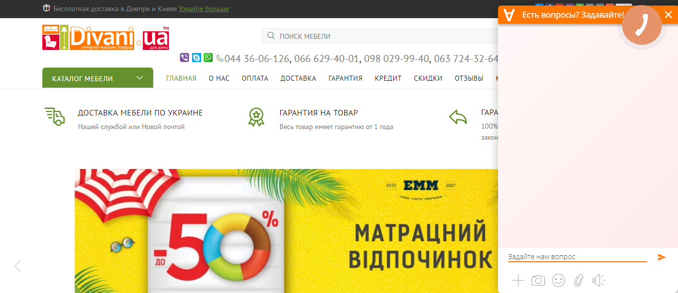
  8. Online chat where managers are really online

    The user comes to the site in search of a product, he has questions, he does not want to call, he does not want to send an order either (after all, he still doubts something) - the user will leave the site if you do not have an online chat.

    And if he can quickly get answers to questions, then he will like it, and it is likely that the order will be yours.

    online chat on site
     
  9. Search

    If you do not have 3 products, then you should provide a search. What is important to know about it:

    • Place the product search bar in the header.
    • It should be possible to filter search results (by price, alphabetically, by popularity).
    • If no matches were found for a query, don't give the user a page with a single line of text. Offer him something else, for example: “We did not find anything according to your request, but we can offer you other similar products” and below is a product catalog.
    implementation of the search for goods on the site

    An example where the search result is empty. Do not do this.
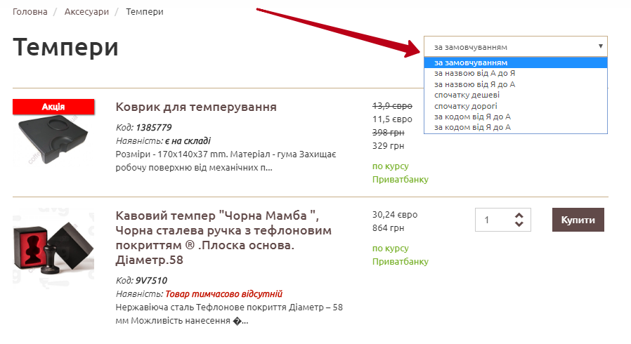
    Example of empty search result
     
  10. Sorting

    • ascending price,
    • descending price,
    • alphabetically,
    • by popularity.

    A small life hack: by default, let all products be displayed on the category pages according to the principle “from lower price to higher”. Items in the same category can have a big price difference - don't confuse the user by going too high. Show that you have a wide range.
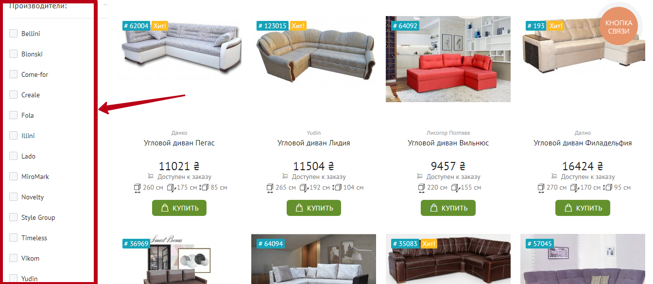
    Sorting the assortment of goods
     
  11. Filters

    The site should be able to filter products by price, manufacturer, main characteristics. And to make it as convenient as possible:

    • arrange all filter values in alphabetical order;
    • if these are numbers, then let them go in ascending order;
    • after selecting the filter value, let the products be sorted automatically, without the need to click on an additional button;
    • add the ability to collapse some filters. This is a trifle, but it makes your site convenient.
    sorting the assortment of goods
     
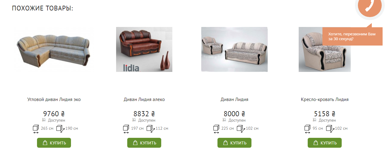
  12. Blocks "Similar products", "Frequently bought together", "Recently viewed":

    • Let these blocks be contained on all final product pages, and the “Recently viewed” block can also be displayed on category pages.
    • The "Similar Products" block can contain products of the same category with a certain price range.
    • The “Frequently bought together” block is an opportunity to push the user to buy more than one product. You have to think carefully which products to display in it.
    • The "Recently viewed" block should display those products that the user has already viewed, perhaps he will want to return to them again.
    Block Related Products
     
  13. Minimum fields to fill

    Sprava specialists know from experience that it is much more convenient for you to work when the user has left you all his contact information: from the name to the phone number of three next of kin for the case if the user will not be available. But we are talking about increasing conversion, which means we must be customer-oriented.

    • Leave only the most important fields: name, phone, possibly email, and a field where the user can leave an additional message.
    • 2 options are allowed: short form and expanded form, but leave the choice to the user.
    • If there are additional fields to fill out, explain to the user why you need this information. For example, "If you enter your address right away, it will significantly speed up the delivery time."
    • If there are still a lot of fields to fill in, then combine them into groups and give headings to each group.
    • If any fields are required, add a hint that they must be filled.
    • After clicking on the "Submit" button, you should not send an email with thanks, but you should definitely notify the user with the message "Thank you for your order/contact. Our manager will contact you within N hours/minutes.”
    Example of a form for ordering goods

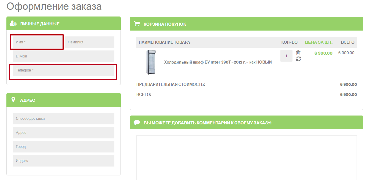
    * Required fields - two, all other fields are grouped, and each group has a title
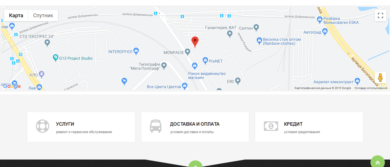
     
  14. Map

    Place a cross-cutting block with a map on all pages of the site, do not force the user to search the site for where your office is located. Don't have an office? Place a map with geotags of points of issue.

    organization mark on the map
     
  15. Diverse content

    Just text is no longer enough:

    • High-quality photo and video content entices the user and makes him order from you.
    • The block with advantages will tell him what you are better than your competitors in.
    • The block with the stages of placing an order will eliminate many questions.

8 Additional Conversion Tips:

Below is an important list that is not directly related to usability, but it will help you achieve higher conversions.

  1. Analyze the market and price competitiveness.
  2. Create a unique offer.
  3. Constantly monitor the list of the most popular pages of the site and check whether they have enough competent content.
  4. Work on your reputation - it's not only about reviews on the site, but also on independent sites. And remember that the negative does not need to be removed, you need to work with it.
  5. Install call tracking - track the number of calls, how many of them turn into orders, how many remain unanswered.
  6. Work with the sales department - an order on the site does not mean a real purchase. It only says that the person is ready for it, now it's up to your employees.
  7. Think over a loyalty system for your regular customers.
  8. Do you have leftover items? It's time to develop a promotional offer for them!

Do you think you've heard all this before? But what on the one hand seems like a trifle can significantly affect the conversion of your site and bring more profit. A website is not just a place to post information, it is a direct link between you and your customers. By striving to constantly improve it, you improve your relationship with customers, which means you work to grow your business. All sales!

Автор
Lenara Kozakova

project-manager

Get a special offer for your website!
We care about improving your sales :)
Свернуть карту
Показать карту