SEO Services
No magic - just our painstaking joint work on the site


No magic - just our painstaking joint work on the site
No magic - just our painstaking joint work on the site
Sharing the most useful advices about marketing!
No magic - just our painstaking joint work on the site

In this article, we will talk not only about the correct design of feedback forms, but also about increasing your sales. After all, this is the main reason why companies develop a website and delve into Internet marketing.
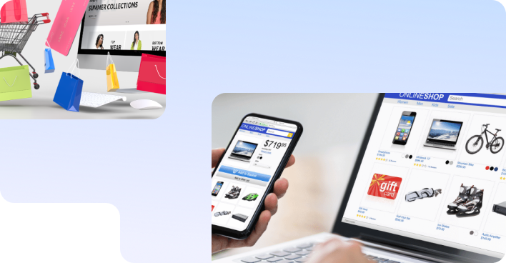
And now there is a website, but for some reason buyers are in no hurry to place orders with you ... You spend more and more money on advertising, hire and fire sales managers, meditate on financial reports, and so on in a circle. What happened?
Everything is very simple. Open your site. Has it been opened more than once, even this morning? Does anything work and nothing is broken? Fine. Let's now look at it through the eyes of your buyer.
So customer found you in organic (Google search results not marked with the “Advertise” label) or saw your advertisement anywhere on the Internet. He went to the site, saw prices, a cool delivery offer, and you convinced him that you are the best. He agrees to buy and proceeds to checkout, opens the cart and ... leaves the site. Why?

According to statistics, 80% of users close the site without placing an order, because the feedback form is very complicated and has a lot of extra fields.
Let's do it again: you change sales managers, implement CRM, analyze reports, but the main reason is different - you demand too much from the buyer. We live in a world where there is too much information and too little time, so no one wants to spend more than a minute placing an order. Therefore, let's look at the most direct sales channel from the site - the feedback form, and figure out what it should be in order to work effectively.
Buttons and interaction forms should be located in places that are obvious for the user. Usually this is the upper right corner in the header (top of the site) - place the “contact” button there, make it visible and watch how the conversion will increase.
Also, don't force the user to go back to the top every time to submit a ticket. Make sure that the header is fixed, and additional CTA buttons (“call to action” - calling to action: “Buy”, “Book”, “Order”, “Contact us”, “Leave a request”...) accompany the user through page scroll.
Sometimes, you do not need to increase the budget for advertising for increasing conversion by 30-60% - it is enough to work with the usability (ease of use) of the form.
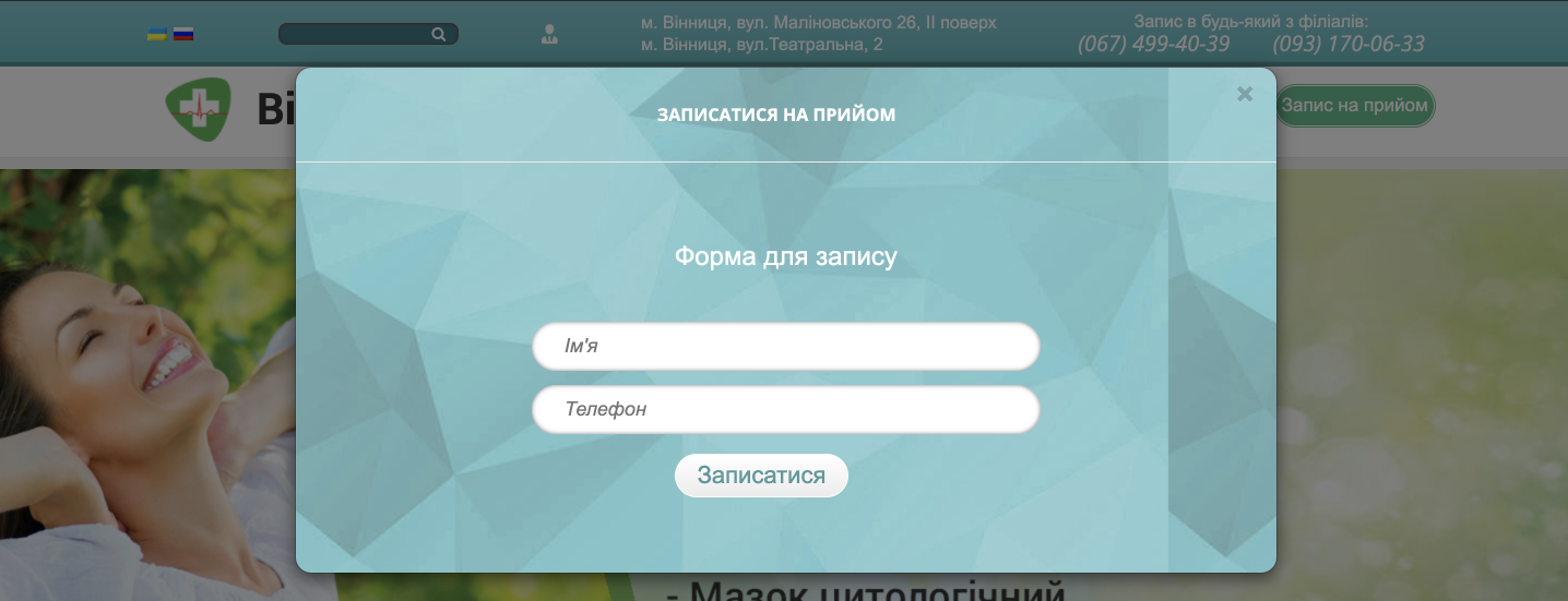
Leave 2-3 fields - do not force the buyer to enter a full resume to place an order with you.
Having a field for a name, phone number, and/or email address is more than enough for you to contact the person and do them a favor. If you are not a large marketplace (such as Rozetka, Prom, etc.), where there is no direct communication with the client to complete the order, then follow this rule. The result will surprise you.
Even if you have a large online store and to speed up the process it is important for you to know the address, full name, etc., still provide the user with several options: a detailed application form and the ability to buy “in 1 click”, indicating only the phone number.
Remember: not the user should simplify your life, but you should simplify it. And then the sales will not keep you waiting! 
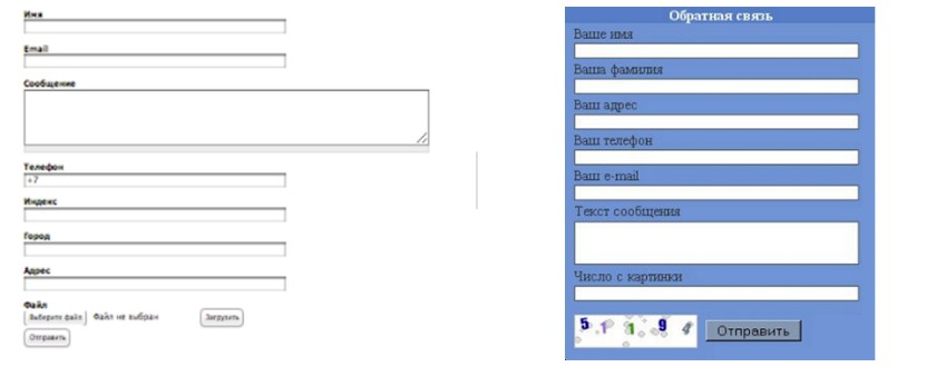
Example. Let's take a look at these three feedback forms . Which one would you rather complete?
The choice is obvious. The third form will require a minimum of time - what you need. And it also takes into account rule number 3. Here it is by the way
Playing “tag pictures with traffic lights” may be interesting for a child, but not at all interesting for your user who wants to order your product / service right now.
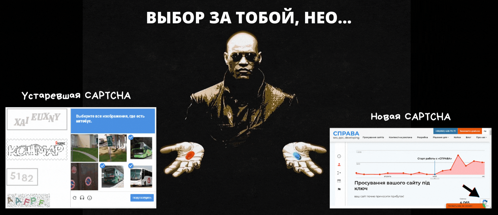
Of course, the captcha is set for a reason - it protects against spam. But keep in mind that you need to install its NEW version, otherwise, along with spam, you risk getting rid of applications too ...
And not because you will ruin your eyesight :) But because everyone has been looking at their phones for a long time. Start your form design with the ADAPTIVE version, the one displayed on smartphones. If you have problems with layout, buttons are not visible, or the form is not submitted from an iPhone, then we have bad news: high sales will remain a dream.
The “Submit” button on the feedback form is what separates the potential client from the application you received. Your potential buyer must know exactly whether his order has been accepted and what to expect next.
Therefore, it is desirable to explain what kind of form it is and what its sending will lead to. For example: “Submit the form and get a 10% discount on your first order”, “Submit a request and we will contact you within 10 minutes”.
And then ALWAYS make sure that:


Or better yet, send the user an automated message or an order completion email with a number!
Do not neglect the consent to data processing. The link to this document should be in the form for two reasons:
If you want to learn more about what documents should be posted on your company's website, taking into account its field of activity, so as not to violate the law, please contact us! 
But if you want to take care of your customers as much as possible and increase the number of hits, make sure that the checkbox is checked by default - this will reduce the user's time to fill out the form.
Once it was something new for everyone, but now it's just a must have! And if you still do not use this channel of communication with customers, then rather start. Online chat, when properly configured, combines everything that increases conversion:
We will talk about how the installation of online chat has affected the business of our customers, but for now...
Make a website for business and not work out the maximum possible feedback forms - how to open a store and forget to unlock the doors for customers :) Don't do it like that!
Those rules that we talked about above are quite simple, but exactly the same and effective! Everything has already been thought of for you - just take it and use it.
If you are not sure about the effectiveness of your current site or simply do not have time to delve into all the nuances, write to us. For many years of working with sites from various business areas (eCommerce, hotels, healthcare and others), we know exactly what is important to consider when developing and promoting, how to increase the number of orders with the same costs for Internet marketing ... Therefore, we are ready to audit your project and tell you why customers leave and how to hold them.
We care about improving your sales :)