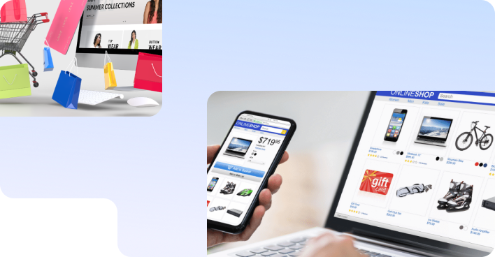
SEO Services
No magic - just our painstaking joint work on the site

No magic - just our painstaking joint work on the site
No magic - just our painstaking joint work on the site
Sharing the most useful advices about marketing!
No magic - just our painstaking joint work on the site

Site usability means "usefulness of use and the ability to be used." When they say “website usability”, it is primarily about the convenience and simplicity of the interface.
The entire path of the client on the site should be designed in such a way as to push him to make a conversion.
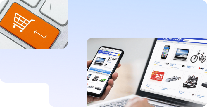
Conversion is an action on the site.
This can be not only an order for a product / service, but also other user interaction with you. He can order a call back, fill out a form on the site, register as a regular user, participate in the promotion, follow the link, subscribe to your newsletter.
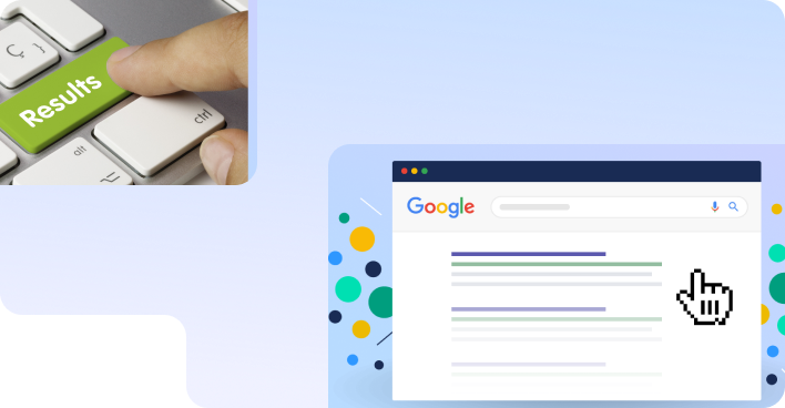
To identify these problems, you need to conduct a usability test, which is carried out with the help of typical representatives of the site's target audience or order an expert assessment of the site's usability from a specialist. You can incorporate the results of this usability audit into your sales strategy to drive more revenue from your site.
Let's share our experience in improving the usability of our clients' websites.
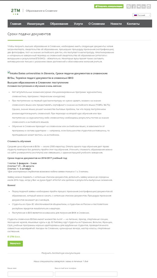
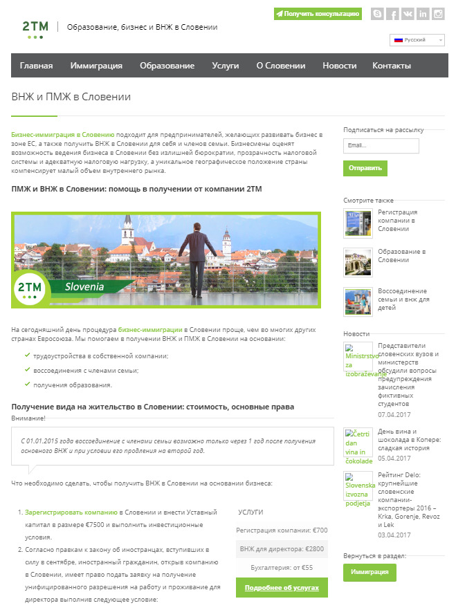
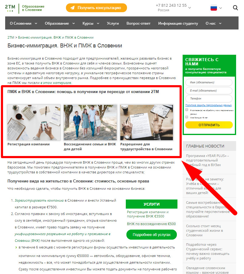
Dilution of textual information with graphics and an image, which makes the text easier to read. An example from the site on education in Slovenia for immigrants from the CIS countries - 2tm.si:
| BEFORE work: | AFTER work: |
 |
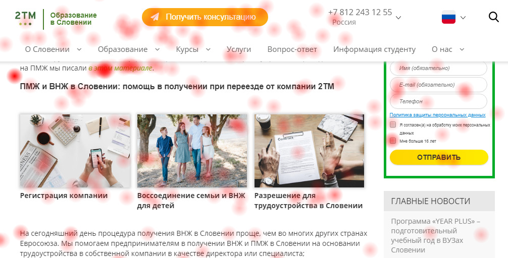 |
| Just text | The same information, diluted with figures and tables |
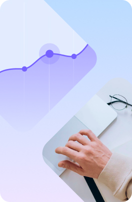
After the changes on the site, page traffic increased in 14 months:
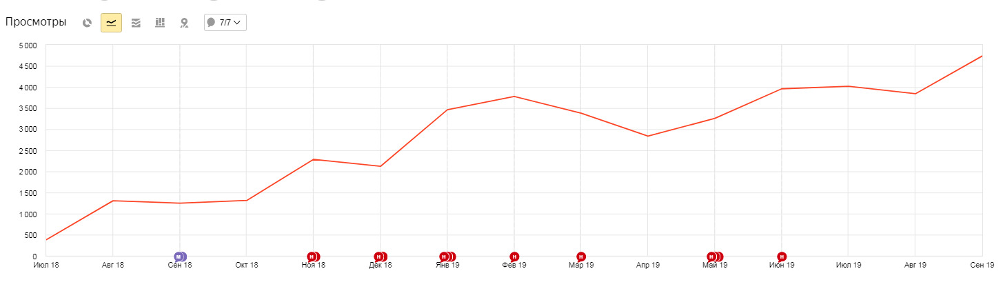
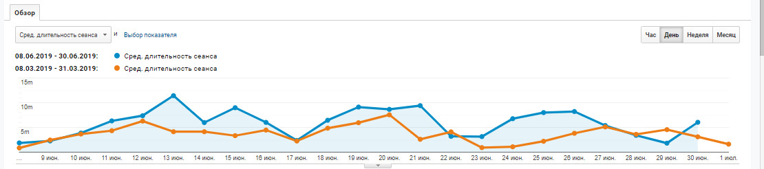
Thus, for two years of systematic work with the site and active feedback from the client, it was possible to increase the average amount of time spent by users on the site.
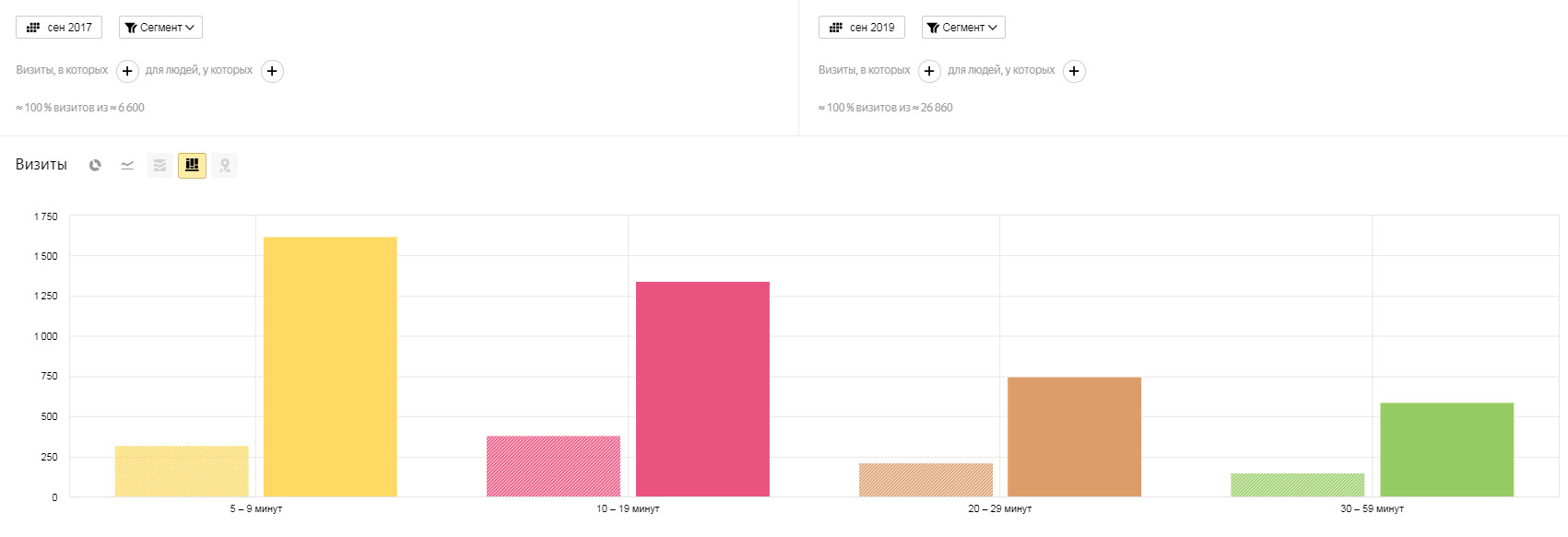
The screenshot shows that the groups of users who spend on the site from 5 minutes to an hour have grown by 3-5 times:
Adding blocks like “Buy with this product” / “Other products”, or “Services that may interest you” / “Other services” provides several advantages:
One more example. This is what the page looked like before the block was placed:
Then a block with transitions to other pages of the site was added:
As you can see from the click map, users actively use the added block - this can be seen from the color of the zones (those that are most often clicked are marked in red).
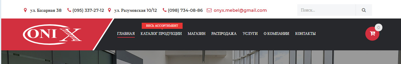
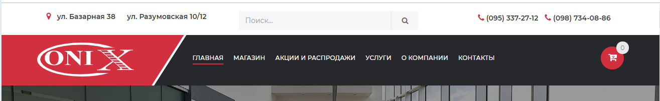
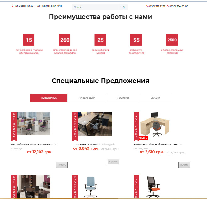
Using the example of the furniture online store Onix let's look at how the right usability solutions helped to reduce the bounce rate and increase the number of orders.
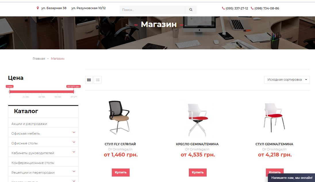
It became:
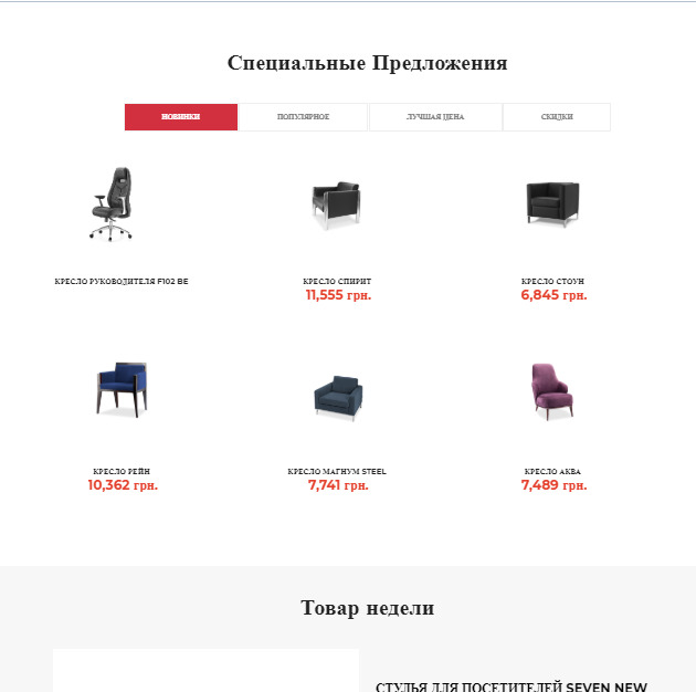
It became:

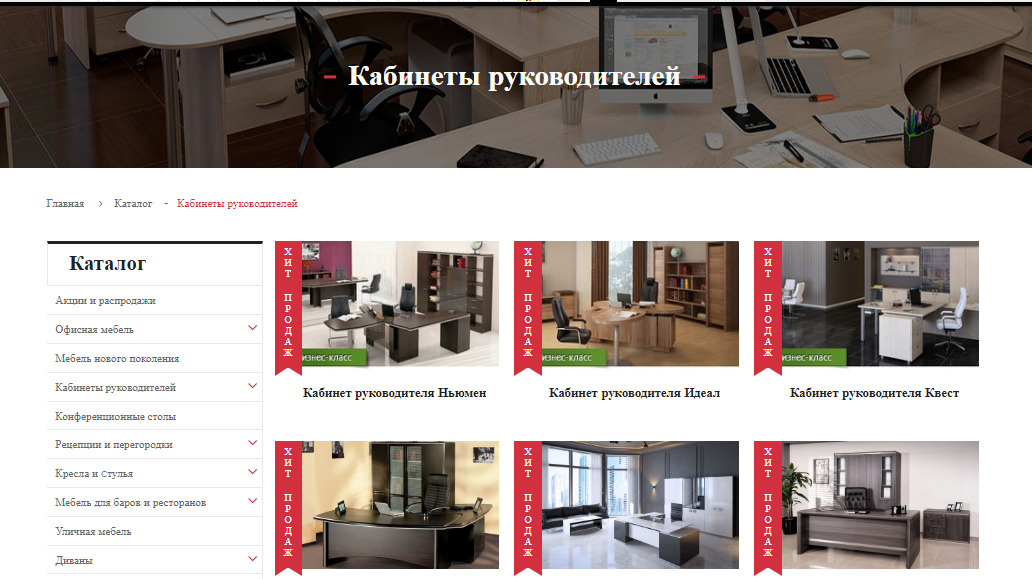
But the main enhancement of the site for the convenience of users was the unification of the sections Product Catalog and Shop. The point is that the customer is positioning itself as a large-scale online furniture store with an emphasis on office models. It is a direct supplier of furniture from manufacturing plants. Therefore, the Product Catalog presented all the furniture that is manufactured by manufacturing plants, and in the Shop section the furniture that is available at the moment.
These sections knocked down buyers, the bounce rate was obscenely high - 57.47%. Initially, in the Products Catalog section, prices for goods were not indicated, it was not possible to buy the goods you liked.
In the Shop section, the price was indicated, but there was not a single call to action, i.e. to buy it was a long way to go.
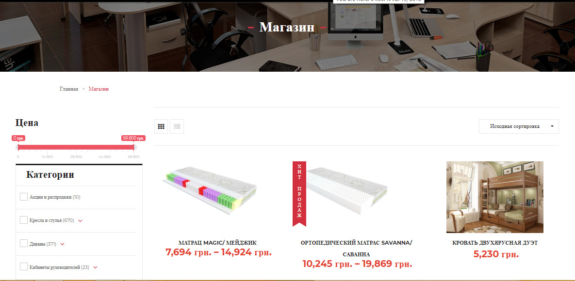
That's why SPRAVA specialists decided to combine these two sections into one - Shop.
The new section contained all the products that are currently in the store or that can be ordered in a short time.
For the new section, we worked out the correct divisions in the product catalog for the convenience of choosing the right product, focused on prices and added a call to action in the form of a Buy button, which helped reduce the bounce rate to 2%.
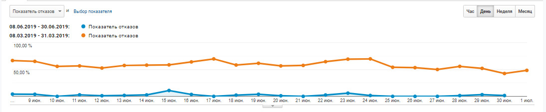
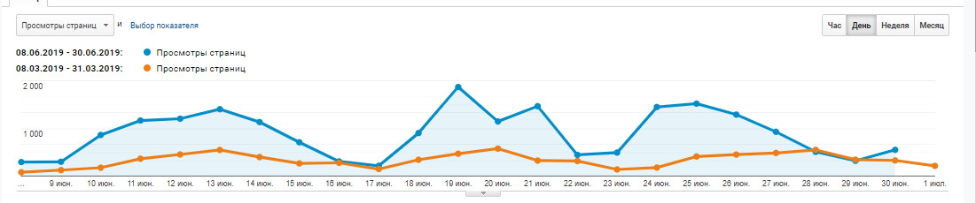
In general, if you compare the two periods “before” and “after improvements” using Google Analytics, you can see positive changes:
Do you want to check if everything is in order with the usability of the site? Then contact us!
Specialists of SPRAVA will check the client's path on your site and tell you how to improve the situation.
We care about improving your sales :)