SEO Services
No magic - just our painstaking joint work on the site


No magic - just our painstaking joint work on the site
No magic - just our painstaking joint work on the site
Sharing the most useful advices about marketing!
No magic - just our painstaking joint work on the site
 Hedonist Chicago
Developing an online store for the US market is a great opportunity to explore a niche in the overseas market by adding the experience and knowledge we have accumulated over the years of working in digital marketing.
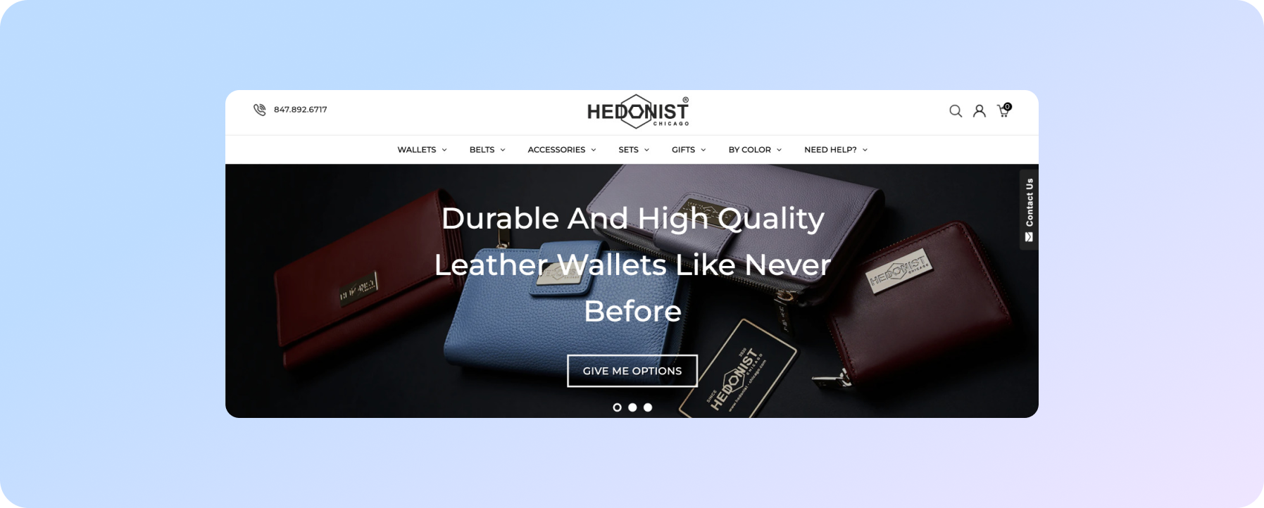
The distinguishing point of this project - we used Shopify platform for the website development
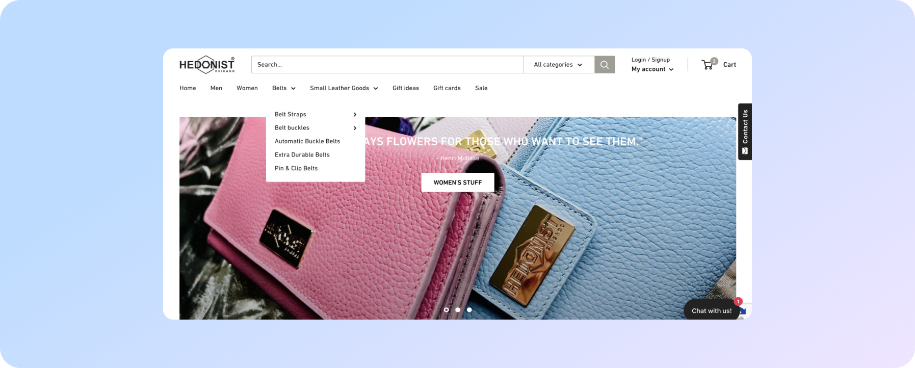
The customer wanted to start selling through the website. For this purpose, we have decided to use the following marketing tools - SEO, contextual advertising Google Ads, and targeting on Facebook / Instagram. Basically, we had a website developed by the customer himself and with an irrelevant design. But the biggest issue was the website’s unclear structure, which would not allow getting the maximum result from search engine optimization.
In any development, we are guided by the principle that each block on the site on any page should be useful to the site visitor. Talking about images, they should:
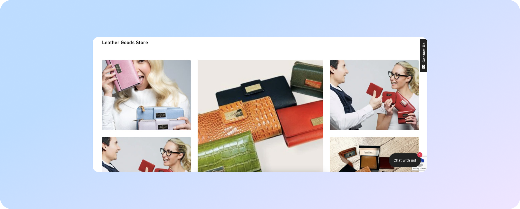
The customer sells genuine leather products of in-house production. The quality of each wallet, belt, and accessory is at the highest level, however, images on the website did not reflect this.
Here’s what we’ve done.

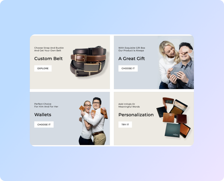
We focused on quality images as we’d been working on the website’s target audience at the very stage of the project discussion. It was important for us to understand who we should target in the visualization. A comic book site for teens and a site with genuine leather products for an adult audience can't look the same. We needed to place the right visual accents to improve brand positioning and immediately target the audience that was our potential customers.
We identified 4 points that set us apart from most competitors and designed them in separate blocks on the site.
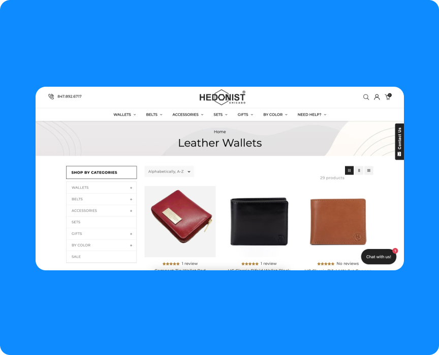
We’ve also adjusted important things that required improvements on the pages of categories.
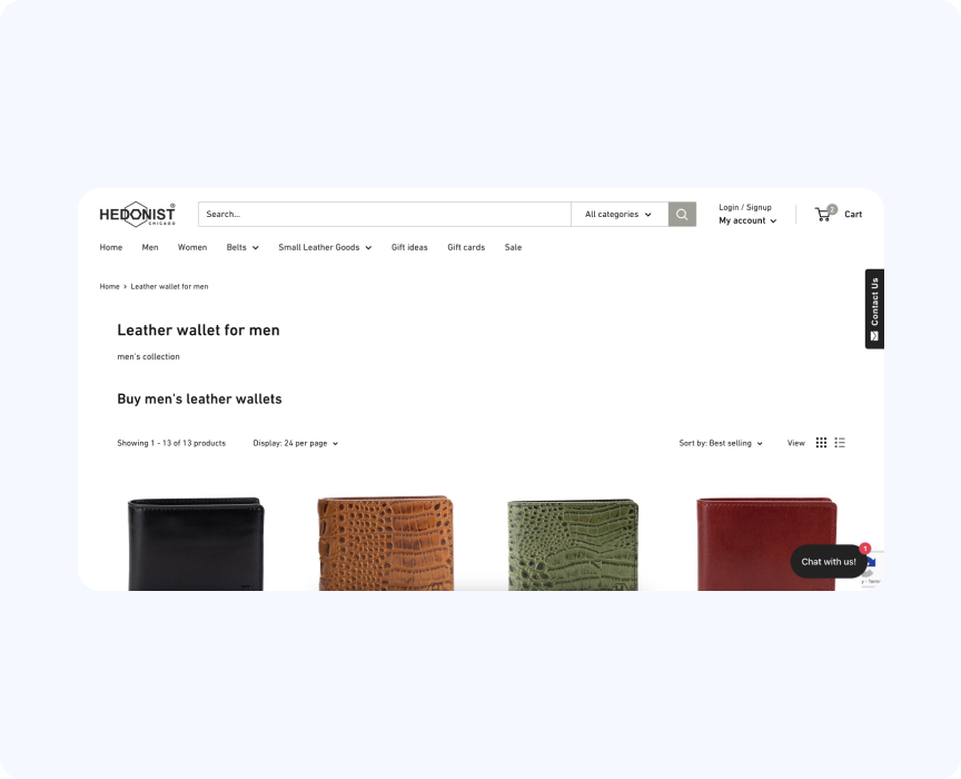
When hitting the category page, the user could not see the full size of even 1 line of products due to previous attempts to optimize and place two headings on top.
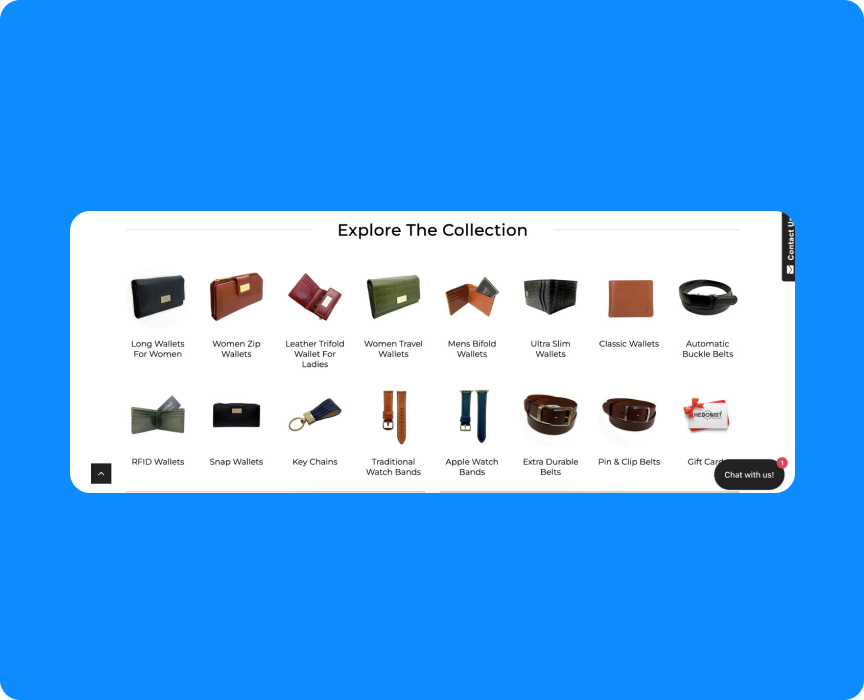
We've redesigned the structure of the category pages to allow the user to see the product range from the first screen and encourage them to scroll further.
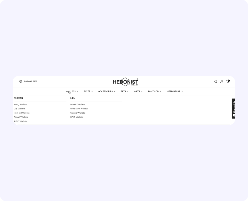
Filters have been added in the left sidebar so that the visitor could easily switch between categories, and choose products by characteristics.
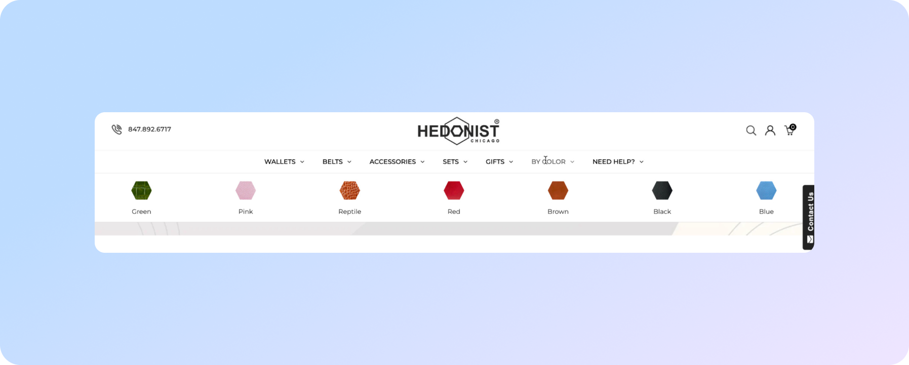
Separate categories by color were also added, which was important for further SEO promotion. It's just that the presence of filters did not allow us to create static URLs to optimize these pages.
That's why we created separate plantings by flowers and displayed them on the menu.
We continue to work on improving the visualization of the site because as we provide new photos, and get statistics of visits - we see what to improve, how to do it, and attract even more potential buyers.
We care about improving your sales :)