Appearance after redesign
The customer's old site did not meet the basic requirements of usability, that is, it was not user-friendly and did not contribute to keeping him on the site ... and even more so - to persuade him to make a purchase decision. Therefore, together with the customer, it was decided to update the site, to make it not only modern externally, understandable internally (for the work of managers), but also convenient for guests.
Below in the image on the left you see how the main page of the site looked on personal computers and laptops before cooperation with our company.
In addition, we have added those blocks and tools that have a good effect on sales: reviews from other buyers, a convenient and simple feedback form, licenses and certificates confirming the qualifications of the seller, logos of partner companies, a map with the location of the store and a company card on Google My Business (what advantages it gives, they wrote here), messengers were added so that it would be convenient for users to contact the manager through any of the popular methods, etc.
It is clearly seen from these analytics systems that the number of site visitors from mobile devices in April 2019 accounted for almost half of all traffic - 48%!
 In the table on the left (this is a screenshot from the Google Analytics account), this is the top line - Mobile. Accordingly, Desktop is the number of users from a PC, and Tablet is from tablets.
Therefore, the development of a new adaptive site development of a new adaptive site was critically important! In order not only to increase the number of visitors to the site, but also, at a minimum, to keep the existing 


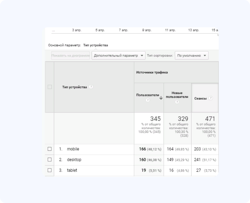
 In the table on the left (this is a screenshot from the Google Analytics account), this is the top line - Mobile. Accordingly, Desktop is the number of users from a PC, and Tablet is from tablets.
