SEO Services
No magic - just our painstaking joint work on the site


No magic - just our painstaking joint work on the site
No magic - just our painstaking joint work on the site
Sharing the most useful advices about marketing!
No magic - just our painstaking joint work on the site

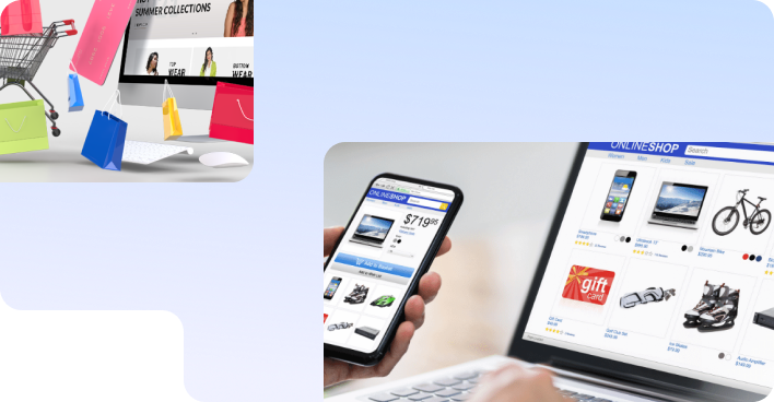
We often tell in our blog how we bring to the site a potential audience from scratch in a short period of time who are looking for this particular product or service (here for example, or in an article about pure SEO). But there are situations when users come to the site, and the numbers are quite impressive. And there are no sales.
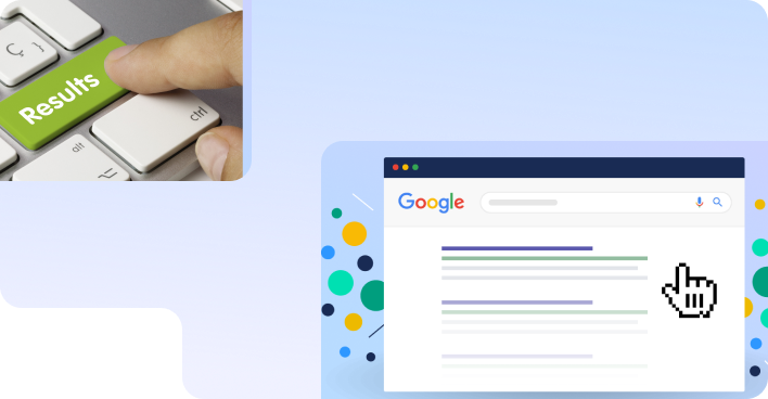
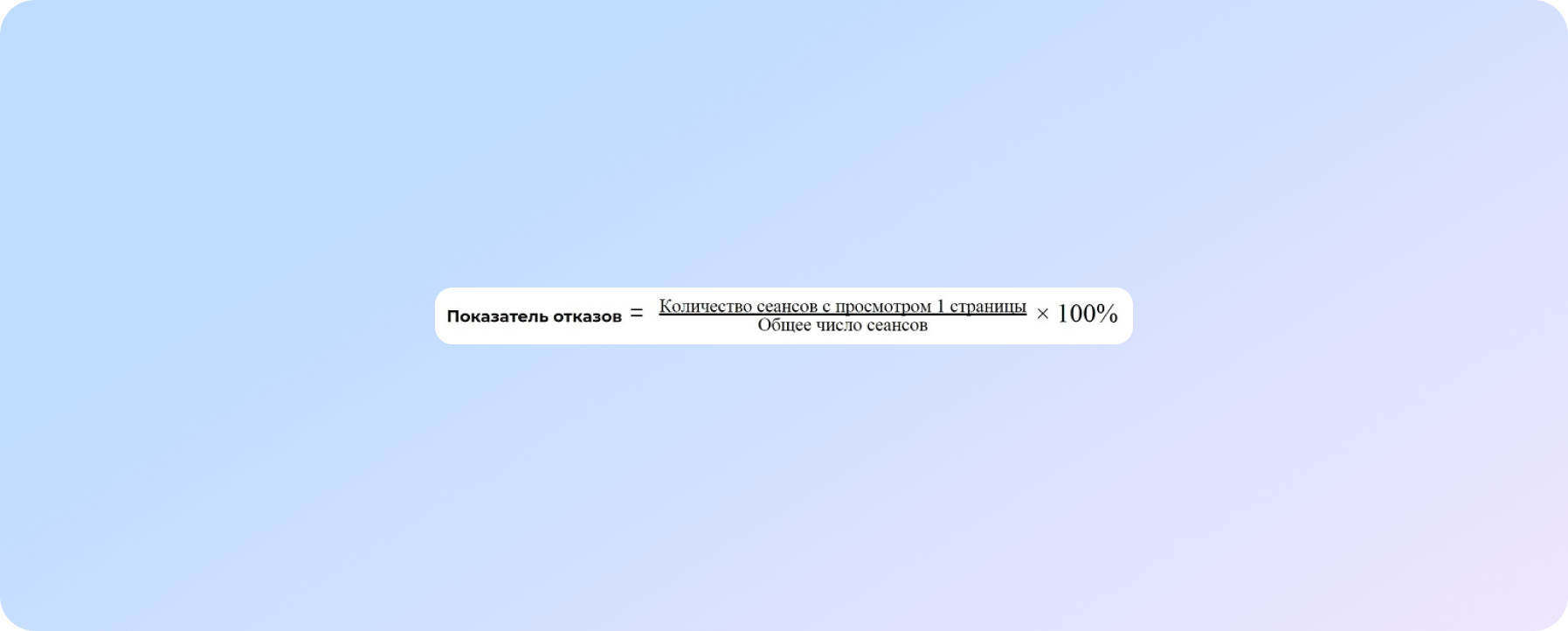
In the position reports, you can see that the site is growing in the search engine rankings. And attendance is good. In this case, the bounce rate from the site should alert you.
A bounce is a session with only 1 page view on your site.
(In Google Analytics, a session is considered a bounce in which only one request to the Google Analytics server was activated.)
If the user was on only one page of your site, did not interact with it - did not order, follow the link, click on the banner - and left, then most likely there is a problem with the interface on the site, due to which he did not find the necessary information.
When there are no sales, the bounce rate there is usually higher than average (the rate will be different for each niche), and zeros in conversions from month to month.
So it's time to read this article, urgently implement all the tips and increase the number of hits from the site, reduce the bounce rate and - ta-da! - turn a website visitor into a buyer of goods.
I will repeat for you the truth from Captain Evidence:
All basic and important information for the user should be placed in one first screen.
The visitor can simply under-scroll and miss something that could influence the purchase decision. Therefore, the easiest way is to put yourself in the place of the user and try to go all the way from the search engine to the checkout of the product.
For example, a user has found a site in a search engine that relates to the desired topic. What is important for him to see?
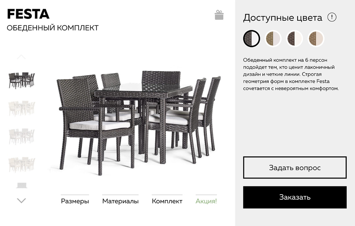
Of course, the product he is looking for. It is desirable to consider it from different angles, preferably in a video review. The visitor wants to study the description, see the cost of a product or service. View work schedule. And if you have any questions, choose a convenient channel of communication with the store.
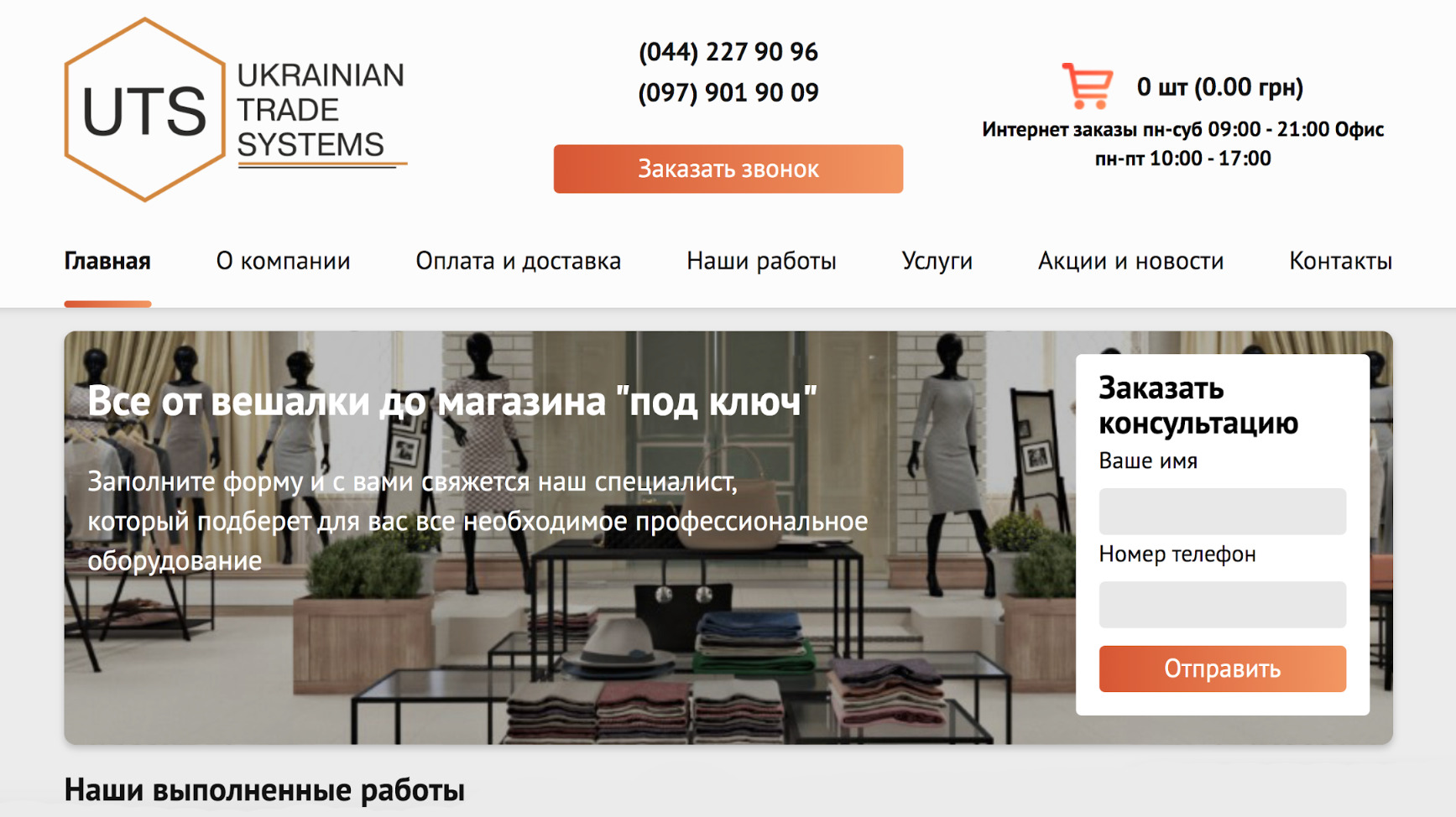
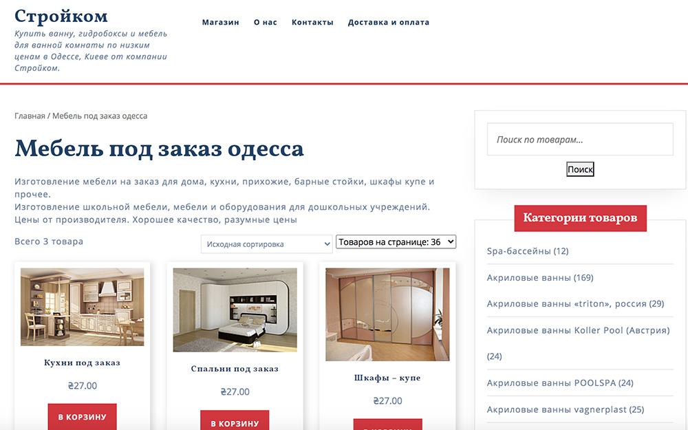
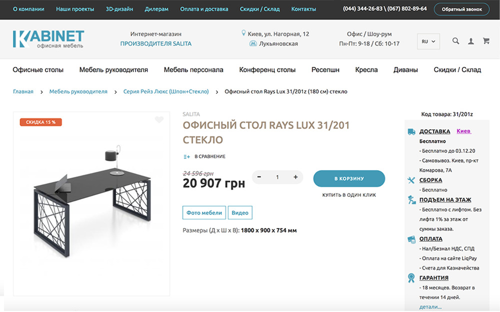
A good example: an online store of commercial equipment.
Everything is logical, understandable, excellent on mobile and desktop
What can be done?
Go all the way as if you are buying a product, fix at which stage visitors have difficulty with search, filling out the registration form, placing an order, paying online.
And if your site has everything, it’s convenient, apparently understandable ... but the number of bounces is still high? Let's try to find the reason for this behavior of users.
This is a very important point in the analysis of the main mistakes. No matter how detailed you describe the product on the page, no matter how loyal pricing policy you offer, if there is no identity on the site, it will be difficult for the user to trust such a brand, and most likely the user will make a decision in favor of a competitor.
We advise you not to use more than three colors on the site. The shades of the chosen color scheme should ideally be combined with the logo. Make the “call to action” buttons the same color, brighter than other elements on the site. As for the text, it is advisable to use no more than two fonts on the site:
How not to do it.
It often happens that the site has a lot of goods and services. Then the menu looks small and infinitely long. When opening a section, the user sees dozens of subsections, does not understand how and where to look for the desired product or service, despairs and leaves.
The simplest solution would be to implement a search bar in the site header, where the user can enter a query and find the product they are looking for in one click.
Header is a block at the top of the site page, which is visible on all pages of the site. As a rule, it contains a logo, menu, contacts, a language switcher, or a shopping cart if the online store has several pages and a common shopping cart is needed.
The second step towards simplification will be the use of a visual menu, the ability to sort product categories.
And the third obligatory element is the so-called "breadcrumbs", where the user will see the entire path passed through the site from the main to the final page, and will be able to return to any of the previous steps in one click.
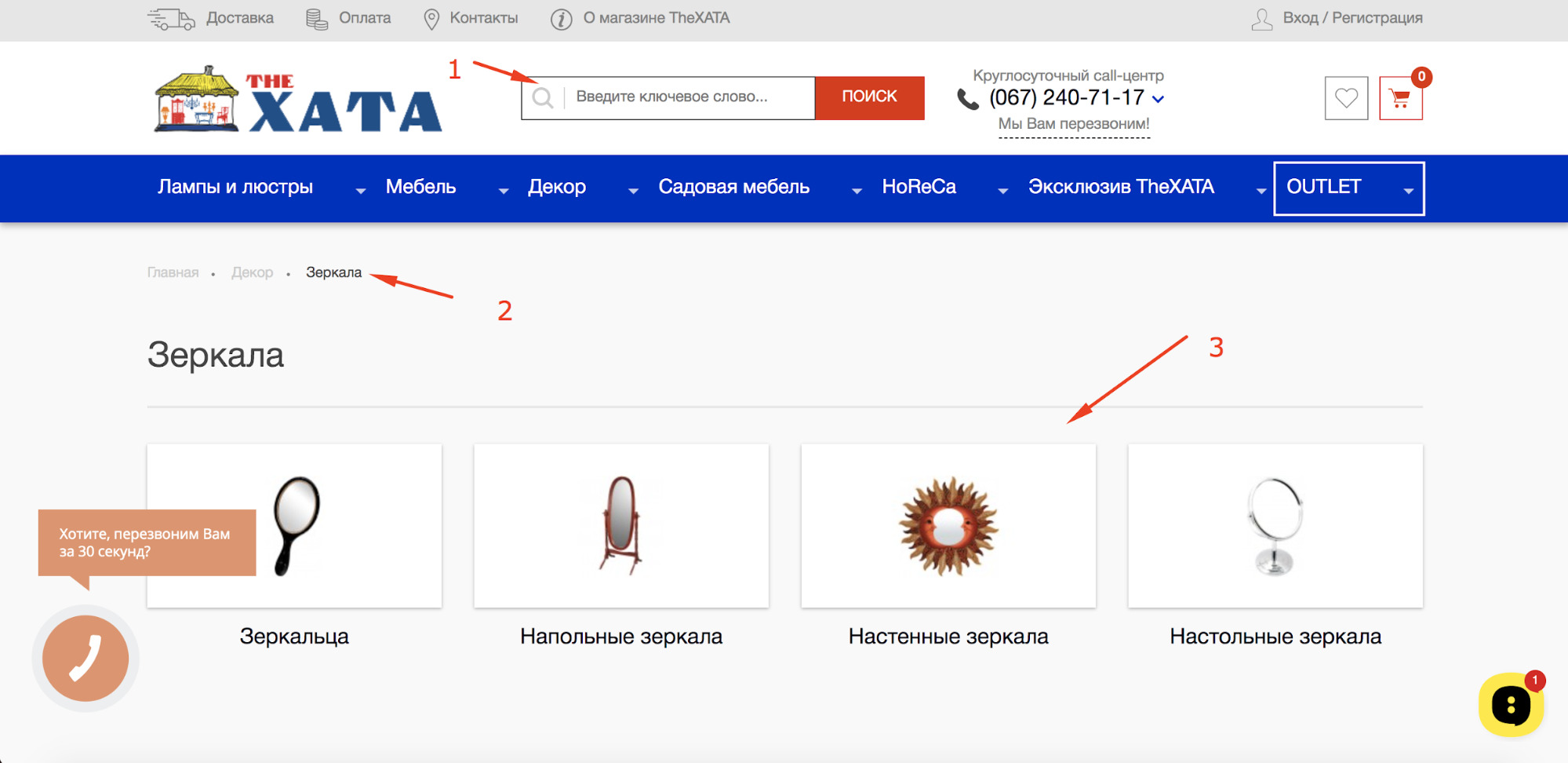
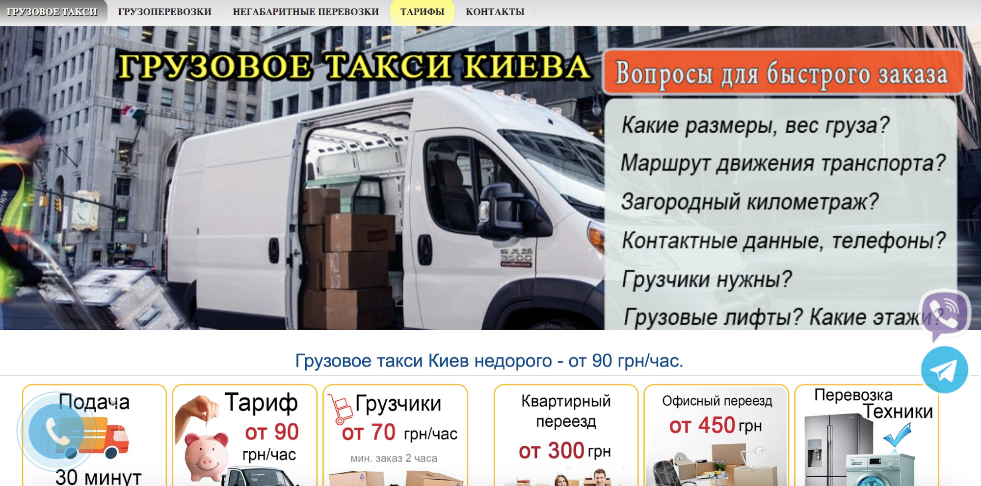
A good example where all three points are implemented.
The site should be adaptive and have adaptive layout separately for PC, separately for mobile devices. It is logical and understandable. But as time goes on, users have less and less opportunity to use computers when searching and buying, and more and more transactions are made using smartphones.
Therefore, all those rules that are described above:
Therefore, all those rules that are described above:
All content that influences the formation of a user's opinion and decision-making should be located so that it is convenient to work with it with fingers, instead of a computer keyboard.
Arrange all the important elements on the first two screens of the mobile device. At the same time, make sure that all photos, infographics and tables fit the size of the device, otherwise your potential buyer simply will not find time to deal with all the information. And you get rejected again.
If you read up to this point and understand that everything we talk about is implemented well, but there are few or no hits, then you need to dig further.
It is important to look at the content and all elements of the landing page, how they affect the user's decision making.
Let's look at a few examples.
Often the fields of these buttons have a standard feedback form.
The user may think that after clicking on the button, he will immediately be required to pay for the goods, but he still wants to find out the details. Therefore, it is better to provide two options for the feedback form:
Try renaming the "Order" button to the "Learn details" button or the "Buy" button to "Call back". See how many times the user clicked on "Buy" and how many times on "Ask a question" using the goal setting.
If after the test you see that the “Buy” button has been used 2 times, and the “Ask a question” button has been clicked 20 times, you can safely leave one button on the page and not confuse the user. Or give the user a choice: buy immediately or ask for details.
Another example of CTA buttons that do not oblige the interested user to anything:
Unfortunately, we often see stock photos on websites. Why "Unfortunately? Because usually such photos have nothing to do with the goods being sold. Trust in such a landing page will immediately be much less. Try to replace the "artificial" photos with real ones. If there are no good photos, make a video review of the product.
Remember that your site is not the only one where the user is looking for a product or service, and he will make a decision in favor of the seller, the credibility of which under the same conditions will be higher.
Pay attention to the number and size of fields in the feedback forms. The number of fields is desirable to do no more than two or three. For example:
Or you can instead "Email" make the field "Comment". Remove the "Address" and "Patronymic" fields, remove order details and various drop-down boxes with options to choose from. Users no longer have time to fill out such forms. The more fields, the more likely it is that this user will not send an application either.
Make sure that the fields are large so that they have hints for the convenience of the user.
If you want a professional UX audit of your site, improve your old site, contact us! We will see the non-obvious, we will prompt, we will redo it. Or we will develop a new modern site.
And finally, a few tips on how to draw the user's attention to the necessary information on the site.
Try to arrange the information in this order:
(Here is a research how people read content from the screen)
For example, if this is a landing page / product card, then it is important to put the logo and USP in the upper left corner. That is, briefly tell where the user got to.
Place the phone and the feedback button in the upper right corner.
Show a photo of the product or a gallery below on the left, since the user first sees the picture, and then reads the text. And to the right of the photo - characteristics, description and other textual information.
There is another important factor - user habits. If you open 50 different merchant sites at random, you will see some product card design patterns that everyone is used to.
You don't have to do that.
The product menu is located on the right, although the user is intuitively used to seeing the catalog on the left
But everything is correct on the page below.
Do not use a lot of bold in the text. It is important to remember that if there are only 2-3 selections in the text, then they will immediately clearly catch the user's eye. If bolding is everywhere, the text will no longer be readable. The idea that you wanted to convey to the user will be lost.
For example, use bold where you show advantages over competitors, highlight the price of a product if you know for sure that it is lower than the market price under equal conditions. Highlight what is important to you and profitable to sell. If among several services you first of all want the user to pay attention to one specific one, highlight it in bold or color.
Often, the site uses several types of buttons. Some lead to a detailed description of a product or service, some lead to feedback forms, some lead to calls to action. It is very important that all buttons are in two colors: all in a neutral color similar to the color of the font or a muted color from the logo color scheme, and only 2 buttons are bright.
For example, if you make the “More Details” buttons bright orange, the “Subscribe to Newsletter” buttons green, and the Callback, “Ask a Question”, and “Order” buttons red, the user will end up distracted by those colors. . Those buttons that should first of all attract attention will be lost.
In this case, the method of transparent buttons works very well: use a transparent background color for all types of buttons, and color ones only for CTAs. Only by contrasting with other buttons, the important buttons "Calculate cost" or "Buy in one click" will attract the proper attention of the user.
And the last tip of visual attraction is the use of modal windows. Remember: everything in the foreground, first of all, will be studied in detail by the site visitor. Therefore, if it is important for you to sell something in a short time, you have a profitable special offer, or the prices for a number of goods or services are simply reduced, then it would be best to display this information in a modal window.
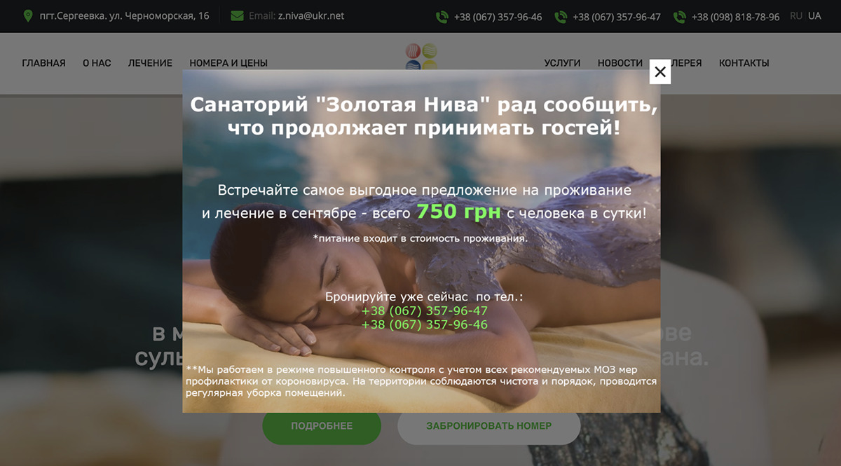
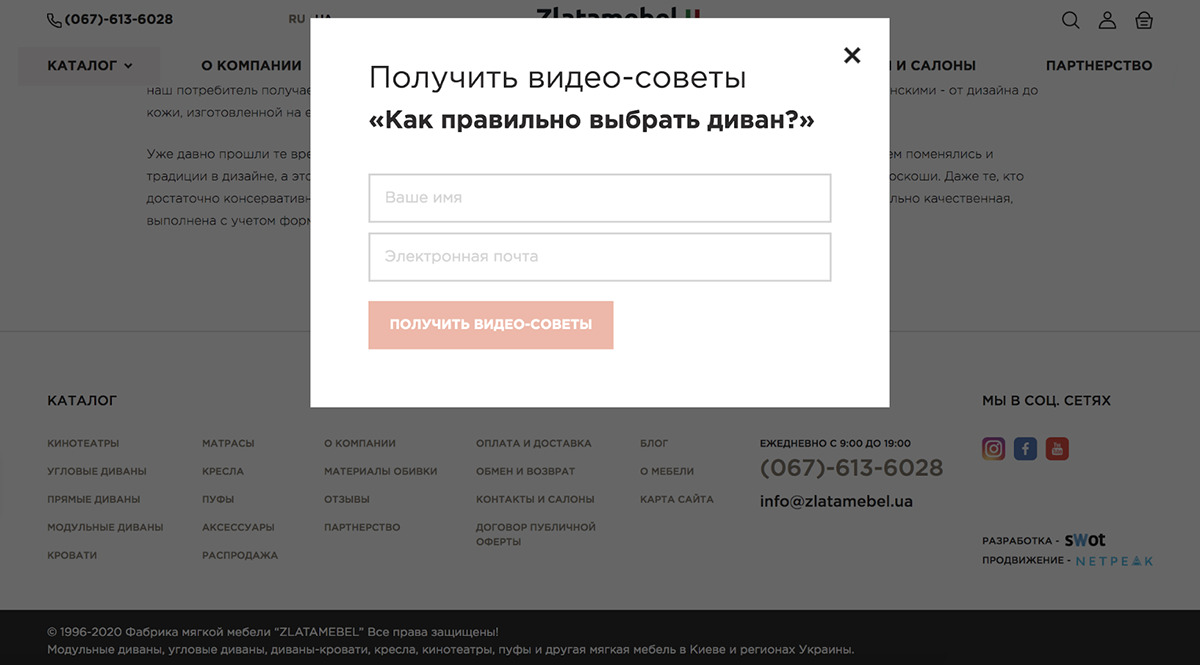
Then, when visiting the site, the user will first of all get acquainted with this information, and only then proceed to reading the rest of the content on the site. It is important to remember that a modal window can both help and harm. For example, if the window appears again and again when moving from page to page, this will cause irritation and result in leaving the site. Or if the user can't find a way to close the window, that will also result in a denial. Therefore, pay attention to the settings for its display so that it does not turn out to be intrusive.
And by the way, we are not only the websites development agency, but we also promote them.
We care about improving your sales :)