No magic - just our painstaking joint work on the site
Promoting plastic surgeon services: how to combine SEO and PPC for maximum results
We were lucky. The customer agreed to tell us about all the nuances, pitfalls and difficulties of promotion in the plastic surgery niche using the example of his website. Read about how the SPRAVA specialists did it with the use of SEO і contextual advertising.
The goals and objectives of the customer determine the action plan
The customer, a plastic surgeon from Zaporozhye, set the task of attracting new clients for plastic surgery services. Also to increase his awareness among target Internet users. It was important for the customer to see the result - an increase in the application number from the site (not positions and traffic) within 4 months from the start of work. The numbers were not specified.
When the customer came to the SPRAVA company, the initial data was as follows::
Website CMS: MODx.
At the time of the start of work, the age of the domain: 4 years (since 04/23/2014).
Website content: minimal, uninformative texts..
Search traffic at the start of work: 3-4 users/day, bounce rate - 58%.
Initial statistics of the customer's website, 2018
Prior to contacting SPRAVA, the site promotion regions were Kyiv and all Ukraine. Here is a screenshot - an example of the title of one of the landing pages:
In this case, it is very difficult to achieve a quick result (increase in requests from the site) even with the right strategy. The fact is that even if the target audience is from Kyiv or the western region of Ukraine, they are unlikely to go to Zaporozhye to see a plastic surgeon. Therefore, it is extremely important to build optimization focusing not only on ambitious plans, but also on your target audience.
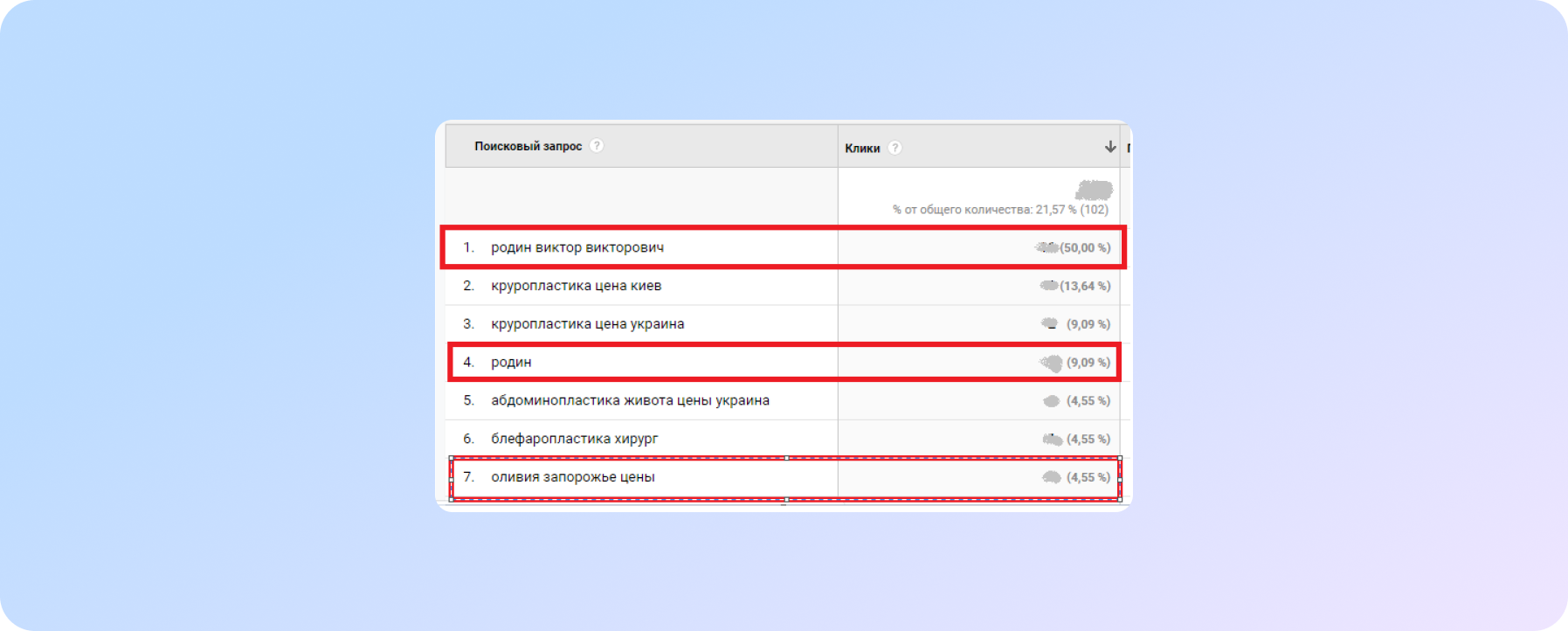
As you can see, based on the Search Console data, the result before the start of work: the main query pool is branded.
In order to create an effective strategy, you need to do some research. This is how we work with each of our customers:
| Analysis | Commercial offer | Brief |
|
Before compiling a substantive commercial offer, we conducted a thorough analysis of the customer's niche, a basic technical and SEO audit of the site. We analyzed the semantics to be guided by. And made an estimated work plan indicating the main mistakes and priority tasks. It was this data that became the basis for both the commercial offer and the detailed scheduling of the project development at the start of work. After signing the cooperation agreement, we sent the customer a detailed brief (questionnaire). We identified the main and secondary areas of activity, figured out the advantages, distinguishing points, supplemented the list of competitors and carefully analyzed their web resources and offers. Our plan of action was next: |
Website preparation: fixing errors and refining the structure of landing pages
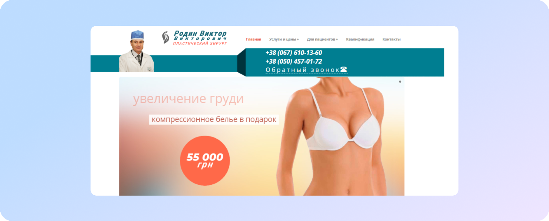
- Main page. Look at the page before the work of SPRAVA specialists:
In order for the page to be effective in terms of applications it needed to be finalized: we had to add and systematize all the information that responds to the intent of the user looking for a plastic surgeon and his services.
If we talk about the main page, we added such things as:
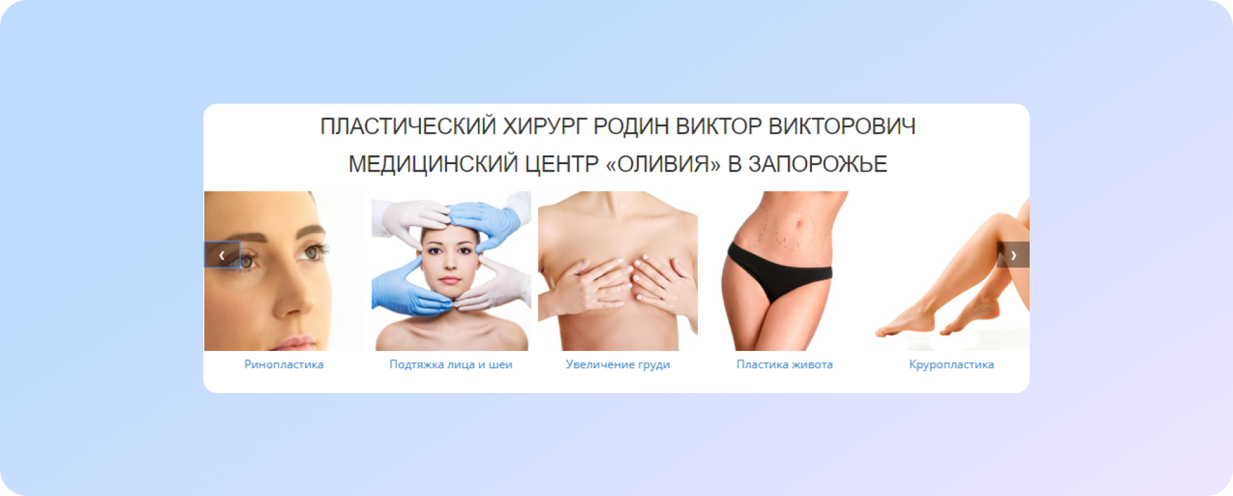
- a carousel with a preview of the doctor’s services, in the form of a “photo + signature” with an active link to the final pages:
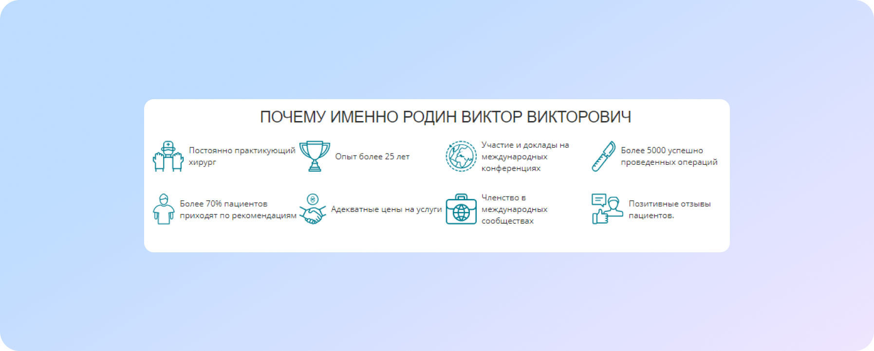
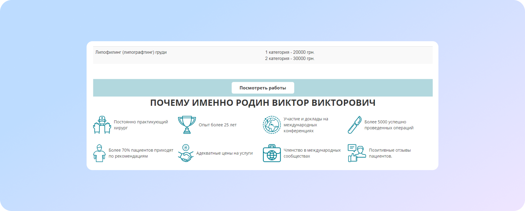
- a block of advantages and strengths of a doctor as a specialist in the field of plastic surgery:
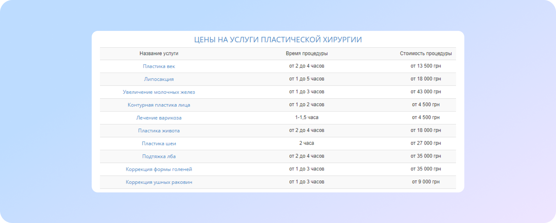
- block with prices for services:
- a callback form:.
Given the popularity of mobile devices, as well as in the wake of Google's introduction of mobile-first-indexing, special attention was paid to the view of the site from mobile phones.
First of all:
- in the adaptive version of the site we displayed the phone number in the header:
| Before | After |
 |
 |
- we made the top menu readable (this problem was relevant for both PC and Mobile). The difficulty is that there are several directions and each of them has many separate services, so you need to display all the services and at the same time not overload the menu from the end user point of view.
- Service pages.
The final page of a service is the second most important page of the site. It is here that the user decides whether to contact this doctor or leave to look for another. Therefore, it is extremely important that the page:
- disclosed information on the service itself as detailed as possible (what, how, how much money);
- evoked confidence in the doctor as a specialist both in a particular service and in general.
That was the basis of the page improvements plan.
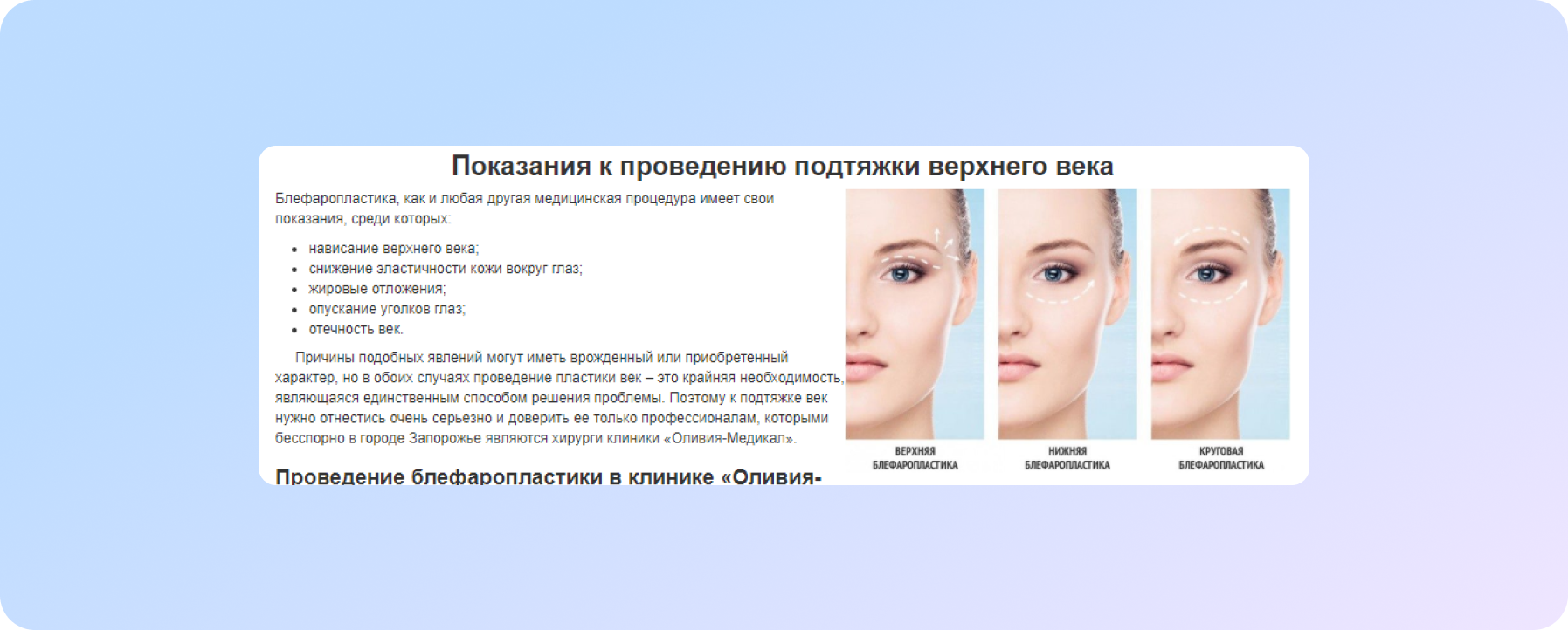
Let us consider a specific example: blepharoplasty.
Before starting work page looked like this: https://web.archive.org/web/20180226012425/http://rodin-doc.com.ua/services/plastika-vek-blefaroplastika.html
And now let’s talk has changed, what work has been carried out:
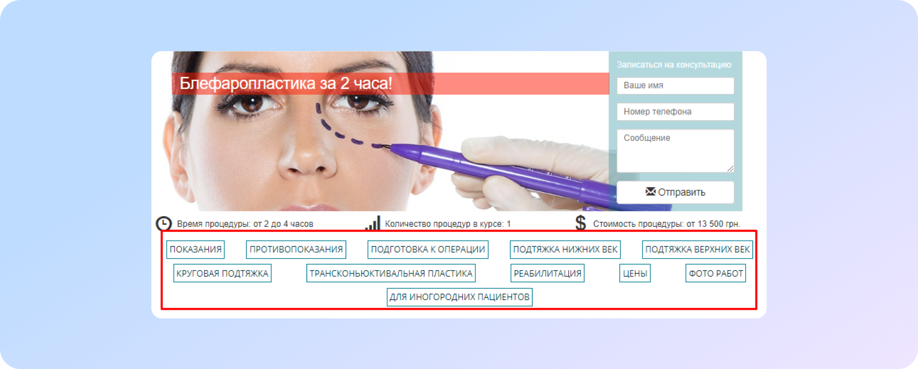
- For easy navigation on the page, we made anchor links:
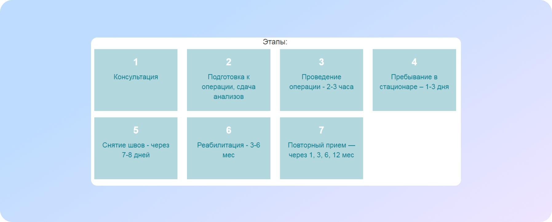
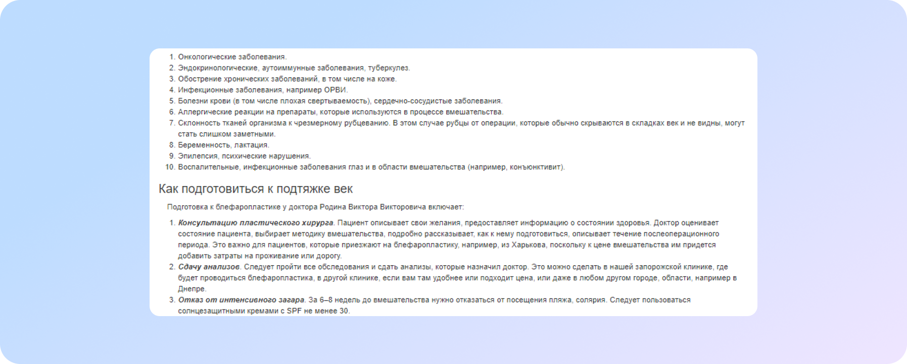
- We described in detail each service by stages and time, so that the visitor understands what awaits him, what the procedure consists of, whether special preparation is needed and what kind:
The site visitor immediately understood how long the operation takes, then rehabilitation, when it is necessary to come for repeated examinations. These are the most concerning questions of all potential patients during the first consultation with a doctor.
An analysis of competitors showed that most often the emphasis is on the communication forms: a call, an appointment for a consultation, an operation. Our strategy was to make each page of the service as informative as possible. In this way we bring the user to the target action without the aggressive “come on, sign up for a consultation” or “come on now, let’s do the operation already, you’ll figure things out along the way.”
Here is what was done:
- We reduced the slider on the service pages in such a way as to show the content on the first screen as much as possible.
- A table with estimated prices was displayed on each page of services.
- Since some of the patients come from other cities, we have posted information for patients from other cities: the conditions and cost of living in the clinic where the doctor sees, information on where you can take tests at the place of residence.
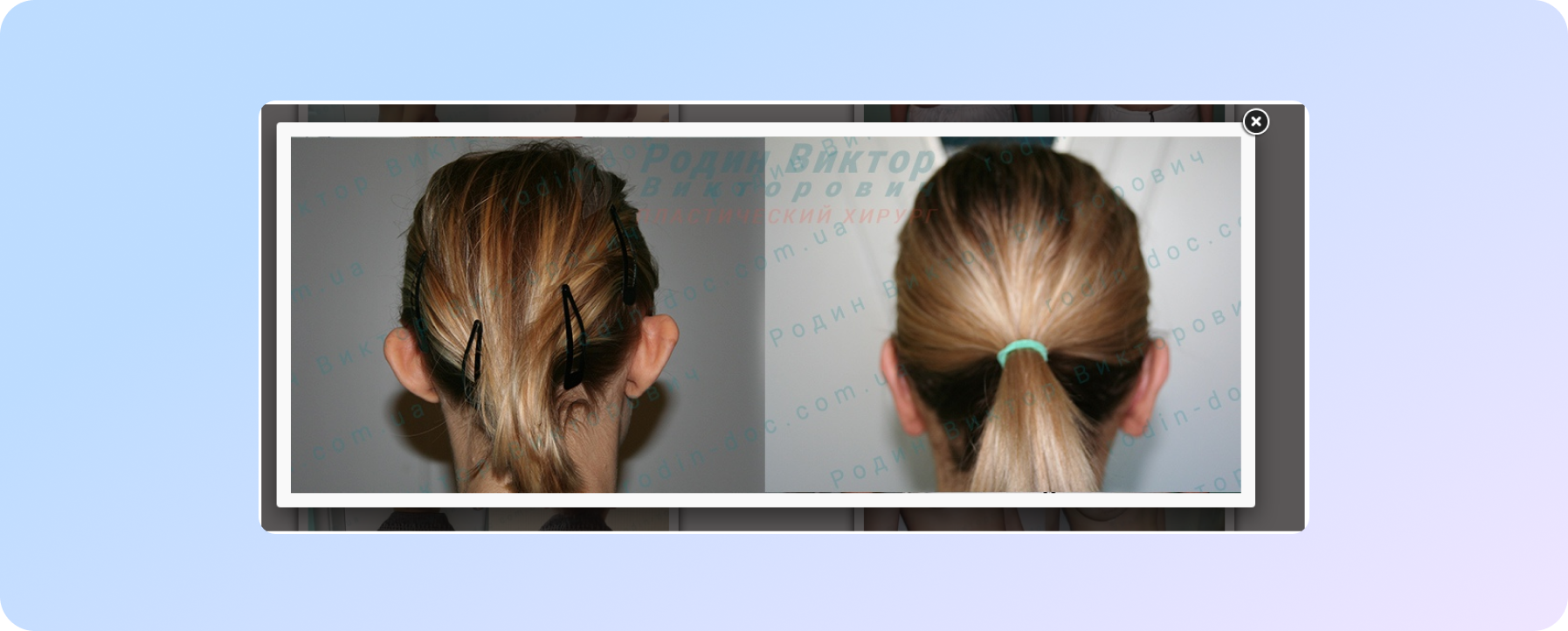
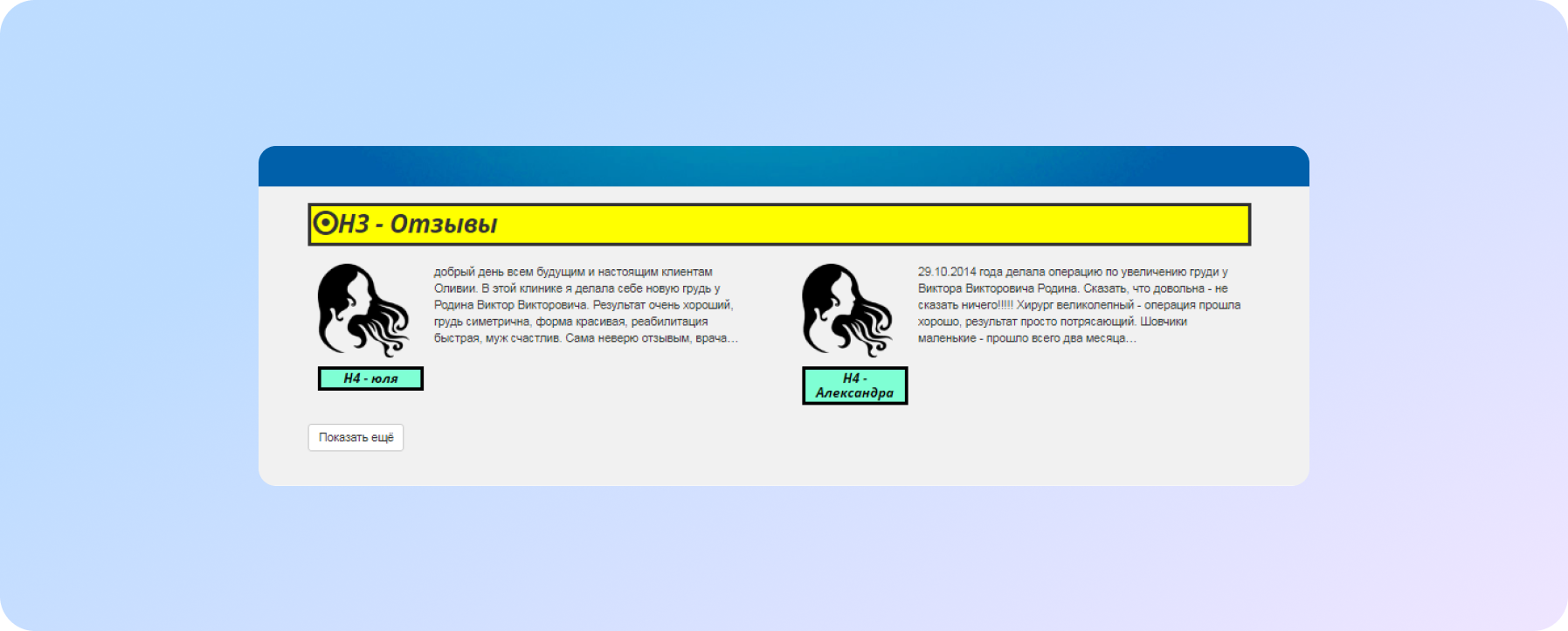
- The “Ask a question” form, the gallery of works “before and after”, reviews and questions were made on each page of the service..
- Other pages.
Other, but no less important works on the site:
- Fixed problems with layout in the site header.
- Solved the problem with loading the callback form in the site header.
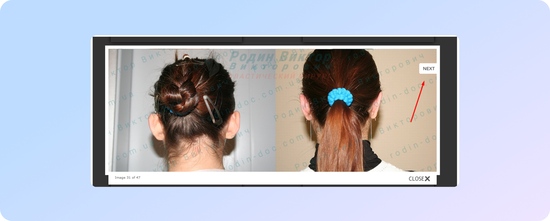
- Fixed the following: in the gallery, photos opened in a lightbox, but the scrolling functionality was not implemented.
Before
After
- In order to make it more convenient for the user, we placed the “Up” button, by clicking on which the user automatically moves to the top of the page.
- In order for the user to receive the most complete answer, a Google map was placed on the "Contacts" page and within the entire site.
- Configured the server response when requesting a non-existent page.
The first results of the work were not long in coming: the failure rate improved from 58% to 46%.
Before
SEO for a plastic surgeon website
Internal website optimization
We analyzed the customer's brief and the niche as a whole. Based on this data, we collected all user requests into a semantic core (SC), which was divided into clusters. Clustering (dividing into groups) allows you to create landing pages in such a way that from the first second it is clear to the user that this page matches his request. Also such pages reveal the topic as much as possible.
A common mistake in this matter is to include three or more related services on one page. This, in our experience, leads to higher bounce rates. Also it brings difficulty for users to study the information on the page, looking for what they need.
Internal optimization included the following tasks:
- Writing unique meta tags (title, description) for queries from the semantic core.
- Full or partial replacement of texts on landing pages.
- Text content optimization: work with the occurrence of search queries and their synonyms, H1-H6 headings, work with LSI words.
- Visual content optimization (attributes for drawings).
- The site structure lacked an important H1 heading for promotion. This was fixed first.
- We worked on unnecessary headings, which are often used by designers who are not involved in SEO on website elements.
- We worked on the robots.txt file: registered the main domain, entered the address of the xml-map, and closed some service sections from indexing. You can read more about this file and its meaning in an article on our blog.
- We found all duplicate pages and redirected site visitors to the desired page address using 301 redirects.
- Updated the data in the xml-map file.
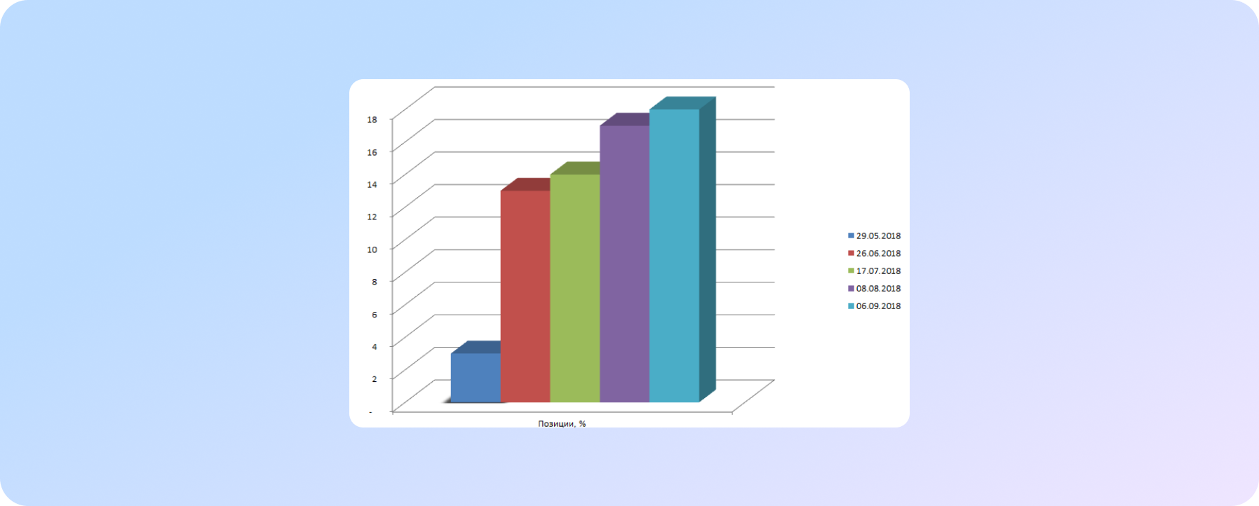
This led to a significant increase in positions. A month later, we saw a 10% increase.
Features of working with landing page content on the site of a plastic surgeon
The main task of the texts on the pages of medical site services is to provide complete and comprehensive information about:
- the service itself;
- indications and contraindications;
- preparation for the visit, the procedure itself;
- the course of the operation, its duration, price;
- recovery time;
- postoperative period.
It is necessary and important to show the expertise and experience of a doctor, to attract traffic. In addition, informational texts can work out potential objections of site visitors.
Since no one else will write better about the specifics than the customer himself, it was decided to work on the content of the site together with him.
We analyzed the texts on the websites of competitors. We made a content plan, which consisted of a list of topics for key queries in this niche. We made detailed terms of reference (the volume of the article and a list of important issues that need to be disclosed, a list of LSI words).
Further, medical copywriters wrote articles. They were checked and corrected by the customer, after which we optimized them and posted them on the site. The articles were supplemented with photographs that clearly illustrate the nuances of a particular operation/procedure.
On each page of the service, a detailed description of the indications and contraindications was made.
Now the main pages of the site look like this:
External optimization
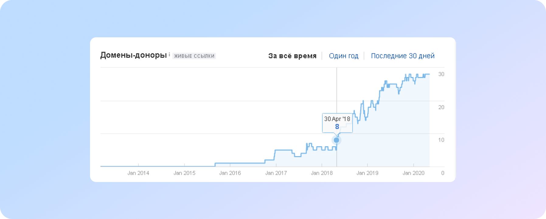
During the analysis, the SEO specialist identified another weak point - the customer's link profile. At the start of work, the site had only 8 donors.
Initially, we analyzed the main focus areas of the customer:
- Breast augmentation.
- Blepharoplasty.
- Rhinoplasty.
- Liposuction.
- Home page cluster.
For each direction, we found competitors in the top of Google search results, analyzed the link profile of each of them. Based on this analysis, we made a link building plan for the site.
To make the link profile natural, work on the link profile was also carried out on the REVIEWS, CONTACTS pages, and not just landing pages.
Features of working with Google Ads in the medical niche
Some contextual advertising agencies fundamentally avoid working with medical topics. This is due to limitations and other difficulties that arise when launching advertising and in the process of work.
For example, advertising of the so-called "beauty injections" (Botox, Dysport), which are widely used in contour plastics, is prohibited. There are restrictions on graphic content: you can’t use a photo of a naked body (then how can you show a portfolio of works?), you can’t give any guarantees of results on landing pages. You can read all the details in the Google AdWords help.
We decided to focus on regional requests, because the likelihood that someone will specifically go to a plastic surgeon in Zaporozhye from Kyiv is low. We will give some recommendations for those who want.
To avoid problems when launching contextual advertising to promote a business in the medical niche, you need to take into account some of the nuances:
- Don't use controversial promises on landing pages and ads. For example, such as “Liposuction is the only way to get rid of fat...”, “We guarantee a 100% result...”, etc. It is also recommended to place a disclaimer with information that the result may differ in each case.
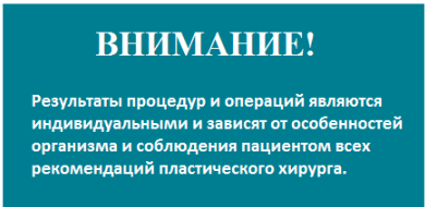 |
Disclaimerр - a written waiver of liability for possible tort consequences of an act as a result of the actions of the person who declared this waiver or third parties. Tort means any kind of liability of the applicant |
- No nudity photos can be used on landing pages.
- Do not use the names of prohibited pharmaceuticals in the text of ads, headlines and on the website.
What difficulties did we encounter when creating an advertising campaign in contextual advertising:
- Since the site is being promoted, in addition to optimization, it is important to take into account the behavioral factor. Therefore, we took a chance and placed photos of works on all landing pages, including photos of works on breast plastic surgery, liposuction. In this way we worked for 8 months until we faced the fact that these ads were blocked.
Since advertising campaigns are monitored daily, we quickly responded and contacted Google.Ads technical support. As a result, we were offered an alternative option: to place a photo in underwear and at the same time the patient's face should be visible. Unfortunately, there were no such photos in the client's portfolio (this was to be expected, since it is unlikely that any of the patients would agree to this), so we were forced to remove the photos from the landing pages, the ads of which were blocked, and place a block with a link to the portfolio.
After the second moderation, the impressions were resumed.
- In the texts on the site pages we wanted to answer the questions of potential patients as much as possible. Including talk about the expected result of the procedure or operation. That’s how we got punished again. To solve the problem, we reworked the texts and placed disclaimers on the pages with services.
What we have achieved:
As a result of working on the campaign, we managed to increase the CTR from 10% to 20%, which resulted in an increase in traffic by 2-2.5 times with the same budget.
Google My Business is an important tool for local promotion
The physical address of the customer's work is the city of Zaporozhye. Therefore, the very first, closest and real audience is locals. And here we had a task - to be in the TOP-3 of search results. And also use additional tools - enter the search results top on the maps, since this block is mandatory on SERP. This made it possible to collect additional traffic.
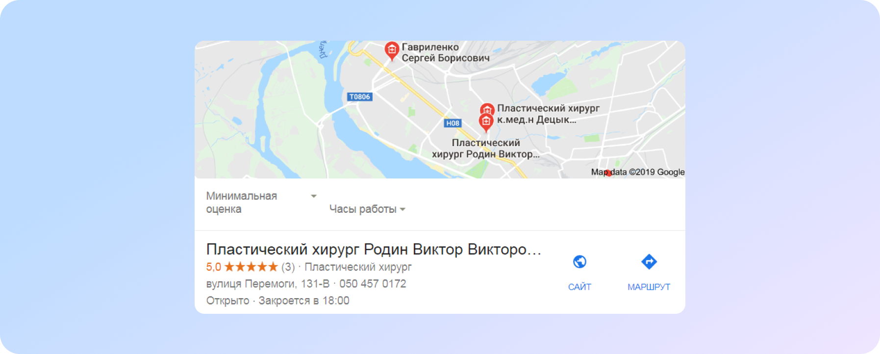
We created a card in Google My Business, confirmed the account, filled in all the required fields (website, contacts, work schedule, company photo, etc.) We also talked with the customer: his patients need to leave reviews not only on the site, but also in the Google My Business account.
It is important to note that in the plastic surgery niche, there are actually few people who want to leave reviews. Not all patients are ready to talk about the fact that they used the services of a plastic surgeon.
The results to date are:
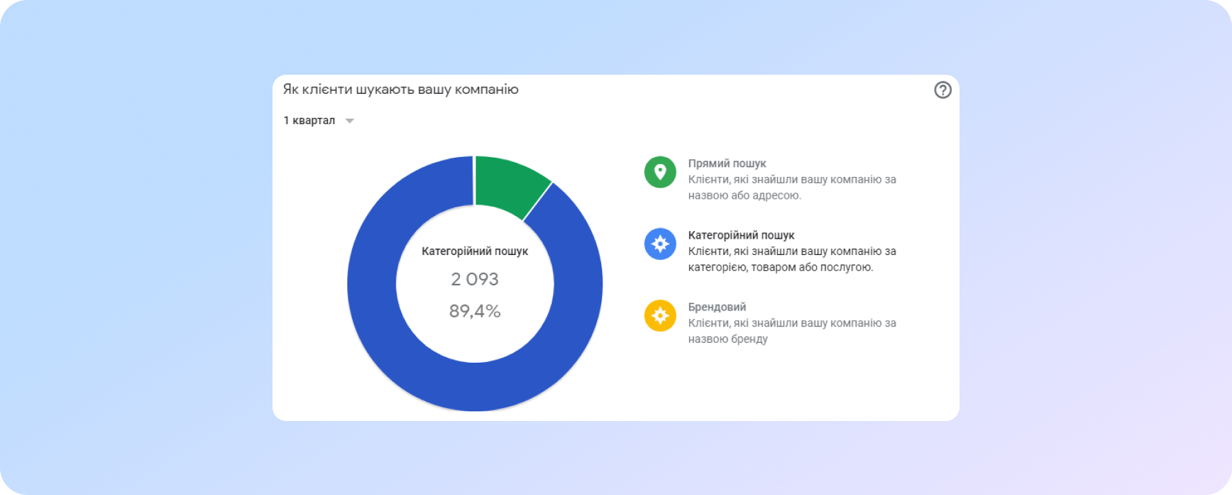
According to statistics, the main traffic is category search
Results of comprehensive work
Work is good, but the customer expected results from us, and this is what we got:
Positions for almost all target queries: TOP-1.
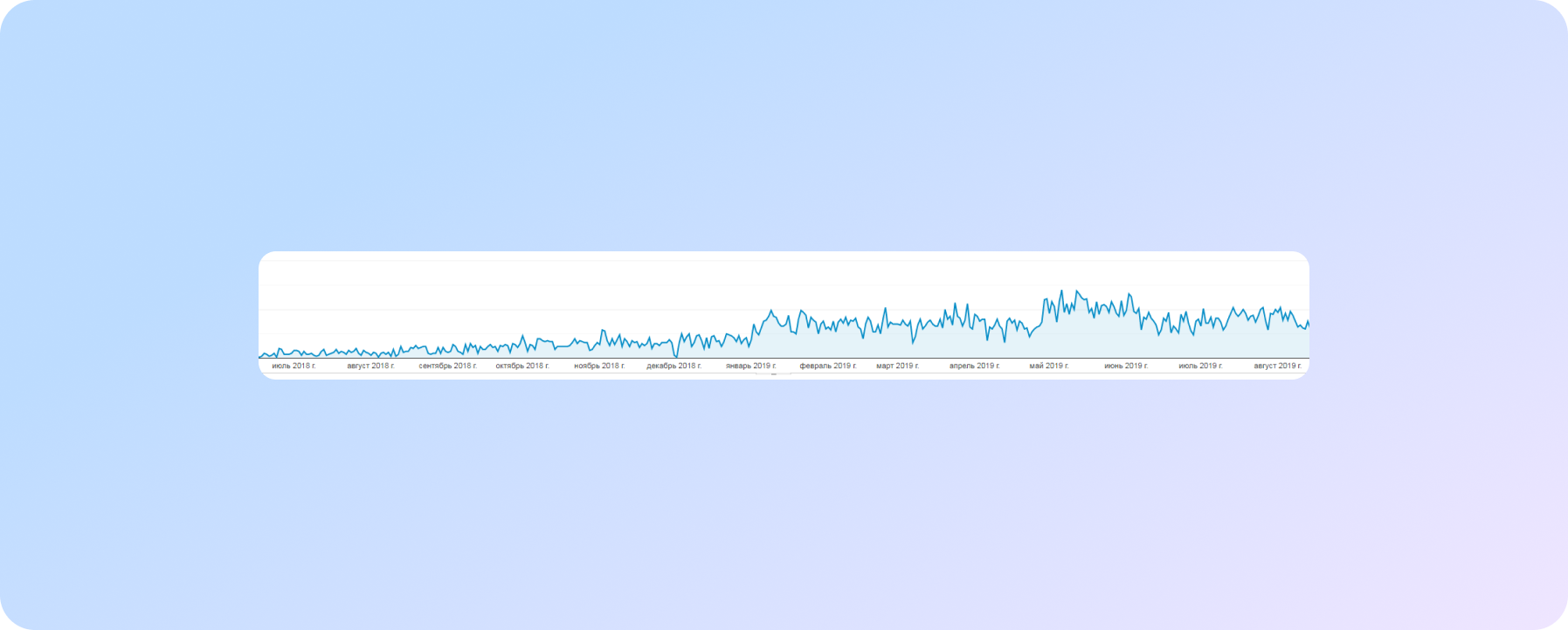
These results converted into organic traffic:
Traffic from context advertising:
When evaluating applications and conversions, you need to understand that even in this niche seasonality exists (during the summer and before holidays, the number of calls decreases significantly).
To evaluate the effectiveness of conversions from the site, we attach data on goals in Google Analytics:
Search traffic at the start of work:
- in May 2018 - 3-4 users/day;
- in May 2019 - average organic traffic of 60-70 users per day.
Professional SEO promotion gave 15 times traffic growth.
An important output of job evaluation is search queries. As you remember, at the beginning of the article it is written that the visits were mainly for the branded request. Now, the bulk of search transitions are made on queries related to the activities of the customer:
Feedback from the customer and the specialist about the project
Feedback from the customer of the project::
Rodin Viktor Viktorovich, plastic surgeon:
“I started cooperation with the company SPRAVA after I received a call from the manager. Then a personal meeting took place, where they told me about the principles of work, showed me what should be improved on the site so that it works more efficiently - all of this won me over. It also played an important role that, as it turned out, my colleague from Western Ukraine also works with your company and is pleased with the result.
We have been working with the company for more than a year - we are satisfied with the cooperation.
We intend to continue further, the goals are further growth and attraction of patients from the cities closest to Zaporozhye, we continue to introduce changes and improve the site.”
What is important according to SPRAVA experts:
Pavlyuchenko Maria Vyacheslavovna, project manager:
“It was very important to define goals and develop a strategy at the first stages. At the first meeting, Viktor Viktorovich described in detail the portrait of his client, spoke about his experience in the field of plastic surgery and the methods he uses. This helped us to delve into the customer's business and determine the promotion strategy."
Conclusion
At the start, it is important to choose the right strategy. It is better to start with local promotion and gradually expand the reach of the audience. Thus, you can quickly get the result and return on advertising.
At all stages, interaction with the customer is necessary - in this way we let him understand how each step affects the result. On the other hand, without it, the work is not so effective.
It is important to use the maximum of channels, paid and free: SEO, contextual advertising, Google My Business.
When the results have already been received, and the site is in the top, this is not a reason to stop, but an impetus to move on, go deeper and detail, and expand geotargeting, achieve new goals and heights.
Find out what we can do for your site!
We care about improving your sales :)


