Got to your site the user must immediately understand where he got to and what is offered here, see the button, pay attention to the features of your hotel. In addition, the text on the site should be as informative as possible.
Imagine that you want to book a hotel. What questions do you have? Are there answers to all these questions on your site? Are prices, room descriptions, services, location noticeable?
Let's check and make sure that your user becomes your guest.
We improve the behavioral factors on the site
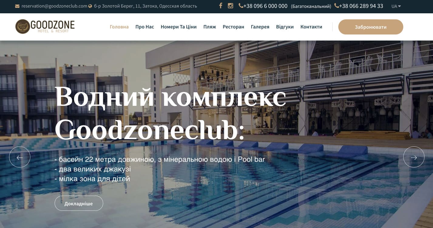
- The first thing that should be available to the user on your site is the USP (Unique Selling Proposition). Based on how you formulate it and how affordable it will be, the user will understand whether he should choose your hotel.
The visitor must understand at first sight that you are working with a specific segment of the target audience (family hotel, conference room for events, restaurant and banquet room for weddings, cozy rooms for travelers).
- In the upper right corner, there must be a contact phone number - this is the most familiar location for the user. Make sure the phone is active - the click must call, otherwise you're creating an extra step for the user before taking the conversion action.
What should be on landing pages?
Imagine that when getting to the landing page, the user can no longer go to other pages of the site. Is there enough information to convince him to stay at your hotel? These pages should convince the user to become your guest and book a room:
- USP (unique selling proposition). Aimed exactly at the target audience. For example: "Hotel by the sea with own beach" or "free Spa for our guests."
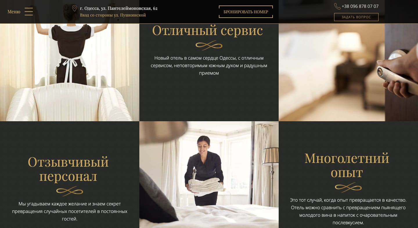
The hotel benefits block should be focused on your audience. If you have a page that is dedicated to family vacations, then information about the availability of a conference room will not be relevant for users.
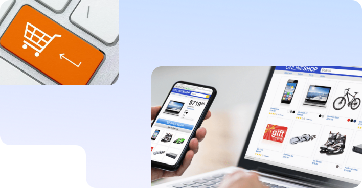
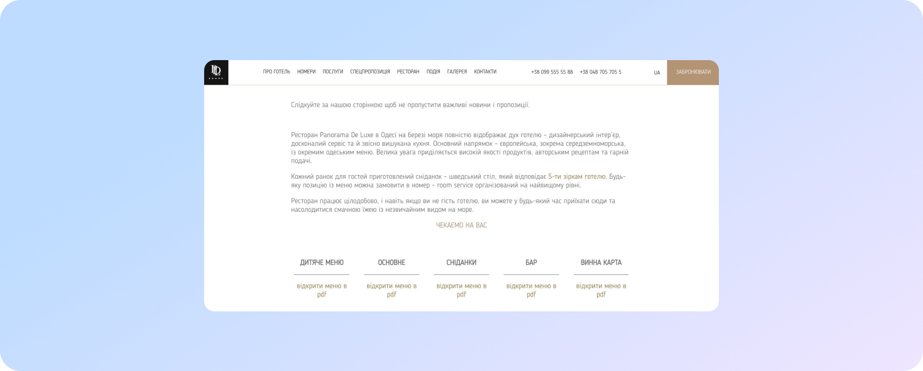
- Rooms and prices are, in fact, your product. Access to the pages of numbers should be from any page of the site. Show there not only a photo, but also a price fork. If you don't list prices, be sure to explain why.
- The feedback form and booking block should contain a minimum of fields. If you have a ready-made booking module installed on your site, then link a quick communication method to it (online chat, Viber, Telegram, callback order) so that you can be quickly and easily contacted in case of questions.
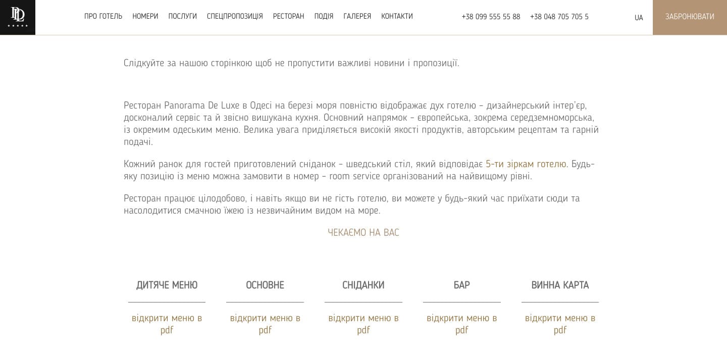
- If you have a "Pool" section, let there be several photos and even a video of the pool. If you have a restaurant and a corresponding section on the site, make a full photo / video review. Don't force the user to search for information on other pages.
Don’t be afraid of large detailed texts. It is important to make the text not in order to improve the position of the site with a large content of keywords, but useful and informative for the user. Divide the text into paragraphs, add clickable links, pictures, add various blocks.
- Add an interactive Google map above the footer with the ability to navigate to the navigator. Your users should easily find information on how to get to you..
- Feedback block. Very important, very important. Generate and prominently post a QR code on a Google Form with a survey and feedback option. Analyze reviews about your hotel on third-party resources and post them on the site.
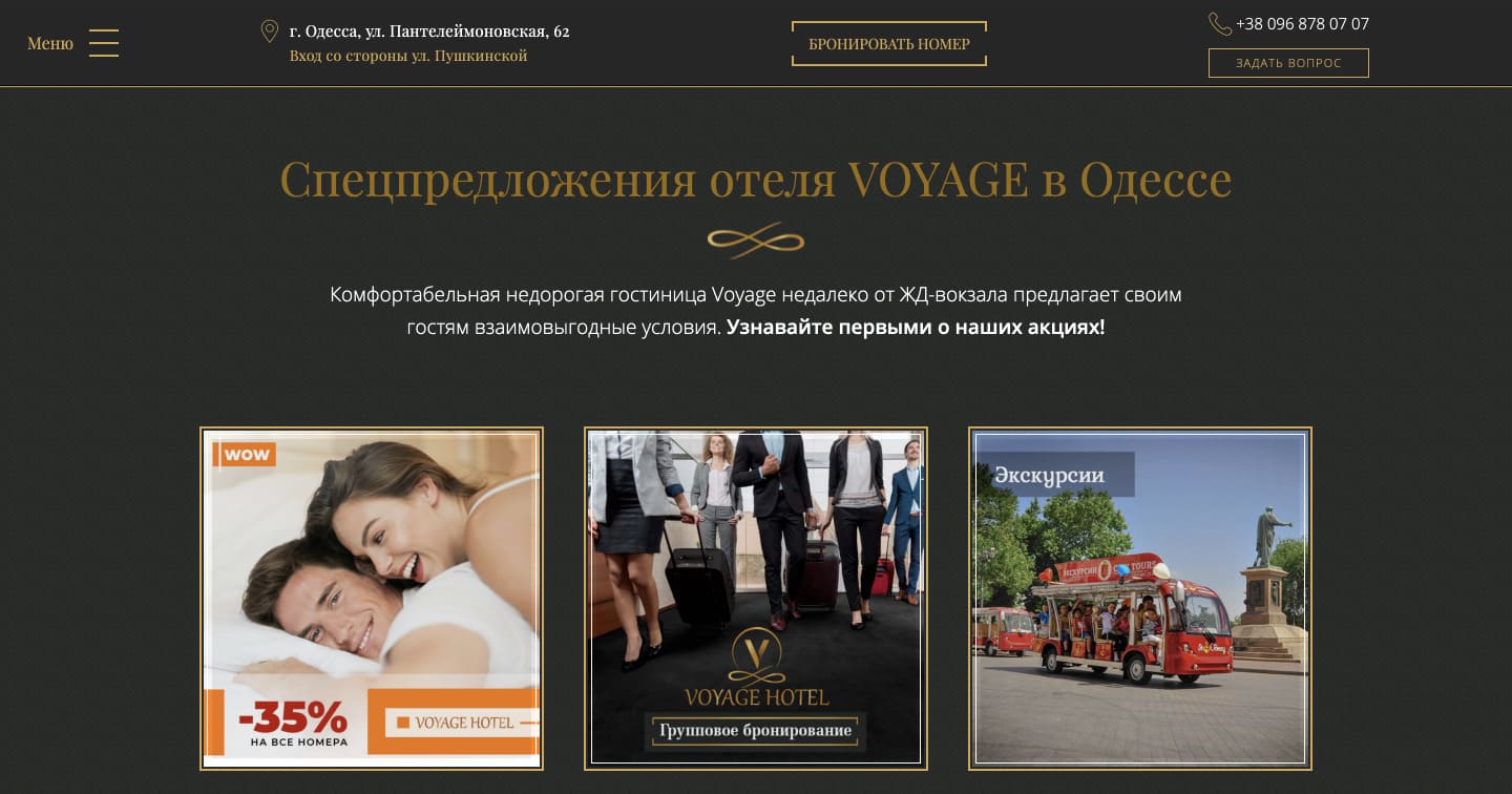
It is important to periodically review the block of special offers. Remove irrelevant ones, let only those that can interest the audience in the near future be on the page.
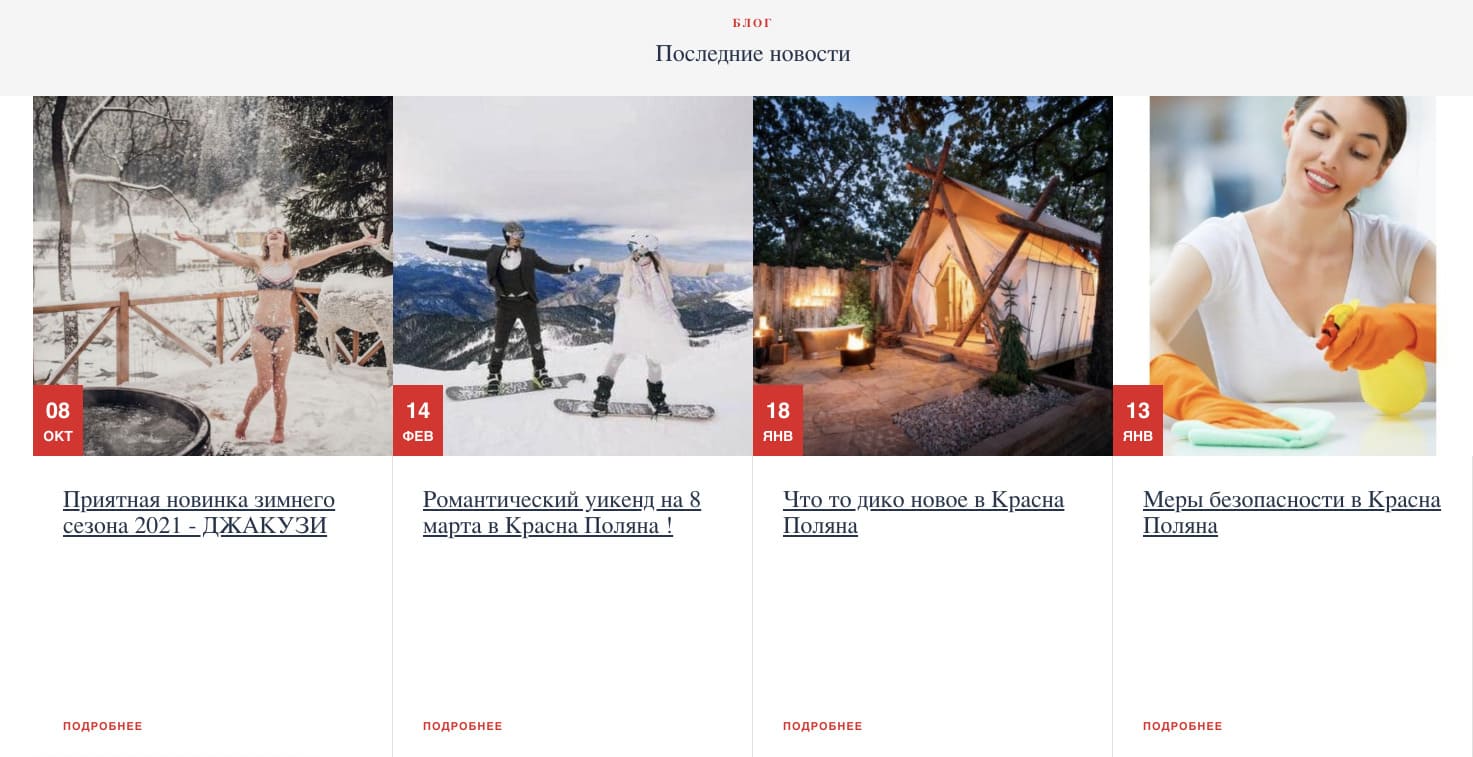
- The "Blog" or "News" section is a great opportunity to interest the user and offer him useful content. For example: about how to spend an interesting day in your city, what sights are nearby and how to get to them conveniently and quickly. Where delicious food is cooked in your city, where there is good music, museums, theaters. According to informational articles, people who can become your guests will get to you. To do this, be sure to place previews of numbers, special offers on the information pages.
Add social media widgets to your site is necessarily. Social networks are now the second calling card, and visitors draw a lot of information from there. There are more videos and photos, reactions and reviews.
- As the user scrolls through the page, it should be easy for the user to reach the call to action (CTA) button (or feedback button). The easier it is to contact you, the more actively users will do it.
What details should you ask your programmer to improve the condition of landing pages?
- Breadcrumbs should be visible on the site. So the visitor better understands the structure of the site. And it’s also important that Breadcrumb markup makes your snippet visible – we wrote more about it here..
- Captchas in contact forms help avoid spam. Make the captcha understandable.
- The Sitemap page is very important in terms of promotion. It looks like an html-page of the site or an xml-file, which lists links to all the important, necessary pages of the site. The map will help the search robot to find any page of the site in seconds.
- Loading page speed is ideally 1-2 seconds. If your site is slow, try to speed it up. We wrote that download speed has become one of the main ranking factors. Don't miss this moment.
Here are the services for checking the download speed:
- See how your site looks in different browsers, mobile, tablet, desktop. Are all items displayed correctly?
- The site logo should be clickable and lead only to the main page of the site. If you click on the logo on the main page, the page should not reload.
- If you have pop-up windows on your site, then you need to make the close button of such a window visible. Otherwise, the user can simply leave.
- Make the site menu end-to-end - the same on every page. The content of the main menu is something like this: contacts, services, rooms, special offers, restaurant, menu, about the hotel, blog, reviews. The names of menu items should be simple and correct so that the user immediately understands what this item is about.
- Heading 1 should be larger than Heading 2, which in turn should be larger than Heading 3. Do you?
- Make the font on the site easy to read, large enough. Headings of the same level always use the same font height and thickness.
- Make sure that the entire area of the buttons on the site is clickable. Do not make only the inscription clickable.
- Be attentive to those who sent you an email or call request. If the visitor left a request for a callback, he should see a message about how soon he will be contacted.
- Important! If you do not list a price on the site, please explain why. Indicate the contact of the person from whom you can check this price.
Check the readiness of your site for the 2021 season with this checklist. If you need high-quality hotel SEO services, we are ready to help you.