No magic - just our painstaking joint work on the site
11 Ways to Stand Out on Google from the Competition
Competition in life, business and Google, we want to stand out, we notice those who stand out, Google notices them too. If your site stands out in the SERP, it gets clicked more often, you get more traffic and more sales, the site's CTR is higher, user factors and positions grow, as does the mood of your SEOs and sellers. In this article, we have collected 6 options for how your site can stand out from the competition in Google's organic search results and 5 options for how to stand out from competitors' ads. What is important is the many ways you can combine and improve your result.
How not to be a gray moth and stand out in Google's organic search results among competitors
Being in the top search engine in 2021 is not enough. After all, you need not only to be in the first positions, but also to make sure that the user opens your site. Let's talk about snippets, because they help make your site visible to a potential visitor and increase the number of clicks from organic search results.
There are basic rules for optimizing meta tags, which are the main ones for generating a snippet in search results:
- targeting search queries;
- lack of spam (listing of search queries);
- do not copy the value of the title tag into description;
- clearly formulate the USP;
- use numbers, not just text content, a phone number, for example;
- use a call to action.
The reality is that in competitive niches (which are almost all niches today), this is not enough. You need to use all possible ways to stand out from other well-written meta tags. Consider the most effective possible ways toundefined attracting a user to the site using a snippet.
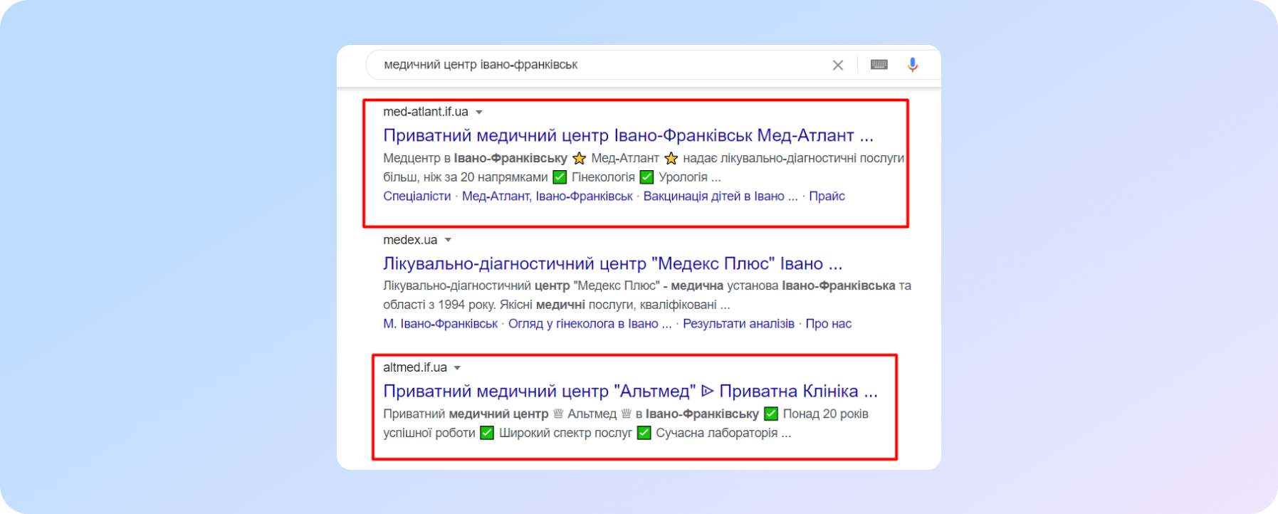
Emoji in snippet
For more attractive snippet - use emoji (the official name is unicode characters). But it is worth considering a few points:
- not all emojis are shown up in search. In order for the work not to be in vain - use those emoji that you meet in the search for competitors. Or test it ;-)
- not all emoji that you can find on the Internet will work with specific sites. Worth checking. Or contact the programmers for help.
Depending on the capabilities of users' browsers, emoji can be either in black and white or in colors. An example of how to use emoji to stand out in the search is shown in the figure.
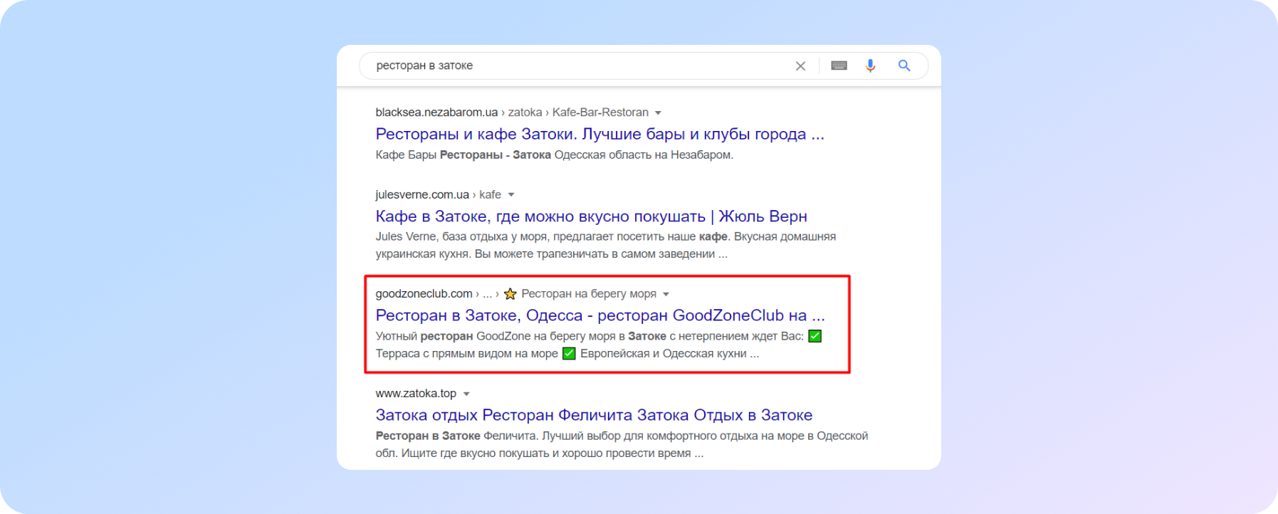
Micromarking of “breadcrumbs”
Another way to make a snippet more attractive is to embed micro-markup on a navigation element such as breadcrumbs. This allows:
- convert the site url into a more understandable form for the average user - text in the language in which the user makes a search;
- with the help of emoji (already known to you from the previous method), it will also stand out in the search visually, sometimes in color representation.
BreadcrumbList type is used for marking BreadcrumbList.
How it might look - you can see in the figure. In a specific example, we used:
- directly BreadcrumbList micro-markup;
- star emoji at the beginning of the page title.
Site ranking in search
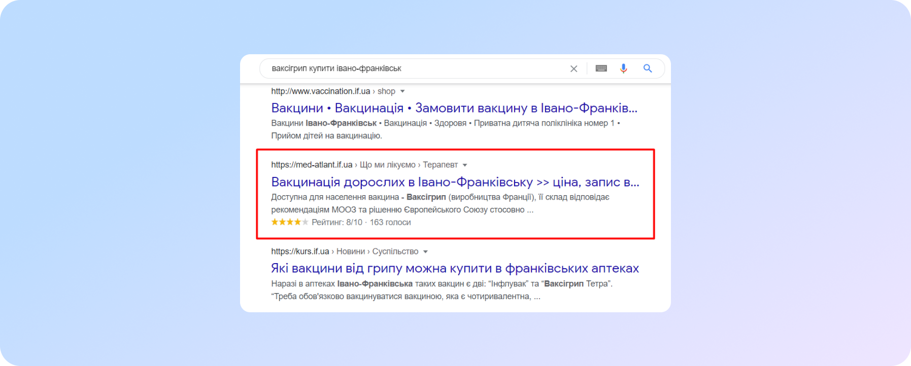
Does the site have reviews? Do you think a rating? Fine! So you need to make a little more effort and make the site even more visible in the search results.
And to be more precise - implement micro-markup for this very rating. To solve this problem, this type is suitable - AggregateRating.
This is how it looks
In the case of correct technical implementation on the site, you get the output of stars, ratings and the number of reviews in Google. Thus, adding another line to the snippet, making it larger in height and also more noticeable.
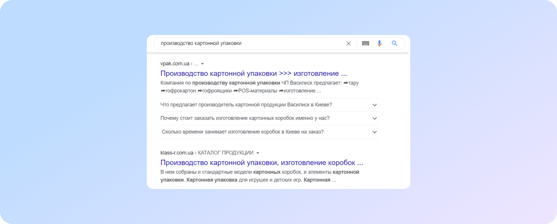
Featured snippet on Google using Q&A block
Google has introduced another opportunity - to be more visible in search, since the summer of 2019. How? Through the output of questions and answers in the snippet, by introducing micro-markup FAQPage.
How it looks in the search is shown in the figure. How to implement and what it gives the site - read in this article.
One important detail: this markup is displayed only for sites that are in the top 10.
Zero position of the site on the first page of search results
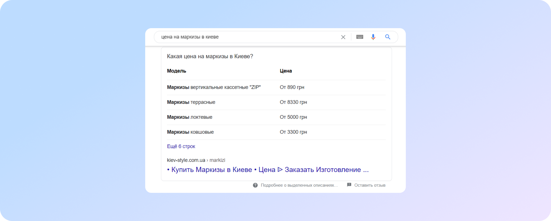
There is this type of SERP in Google's organic search - Featured Snippets (in other words - zero position or highlighted descriptions). With this presentation of search results, Google offers a quick response to a user's query. If we talk about commercial queries, then most often this type of results is shown for queries with a price.
There is no way to 100% get into the zero position. But there are a few rules that increase the chances of the site to a zero position:
- availability of thematic content (that is, if the user is looking for prices - they should be presented on the site);
- optimization of content on the site for relevant search queries;
- Present the data as a table, not in solid text.
The presentation of data in the zero position in google results can be in different formats:
- Output a text block.
- Presenting the data as a table.
A table view. Appears in Google SERPs as the name of this table and a few rows. If there is more data in the table than can be reflected in the snippet, a button appears in the form of "More ... strings" with a transition to the site. And it is this button that is the ability for the site to collect more traffic.
The text format of getting into the zero position of Google. In addition to the text that corresponds to the search query, a picture can also fall into the snippet. Which makes this block more visible, and therefore increases the CTR of the zero position.
Google is constantly working on the kind of search, on its elements. He works on algorithms and new tools. Therefore, always follow the novelties, competitors and the search in general. This will make it possible to find effective tools and get efficiency from them even before everyone starts using it.
If you still do not know how to start to be noticeable among competitors, ask us for professional SEO help.
STAND OUT in Google ADS - 5 Tips
In order to make ads more noticeable on Google search, it is not enough to write a relevant and beautiful ad. Experience of our PPC advertising company says that you still need to use:
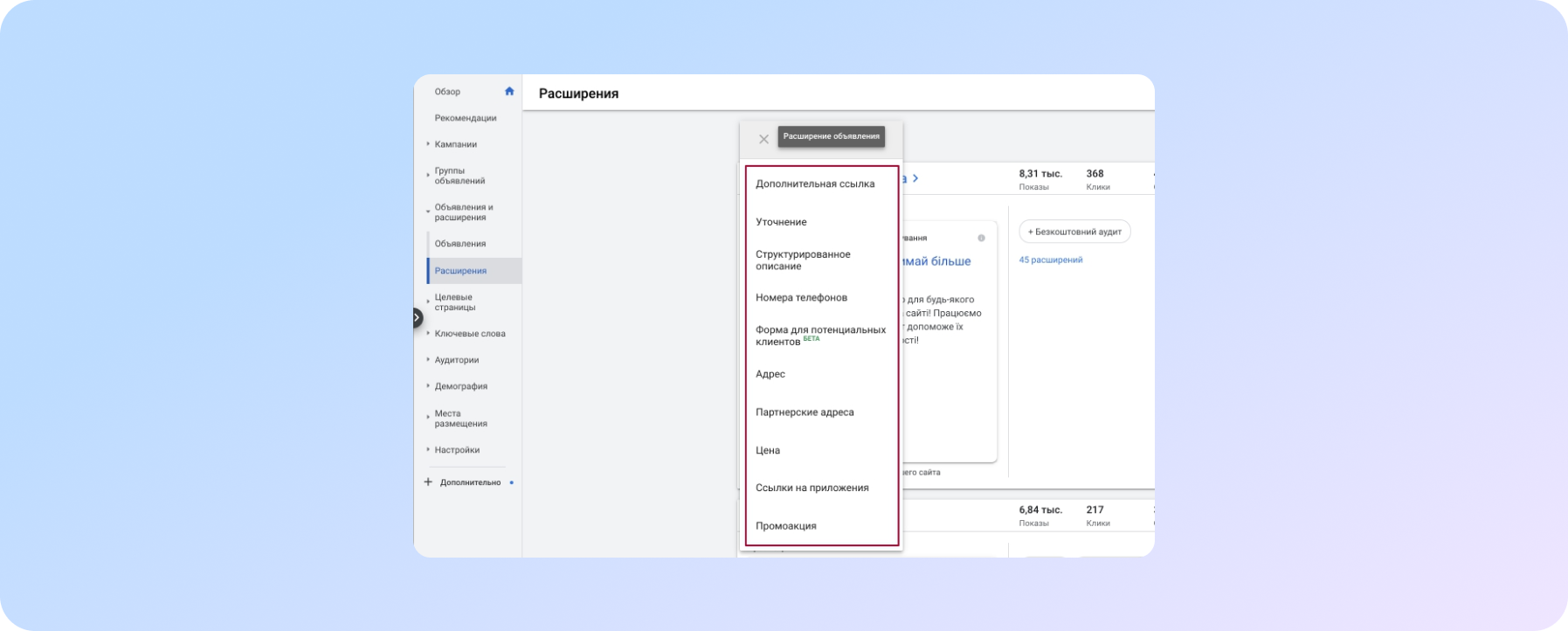
Ad extensions
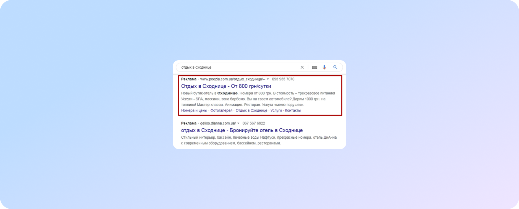
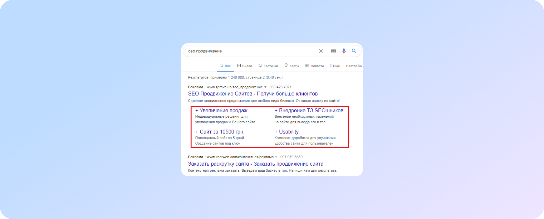
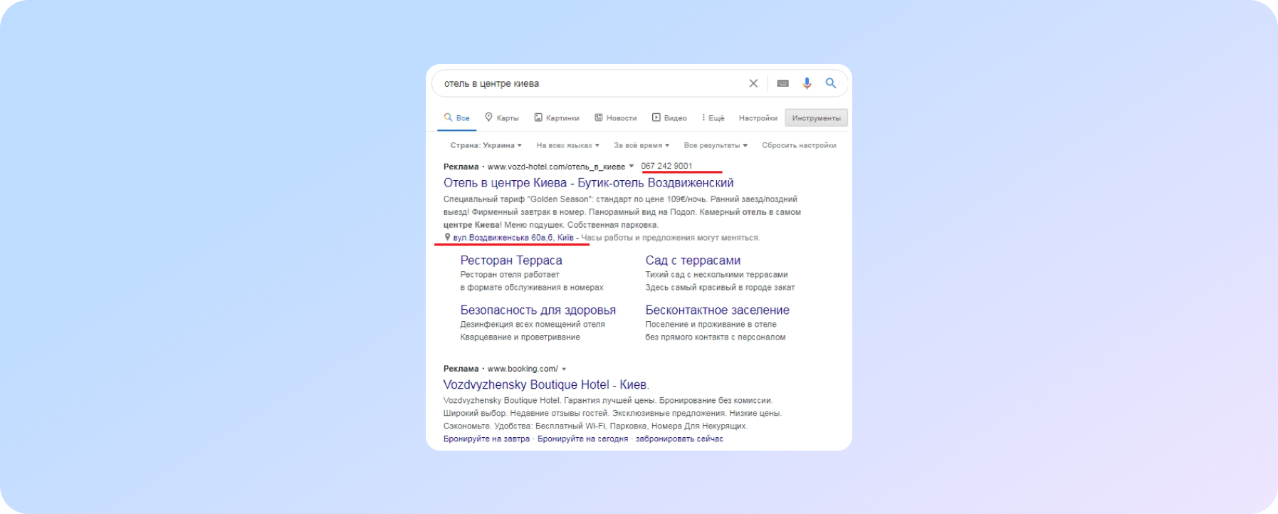
Since, in addition to functionality and informativeness, they increase the size and visibility of the ad, an example of how the use of refinements and additional links visually increases the ad.
An example of how using descriptions to sitelinks increases the size and visibility of your ad.
An example of using the Address extension, which will be relevant if you want to attract customers to the store or, as in this case, guests to the hotel. The phone number is also relevant, especially on mobile devices, thanks to this extension, users can call the company by pressing just one button
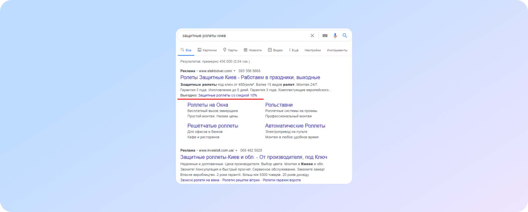
To draw the user's attention to promotions, discounts or any other benefits that you may offer, it will be appropriate to use the Promotion extension, which will help to stand out favorably among competitors
It is worth noting that if you create ads within the same advertising campaign both in Russian and in Ukrainian, but in different ad groups, then do not forget to specify the appropriate extensions for ads in Ukrainian and Russian languages, otherwise you may get an ad written in two languages, as in the screenshot above (second, lower ad).
Additionally (!)
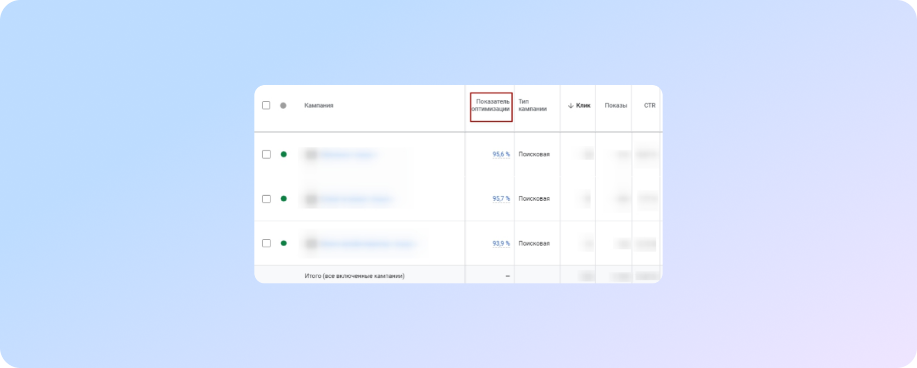
In order for ads to be shown in higher (noticeable) positions, it is recommended to pay attention, among other things, to the optimization rate of advertising campaigns and not to allow it to fall below 75%
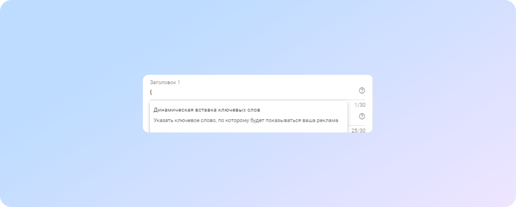
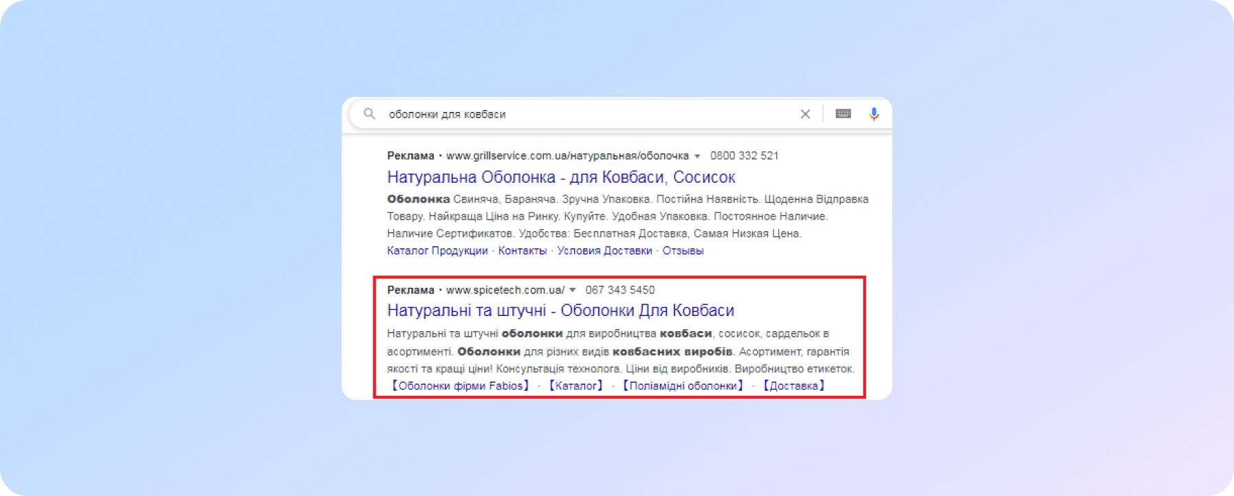
Insert keywords into your ad title or text
You can use the dynamic addition of keywords to the titles or text of the ad (keywords will be marked in bold in the ad text, which helps the ad stand out from the competition)
Or create ad text with the addition of a meaningful keyword
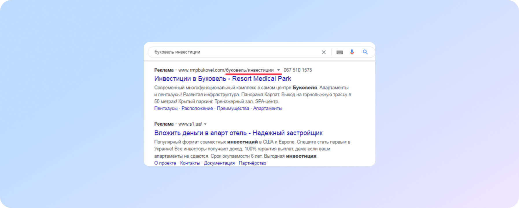
Andusing the display url
In addition to its informativeness for the user (it is immediately clear on the page with what content he will get), the displayed link can highlight the ad against the background of competitors.
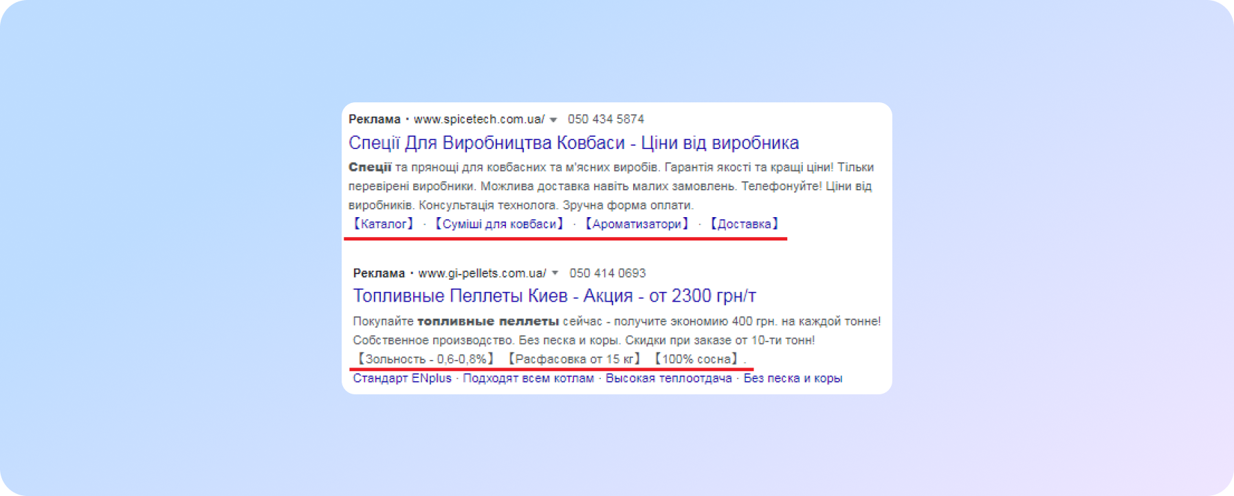
Use of parentheses or square brackets
In refiners and quick links (you can try to use them in headings and in the text of the ad, you can use parentheses, but you are less likely to pass moderation).
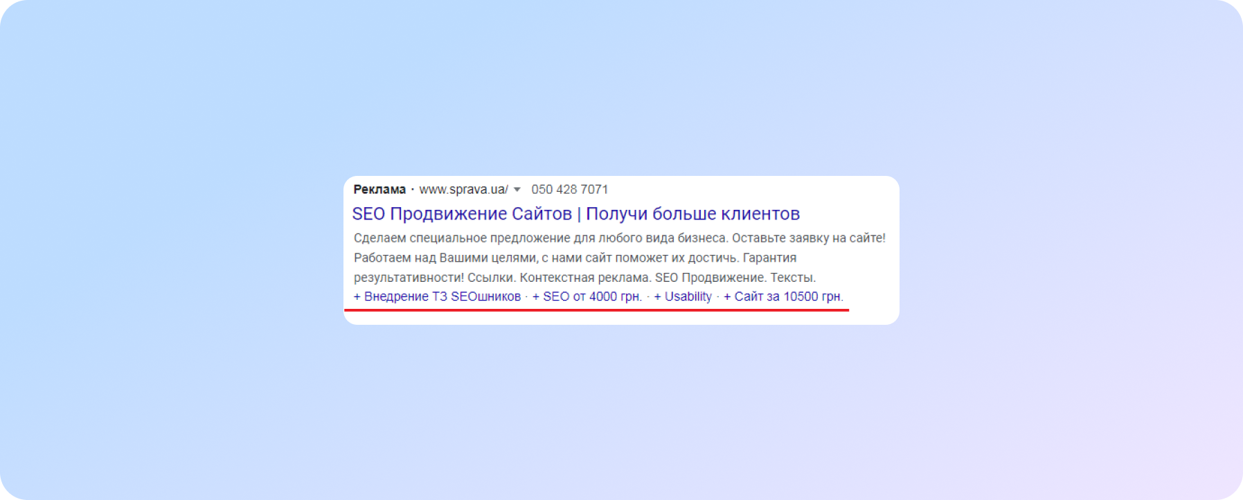
Alternative to parentheses – use of the "+" sign
Withspecifics ®, %, $, «» and numbers in ads
All these symbols help to "catch" the user's eye and can increase clickability
We care about improving your sales :)


