No magic - just our painstaking joint work on the site
Content solutions for an online store
Proper content marketing for an online store makes the store profitable
Let's think about what affects the profitability of an online store. What you need is to make sure that:
- your store was found (advertising in the search and top in organic search are responsible for this);
- users on the site saw what you offer (you have 3 seconds), became interested and stayed longer, moving from section to section and choosing;
- the assortment of the store is sufficient to satisfy the client, and that the price, payment method and delivery terms are suitable;
- your offer is credible;
- your store is different from many of the same.
Each item has its own solution, but the texts will help to stand out. If you want to sell a lot, then take care of the reader on every website page - both on the main and category pages, in product cards, in the section on delivery and payment, on the page of guarantees, promotions, FAQ, on the blog. Everywhere.
Imagine that your text is a friendly sales consultant, the dream of any store owner. Therefore, you will have to write in such a way that the user receives answers to all questions.
By the way! Do you know that every third Internet user in Ukraine buys goods online? At the same time, about 82% made from 5 to 20 online purchases over the past year, and another 17% - even more than 20 (source)
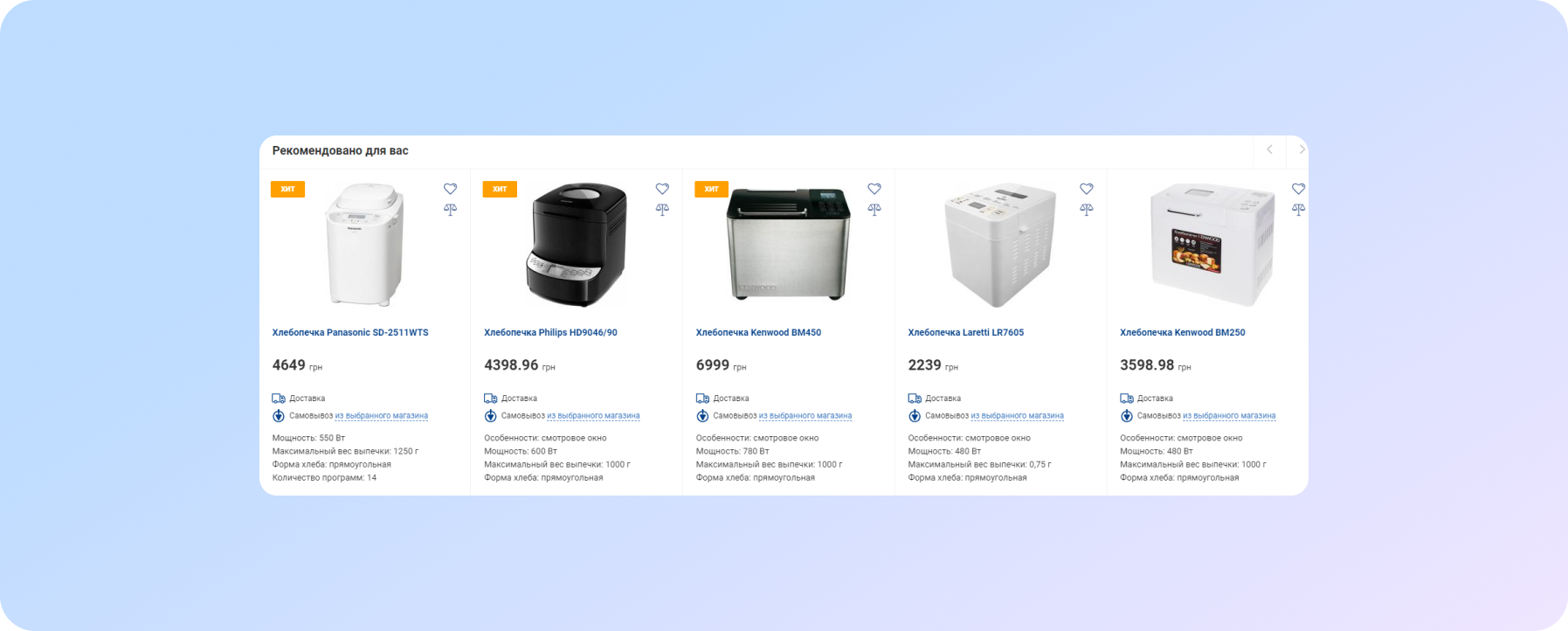
Imagine that you suddenly wanted to buy a bread machine. You can submit a product on the site like this.
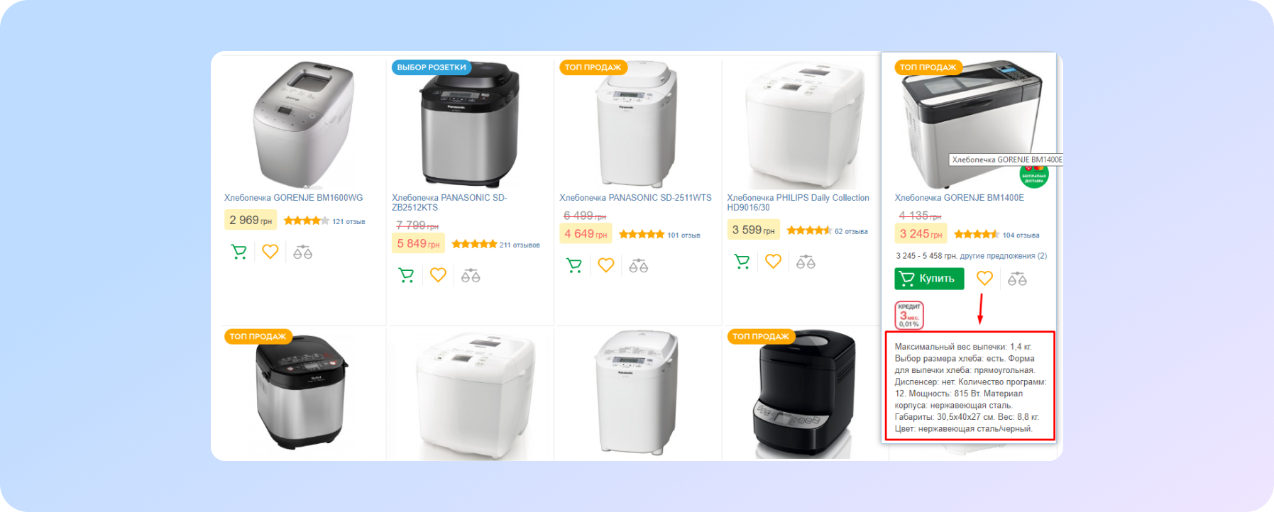
And it's possible like this:
The difference is obvious, right?
In the second case, a potential buyer immediately sees concentrated important information on the page, and it is easier for him to make a choice.
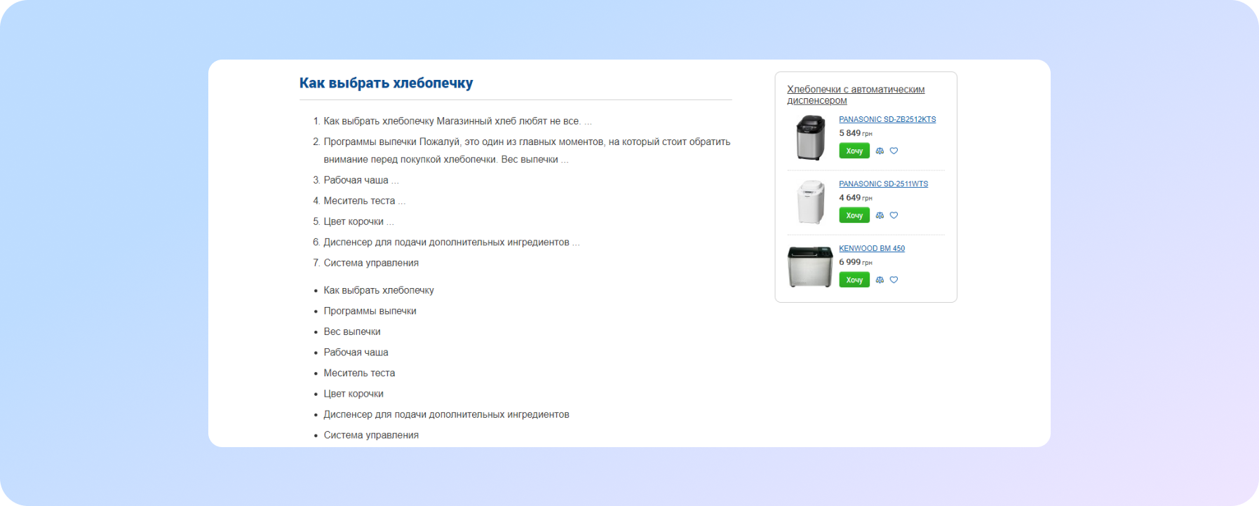
On information queries users often get to the following pages:
And this is an excellent article-recommendation on choosing a bread machine, not only well-linked, but also with an advertising banner with bread machines.
A good content solution for an information query is in the third screenshot.
Therefore, content is your assistant. It performs three functions in the online store at once:
- Attracts search traffic. Search engines scan texts that are relevant to customer requests and rank high-quality texts that answer questions well. And the links in the texts to the catalog of goods promote these goods.
- If the buyer liked the way you prepared the content (for example, in a review article or on a product card), he will be more willing to complete a conversion action. Order, write, subscribe to the newsletter or even buy. The behavioral factors of the site are also improving. Because the content is read, respectively, users spend more time on the site. And if you share it on social networks - it's generally good! Even better, if readers turn into subscribers and then into buyers. The most important task is to start generating repeat sales for the online store with the help of content.
- Creates an image for your brand. Interesting, meaningful texts which are well-designed and diluted with photos, videos, infographics, will increase the loyalty of visitors.
If you sell complex products, then content marketing for an online store “must have”: training videos, step-by-step guides, comparison reviews, test drives. They will help you lead a client to a deal, as is the case with a bread machine.
Let's see what kind of content is needed for different types of online stores.
What content is needed for two types of online stores?
Marketplaces and hypermarkets (such as Rozetka) are characterized by a huge number of non-unique products. Products in such stores compete on:
- working conditions;
- advantages;
- price;
- terms of delivery (time, choice);
- the presence of a guarantee from the manufacturer and the store;
- terms of payment (installment plan).
An important role is played by the brand of the product, certification, reviews about the service of the store.
Things are a little different in small stores (from 100 to 1000 exclusive items). Here in the content on the website it is important to show:
- what is the uniqueness of the product, how it differs from analogues (handmade blankets, for example);
- provide evidence of quality;
- benefits;
- and for new products on the market, it is important to create demand - here you need to tell what kind of pain a potential buyer is covered.
In small shops, goods compete with each other (shop of handmade blankets / tablecloths / hats). It is important to indicate the composition, show quality and make a cool visual. There are many subtleties in the product description - what is the peculiarity of the product, how it differs from competing products.
Make the benefit of your product obvious. To do this, try not only to describe, but also to show the product in person: video review, photos from different angles.
Types of content which are necessary for an online store
- selling texts for static pages,
- news and promotions,
- category texts,
- product cards,
- useful articles.
What do I mean by static pages? Text for the main page, text about the store, about production, about payment and delivery, guarantees, objections / FAQ and contacts. All of these pages (and the text on them) are important to your customers' decision making. Especially for those who came to you for the first time and had not interacted with you before. He hasn't had a positive experience yet. And now he wants to make a decision whether to order goods from you or not.
By the way! If you need an audit of your texts on the site, new texts and SEO services, please contact us. Let's help to your site
The sales chain and how to use customer touch points
Texts are responsible for each stage of the sales chain on your site.
| Target: | A - Attention | I - Interest | D - Desire | A - Action |
| Attract attention | ||||
| Show problem solution | ||||
| Show Benefits | ||||
| Build trust | ||||
| Work with objections | ||||
| Call to action |
Перша мета – привернути увагу. З цим завданням справляється текст на головній, якщо розглядати глобально весь сайт в цілому. Далі потрібно обов'язково показати рішення проблеми, підвести до потрібного висновку, викликати довіру, зняти заперечення і закликати до дії. Кожна сторінка вашого сайту, вашого інтернет-магазину може закривати ту чи іншу ціль, або кілька одразу.
Then all items from the first column will be included in one selling text. For example, in a text about a store, in which you can show all this pointwise, and then decipher it.
| Purpose: | Text pages: |
| Attract Attention | Home |
| Show problem solution | Item card |
| Show benefits | About store, product card |
| Inspire confidence | About the store, production |
| Work with objections | Delivery, payment, FAQ |
| Call to action | Feedback form, contacts |
The most important page on the website of an e-commerce website is the product card. It should close the entire sales chain, all goals. Because often a person is looking for a specific product in the search and comes to the site immediately to it.
And it is very important to do everything you need inside the product card. Use, in addition to text, pictures, videos, reviews.
| Purpose: | Page text: | The product card closes the entire sales chain |
| Attract Attention | Home | |
| Show problem solution | Item card | |
| Show benefits | About store, product card | |
| Inspire confidence | About the store, production | |
| Work with objections | Delivery, payment, FAQ | |
| Call to action | Feedback form, contacts |
Use this table to check if all stages of the sales chain are well represented by the texts in your store. It is very important to follow these rules for writing texts for an online store.
Copywriting: how to start writing good text for an online store
Next, you need to look at what direct competitors offer to the target audience. As well as indirect competitors (marketplaces, for example, or giant stores). Monitor promotions and prices, delivery terms. Only then can you understand your own USP (Unique Selling Proposition) and stand out from the competition in your niche.
Tip: if you can’t always compete on price, then you definitely can on the level of service.
Next, you need to create the structure of the selling text on the site. Look at the sample structure
Headline (problem - information - base) solution (USP or offer) buyer benefit evidence call to action (CTA)
There is another recipe for writing a good text from Olga Pavlova:
So, you need to write the text for one (!) page of the site.
Scheme below.
Any retreat is a guarantee of failure.
- Make a list of all (!) questions that people ask in a particular situation. Not in your mind but compose them on the paper. It is possible on a computer. But not in your mind!
- Check that the questions are formulated in easy and simple, conversational language. This is an indicator that people really need answers.
- Check that these are the questions. A question is a sentence with a question mark at the end. The only way. It is important. Everyone is lazy, don't be like everyone else. Error-leader: "Address". What's the address? What is the question?
- Write a coherent text that answers all these questions.
- Check that the text contains all the answers.
- (The most difficult) Check that there is nothing in the text that is not the answer to the question. Nothing extra! Not a word. No question - no answer: this is the most important and most difficult.
- By this point, your hands should already be itching to structure the text: headings, lists and so on. It's time.
- If your hands don't itch, you have to force yourself. Headings. Lists. Paragraphs must be no longer than 7 lines.
- Rewrite the text entirely according to the principle of an inverted pyramid. The text begins with the main. The paragraph starts with the main one. The sentence begins with the main. The main thing is for the readers, not for you. Don't be lazy and don't be creative.
- Reread in search of places where additional questions may arise. Don't write answers! Post links to answers. Links only. If there is nothing else to refer to, you mark that this “something” needs to be done.
- Reread in search of places where it is better to replace the words or accompany them with illustrations. Add illustrations. The map is an illustration. No illustration - solve the problem, do not sweep it under the carpet.
- Editing, proofreading, second opinion.
- Run through all the points again in order to check that nothing is missing anywhere lowered.
- You can place text on your website..
How not to write texts on the website of an online store
Always put yourself in the place of the buyer: does he understand everything? Did he get your logic? Is it easy to choose a product?
Forget about clichés and patterns that only cause irritation. Into the firebox
“the lowest prices”, “dynamically developing companies”, “the most highly qualified managers”, “super reliable kettle”. Instead, sustain your words with facts.
Long watery texts are inappropriate. Low skilled copywriters deliberately breed speech seas in order to increase the payment for the text. Information must be accurate, useful, relevant. If you sell watches, then you don't need an essay on the history of watches. If tourist tents, then arguments about romance under the starry sky will be inappropriate.
Never copy the texts of competitors. The uniqueness of the texts technically and in meaning that's what you need to strive for. Maximum attention to secede from competitors, emphasis on USP and the added value of your product (high technology, for example, or the same high service of your store).
The texts on the site should be clearly structured, divided into paragraphs, subheadings lined up in a clear system. Avoid stylistic, semantic, spelling and grammatical errors. There are excellent services for checking texts.
The days of SEO texts are long gone, you need to write for people. But it is still too early to refuse keywords. Organically fit them into titles, tags, texts, but do not spam. We talked about this in the article “How to write texts for websites in 2020?”
What can be the proof that your store is the best and the products are of excellent quality?
First of all, guarantees from the manufacturer and from the store. Do you know what this means for the buyer? The fact that you do not have a “gray product”, but you work officially with a manufacturer brand, even if not directly.
Reviews work great. Well, you know this by yourself, as well as the fact that fake reviews are very noticable. An online store without reviews looks suspicious, and the inability to leave a review is also suspicious. People read reviews about trading platforms on the Internet both on the sites themselves and in Google maps.
It's cool if you have collaborated with large recognizable companies and can show their logos as partner brands.
Show the real achievements of your company. At the same time, one must understand that XXX years on the market is doubtful for a site visitor. He cannot understand whether it is a lot or a little, what it means:
- we developed a cool loyalty program - an achievement;
- we work directly with manufacturers - an achievement;
- we respond to your requests in 30 seconds - an achievement.
The technology of work can also be proof of the special qualities of the product.
Place information about current customers and their number, brand or store regalia (certificates, information about participation in industry exhibitions, awards) on the page “About us”.
Guarantees and work with objections can be included both in a separate text and in the text about the company, as well as in the texts of product cards.
Subscribe to S PRAVA newsletter, and you will not miss the continuation of this article, where I will talk about the cool design of the main page, shopping cart, product card, page "About us". You will also learn how a USP differs from an offer. We write letters not so often, we talk about the news of search engines, PPC and SEO.
We care about improving your sales :)


