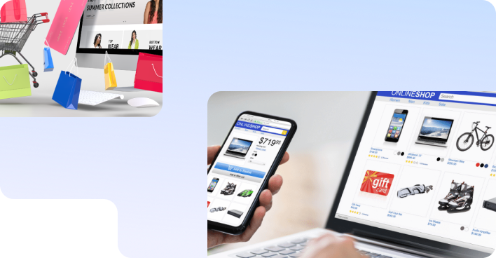
SEO Services
No magic - just our painstaking joint work on the site


No magic - just our painstaking joint work on the site
No magic - just our painstaking joint work on the site
Sharing the most useful advices about marketing!
No magic - just our painstaking joint work on the site

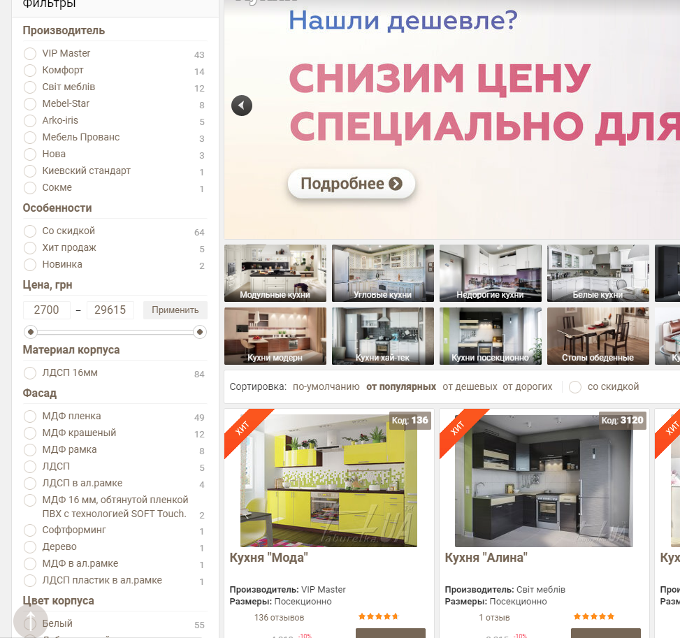
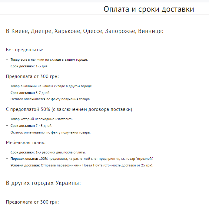
Commercial site factors are the elements and characteristics of the site that affect the trust of buyers. These factors are important for the site, they affect the behavior of users and the ranking of the site by search engines. If your task is to improve the position of the site in the search results, then carefully study what are the commercial factors, typical errors and how to solve them.
So let's go!
The most important thing for a future buyer is the ability to quickly contact the brand and get answers to their questions. Therefore, the site should have all the necessary information for this:
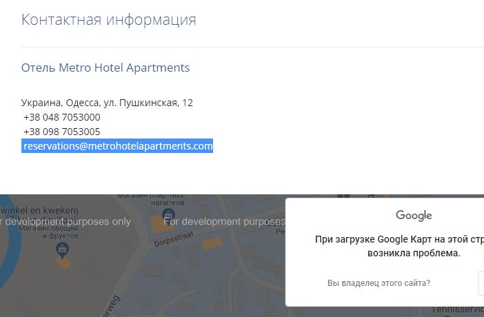
Wrong contact page example: Google map is not displayed, there are 2 phones (it is not clear which ones are responsible for what)
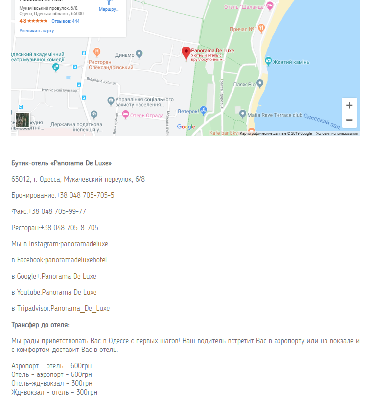
A good example of the implementation of the contact page: the purpose of each phone is signed, there are links to social networks, and the cost of the transfer is given. All on one page!
First of all, registration on the site is necessary for large web resources, for example, online supermarkets, where there are a lot of goods, and the user wants to monitor price changes or “postpone” the product they like.
Contacts of a company or an online store should always be in the user's field of vision. This is necessary so that at any time the site visitor can contact the company manager. In addition to the "Contact" page in the main menu, the best option is to add a maximum of two phone numbers, an address, and hours of operation to the site header.

Bad example: in the header of the site there are no contacts at all and ways to contact in the header of the site there is an address, a phone number

A good example: in the header of the site there is an address, a phone number, a form for ordering a call "Call me back"
Be honest, if there are several ways to contact the manager of the company, which method will you choose: call or ask a question online? There is a category of people who do not like to resolve issues by phone, it is much easier for them to write. Or they are so busy that they are not able to dial the phone number of a store or company during business hours.
A good site allows the user to choose how best to ask a question. It is clear that there should be not only the possibility of online communication, but also feedback from the company manager. If there is no person who will respond to text messages online within 20-30 seconds, it is better not to do online chat, because bounce rates may increase.
In its turn, the absence of such a source of communication is the loss of potential customers. Also, online chat is a good way to protect yourself from technical problems: if some technical malfunction occurs on the site (for example, the booking form on the hotel website has stopped working), the user has an alternative way to order online. And if there is only the booking form that stopped working, the hotel immediately loses the booking.
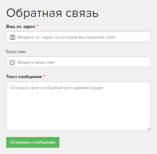
Bad example of a feedback form: a lot of unnecessary fields
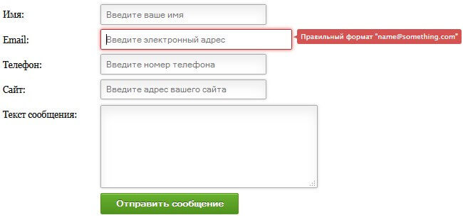
A good example of a form: only three fields (name, email, and the message itself). The fewer fields the better.
Hooray! The user came to our website through one of the traffic acquisition channels. And what does he see as a result? How complete is your commercial offer? A large list of products and services on the site increases the likelihood that the user will satisfy his search needs and buy from you. Also, search engines strive to satisfy the user's request as much as possible, therefore they prefer sites with a large assortment of goods and services.
Bad example: an article was written on a commercial request
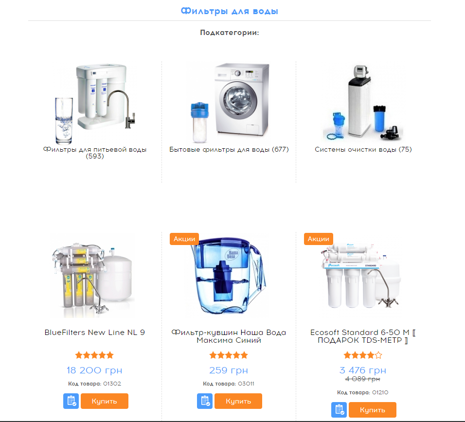
Good example: links to subcategories and a list of products
Filters will help the user to quickly navigate the proposed assortment on the site and quickly find what they need. Make search options simple and convenient. See how search by parameters is implemented in your niche, ask how your customers search for products.
Those pages that may have commercial value are better optimized for certain parameters in order to attract additional traffic for low-frequency queries. Pages that are designed for greater user convenience can be closed from the index (for example, pages sorted by price, etc.).
To implement the first option, it is necessary to add unique title and description meta tags, H1-H6 headings, texts for target search queries, to each desired filtering page, respectively, corresponding to the filter parameters.
In the product category, there is an opportunity to systematize and filter products by the specified parameter
The most important page of the site is not the main one, but the product card. This is where the user makes the final decision: to buy or not? The card must answer ALL user questions. In addition, product card pages can also be traffic source pages and provide sellings, but for this you need to be as relevant as possible to low-frequency and high-converting queries. If the content of the product cards is good, then the ranking in search engines will be better.
In each product card, present:
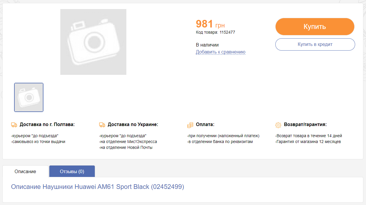
Uninformative product card: no photo, description, technical specifications. Only information about payment and delivery
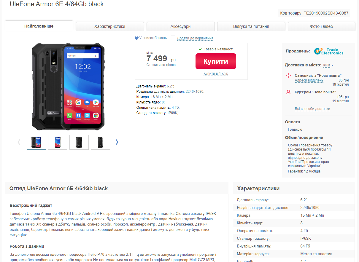
A good example of presenting information on the product page: several photos, information about payment and delivery, exchange and return, product description, product specifications
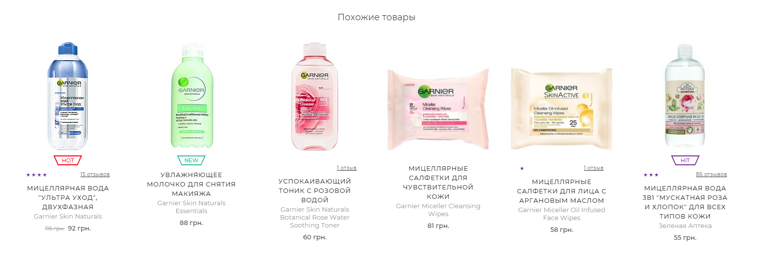
Tell the user how to replace the product with a similar one, how to find the viewed product faster and easier, and what else would be useful to buy. Such blocks are best placed on the final page of the product, even several at the same time.
Hints can significantly increase the average customer check if they are thoughtful and useful.
Shopping cart is a conversion element of the website. Therefore, the process of adding goods to the cart should be simple and clear, without complicated forms and mandatory registration on the site. If the product has already been added to the cart, it should be visible on the site. A great way to boost conversions is to implement a one-click purchase option.
In the basket it is possible to increase or decrease the number of items, all fields are required for ordering
What functionality of the shopping cart will be useful to the customer? The ability to change the color of the model, size and quantity directly in the shopping cart (if the user leaves to do this, he may already be in the cart and will not return). Possibility to remove the product and return the removed product. Promotion hint: "You have to buy 500 UAH to take part in the promotion or get free delivery." It is good if auxiliary, additional goods are reflected in the shopping cart.
It is very important to indicate the cost of goods or services on the site. If the client does not understand the pricing policy of a company or an online store, he is more likely to place an order with competitors. Calling by phone, specifying the price and conditions of purchase is the performance of unnecessary actions, for which not everyone is ready. Why put in the effort when there are so many open-price listings out there?
Each business has a different approach to the formation of the final price of a product or service. Therefore, if the question of price is not so unambiguous, you can indicate approximate prices or “Prices from ...” and describe what they depend on. For example, such an implementation may be justified for manufacturers or suppliers of plastic windows. In addition, the price must be competitive, monitor the offers of your closest competitors.
Bad example: there is no price on the page
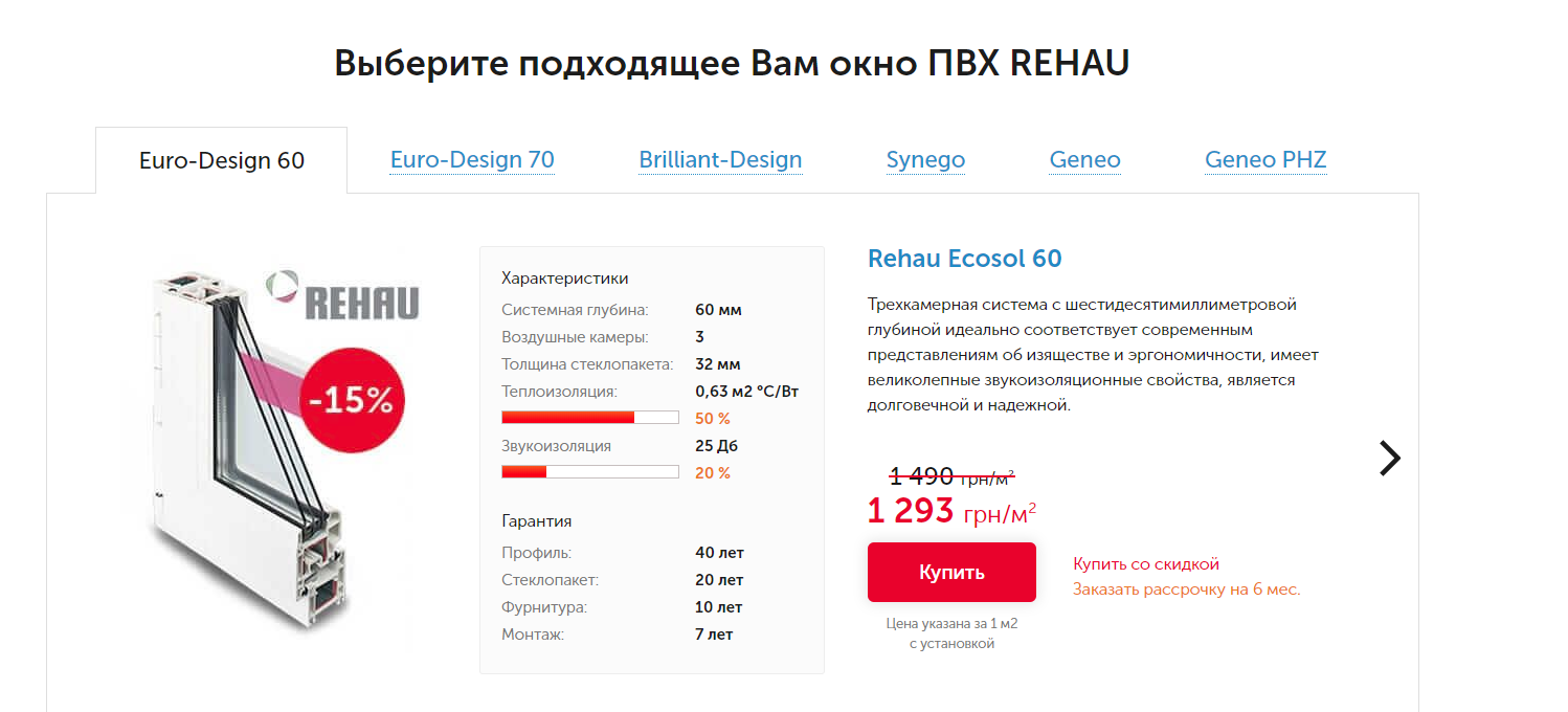
A good example: there are prices for 1 sq. m with installation
For promotional offers and discounts, it is better to make a separate section, put it in the main menu. It is important to follow the up-to-date description of the terms and conditions of the promotions. If all promotional offers are outdated and not relevant at the moment, then you should not delete them, but simply indicate next to them that the promotion has already ended.
Maybe you have a cumulative discount program for goods or services or a loyalty program? Describe it clearly.
Another idea of a promotional offer is to give a discount for a review about cooperation with your company from your clients.
Do not be afraid to offer the client several payment methods, describe each of them in detail, adding payment details.
Bad example: short information about payment methods
A good example: features of making payments and prepayments by region, payment procedure
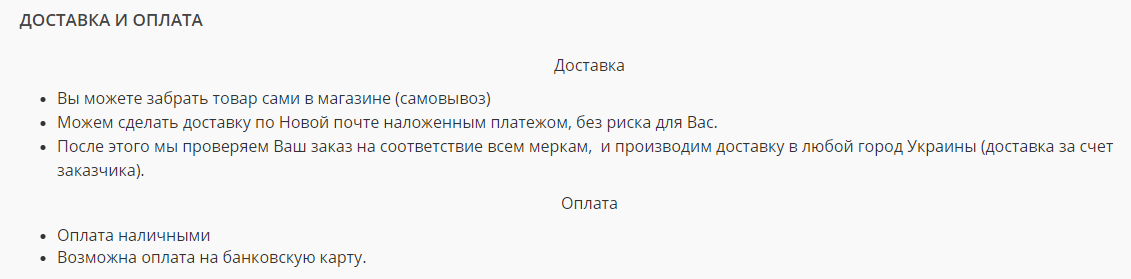
How can the customer receive the goods? What delivery services do you cooperate with? Describe in detail the regions to which you deliver, the terms, conditions for the transfer of goods, the cost of transport services of each of the delivery services. Is it only pickup or address delivery available? Indicate these points on the page. Give as accurate and complete information as possible.
A bad example: the information is unreadable, besides, it is also added with pictures to the site. Image text is not indexed by search engines

A good example: each delivery method is visualized, the cost is listed in each delivery option depending on the amount of the order, the delivery service working hours
A page with an algorithm of step-by-step actions for ordering a product or service through the site: from choosing a product/service to sending money by cash on delivery. This is especially true for large and complex sites, for example, car parts websites.
This is a very important point that can form the basis of your unique selling proposition. Do you guarantee the quality of the provided goods and services? What cases and for how long is the warranty covered? List all information on your site. This is not only a commercial factor, but also an increase in confidence on the part of a potential buyer. A good move is to highlight all your obligations with icons, contrasting colors.
Bad option: there is really no information about the guarantee
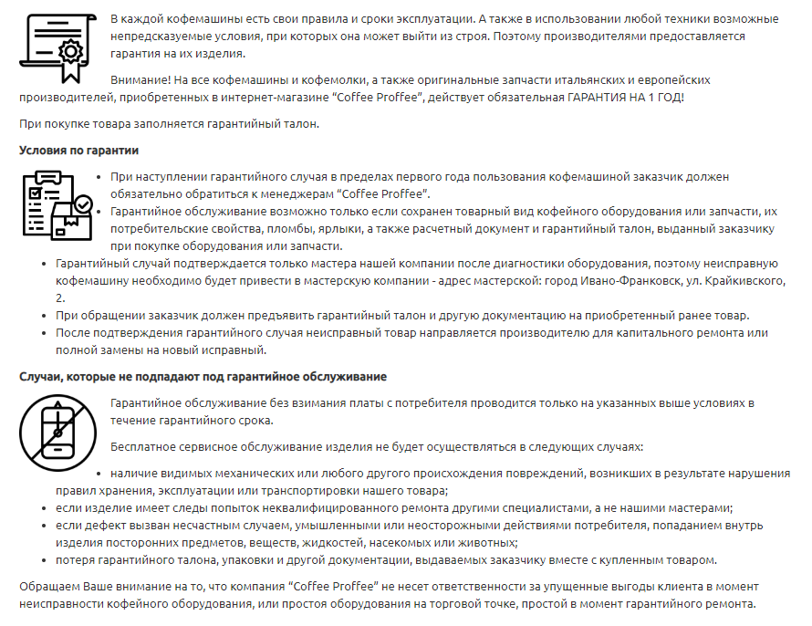
A good option: the terms of the warranty are described, as well as cases that are not covered by warranty service
It happens differently, the product did not fit or the buyer wants to exchange it. How to do it? On a separate page, describe the algorithm for making a return and exchange of goods with a detailed indication of all the conditions and the return form, if it is a stage of the procedure.
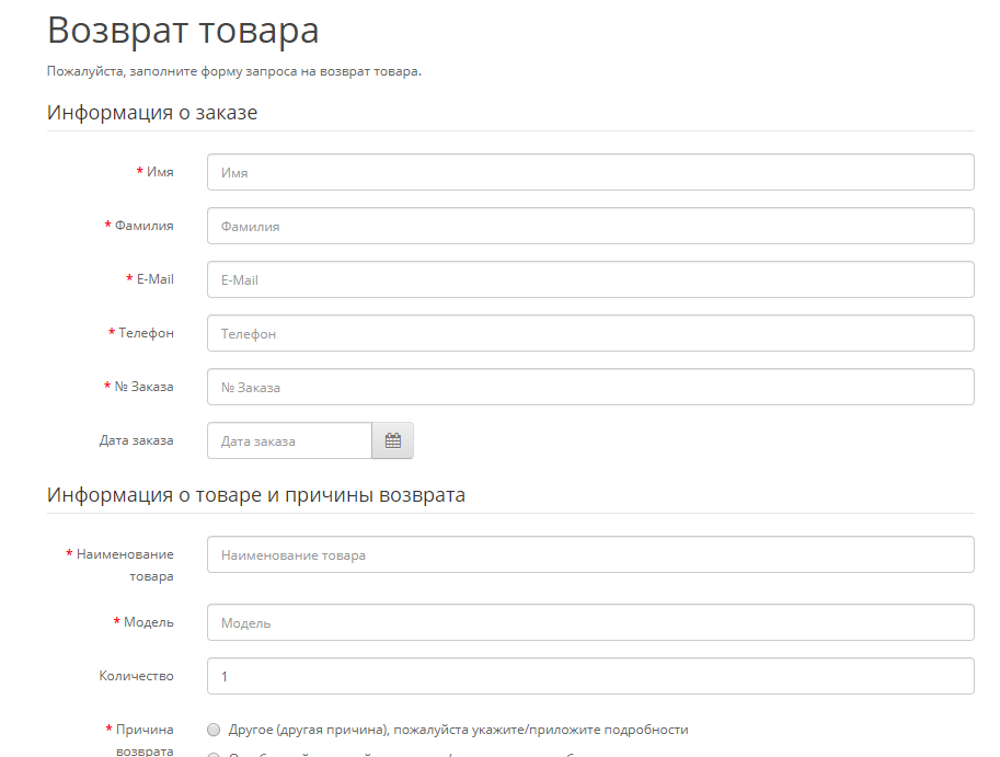
Bad example: you need to fill in a certain number of fields just to leave a request for a return of goods
A good option: the algorithm of actions for returning products is outlined
Want to optimize your site? Contact the experts of SPRAVA. We will explore your web resource and find weaknesses. It's like getting your car serviced before a long trip. First check-up, fix it, then we go
This page is not really about your brand, but about the value your brand/shop/center brings to consumers. What makes you special to them.
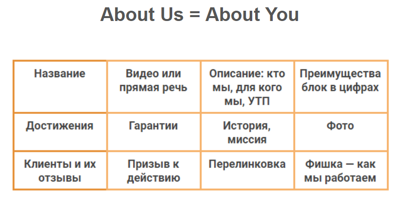
Here is a slide hint for you what exactly is appropriate to place on this page
Bad option: the main page and the "About us" page are merged. Pretty common mistake. On the main page, the main directions of the company's work, the advantages of buying and cooperation should be placed. On the "About us" page, you need to place information about the company, team, etc.
A good implementation option: there is a history of the company, a photo of the team
Here are some more great examples:
Part of the "About us" page of the furniture factory
Have you received awards or won nominations? Show it. Post good quality photos of diplomas, certificates, awards for the successful completion of work and recognition in the profile direction and that you should be trusted.
The size of photos or scans should allow a user to easily read what is written on them, he can enlarge the photo by clicking on it. You can also sign each award.
The best result of the work is good customer reviews. Provide an opportunity to share the impression of working with the company, which will increase customer loyalty.
A great implementation option is to put the last few reviews on the main page and add a link to the guestbook section where you can read the entire list of reviews or leave a new one.
It also matters what target audience the customer's business is aimed at.
In the B2C segment, simple feedback through the form in the text version is quite enough. If we are talking about the B2B segment, then plain text will not inspire confidence. Therefore, it is better to post scanned copies of official letters of gratitude or video reviews of customers.
Post photos with examples of work performed in good quality, photos of employees in the process of completing an order. Thus, it is easier to win over a potential client to yourself, show the range of your skills and capabilities, protect them from fear for the result.
The most important factors for the e-commerce site promotion are:
Check your site: do you have everything, is there clear text everywhere. The strength of certain commercial factors, what to do is critical and what can be neglected, depends on the niche and specifics of your business.
Implementing this list of commercial factors will take a lot of time and effort, but with their help you will not only improve the visibility of the site in search engines,
increase the number of visitors, but you can also emphasize the reliability of the resource in the eyes of users. The more convenient and interesting your resource is, the more new customers it will help to attract, as well as retain old ones.
Do not be afraid to test, create and implement new ideas, tracking their impact on the result.
For someone SEO is hard. Someone considers SEO a real headache. BUT the experts of SPRAVA say this: “We are SEO.” Ask questions about optimizing your site and we will help.
We care about improving your sales :)